Status
Open to Work
HiPortfolio
Burning the Rulebook & Building Something Better
How can we rebuild HiPortfolio from a generic, low-presence version into a brand that feels instantly unmistakable, unapologetically bold, strategically sharp, and designed to win in a world of “clean aesthetic” sameness?
Brand Introduction
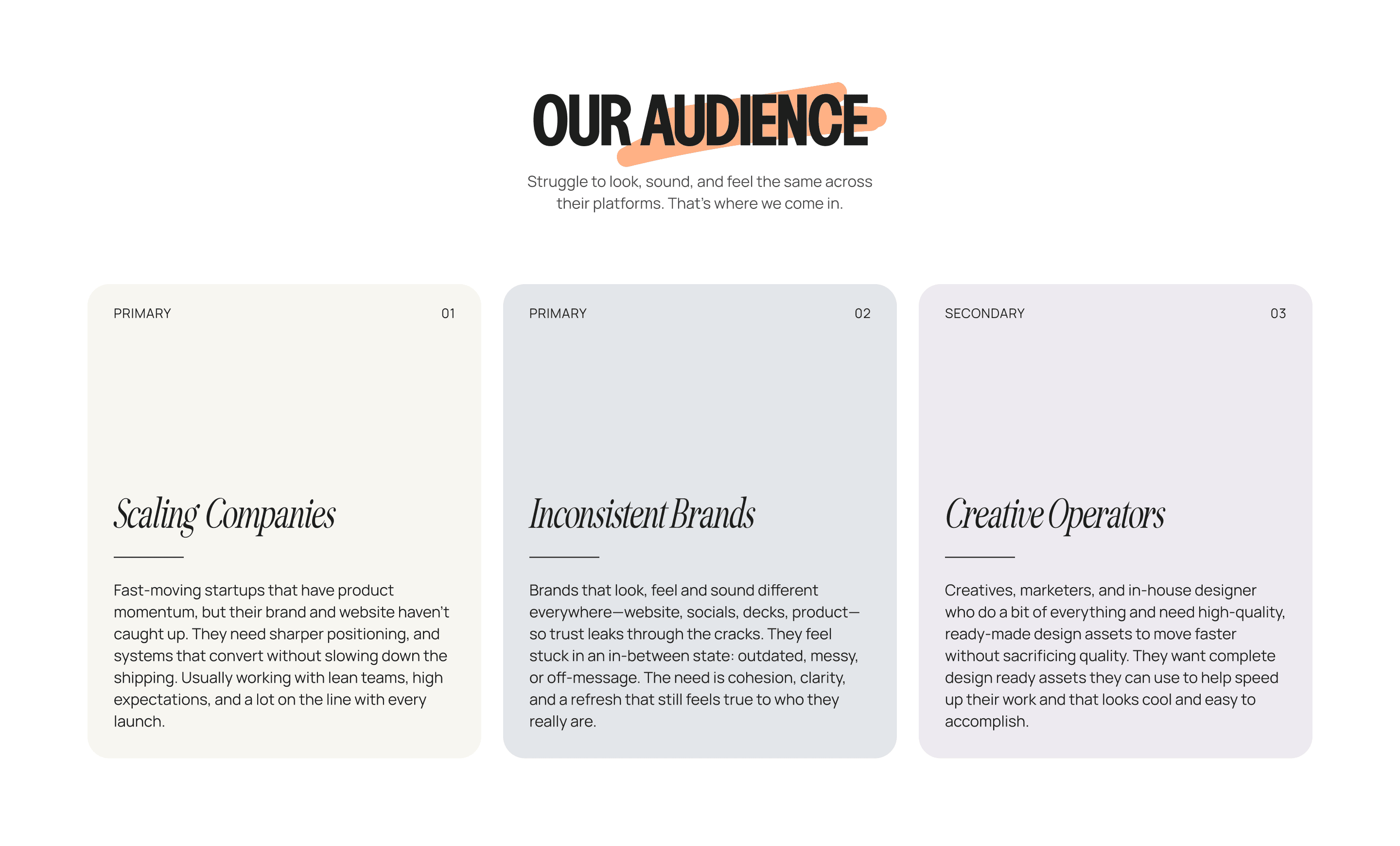
HiPortfolio is a global design and no-code agency built for startups and scale-ups who dare to stand out, blending strategic creativity with bold execution across brand, websites, and products.
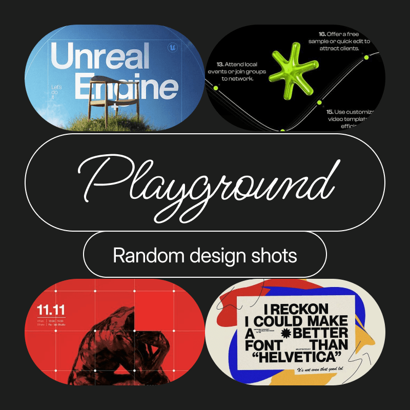
Ask Ai for Overview
My Role
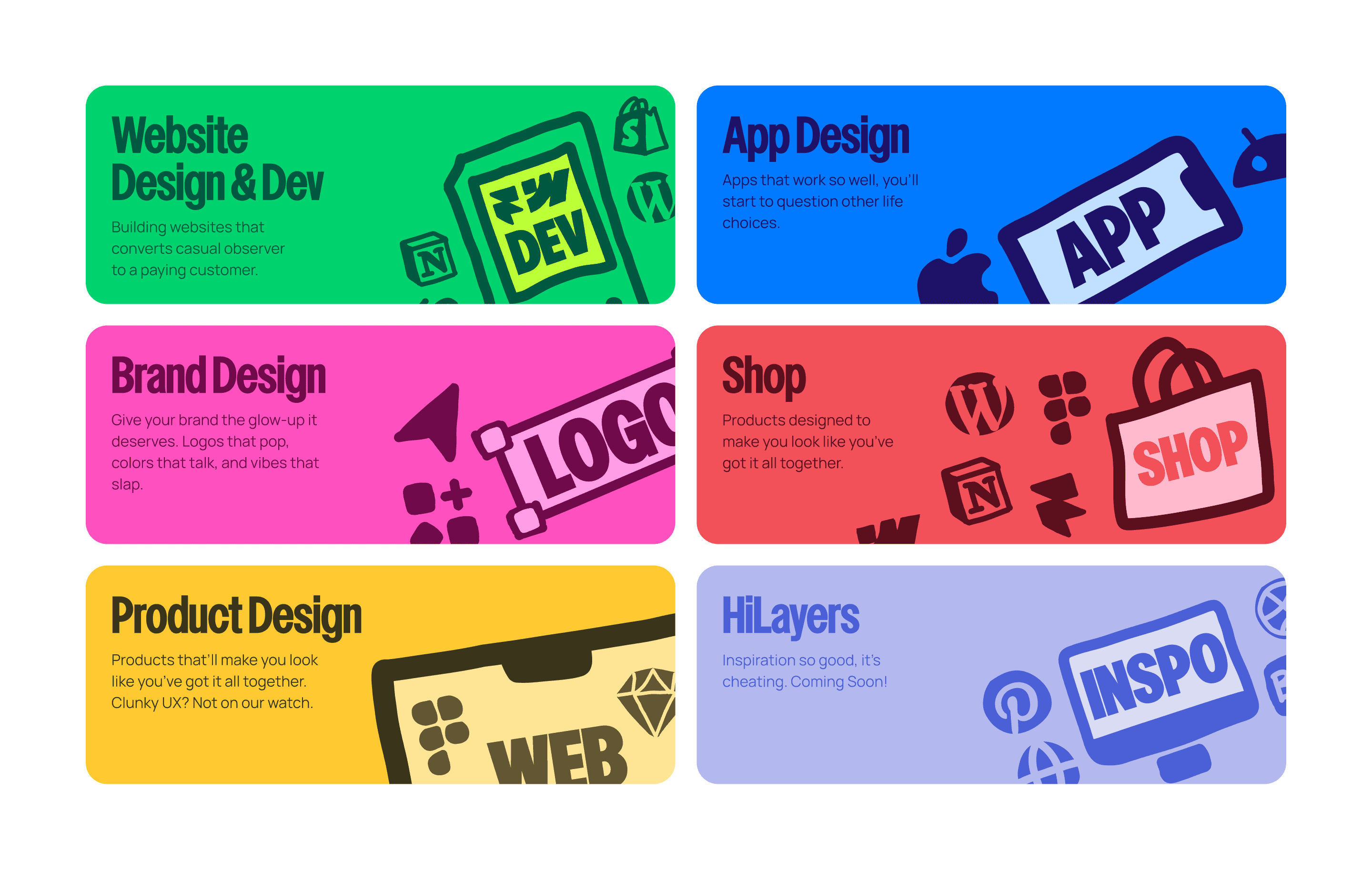
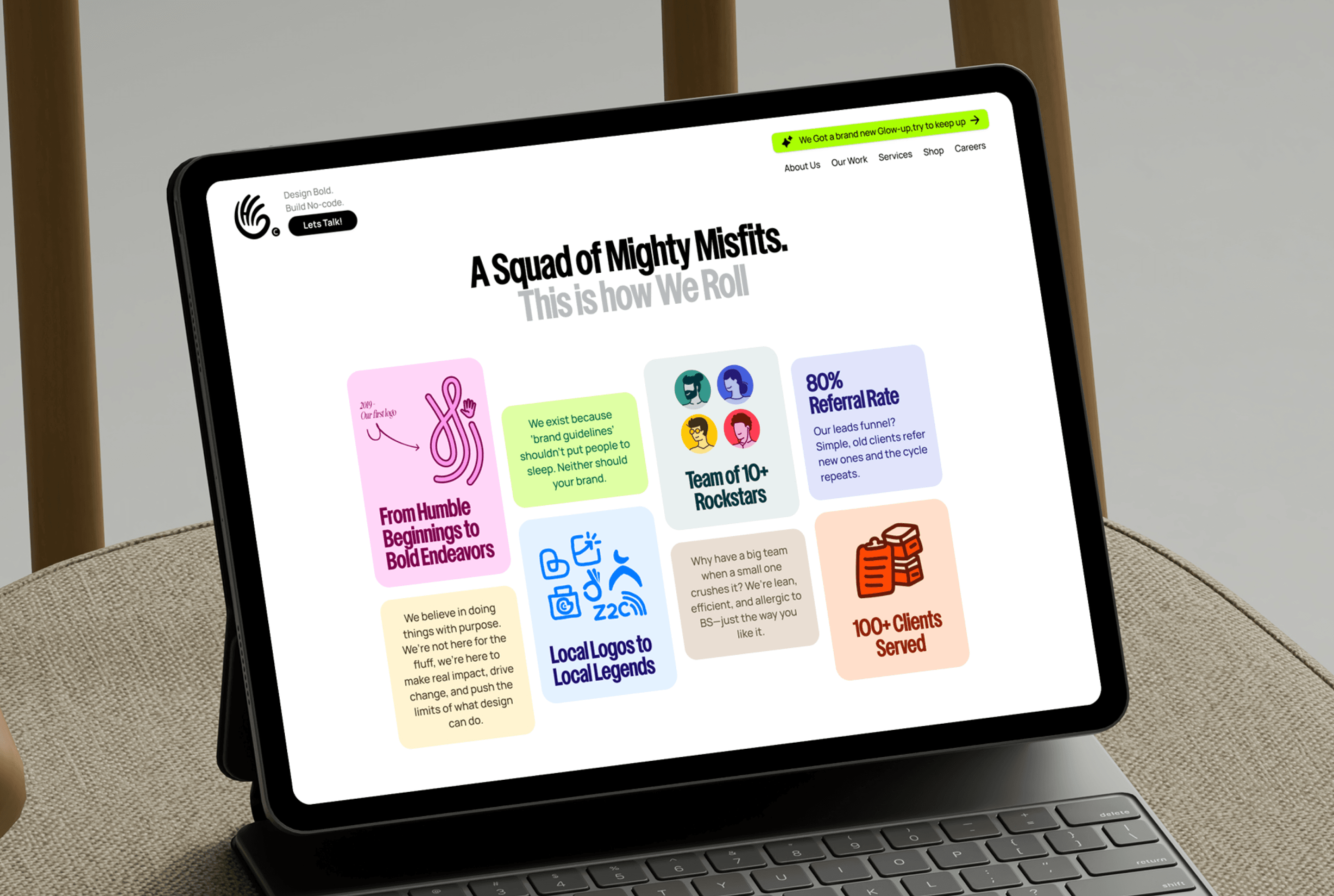
Brand Identity
Website Design
Website Development
Highlights & Impact
4x increase in quarterly revenue for 2025.
Partnered with 30+ brands across 8 industries in the last 2 years.
Lead the team of 7 people, including creatives and engineers.
Designed experiences used by more than 100k+ people.

HiPortfolio didn’t start as a “let’s launch an agency” moment. It started way more casually, via a friend who was running his freelance practice under the name Hi, and pulled me in to help on a couple of projects. So I helped. Then we did a few more and somewhere in between those projects, we thought what if we stopped treating this like a side thing and actually built something substantial? A real agency, with structure, with intent, one that does cutting-edge work, with a point of view, and a standard that’s bold and brave.
So in April 2024, we made the call and ditched the practice and went all in. We had a very cute idea that this was going to be straightforward and we'd be done in a couple of months. Maybe three, tops.
I still laugh about that.
Turns out, building an agency from scratch is like assembling furniture blindfolded, with one hand tied behind your back. We had to build everything from scratch—and I mean everything. The identity, sure, the website, obviously. But then there was everything else. The case studies that took forever to write, social profiles that sat empty, documentation, legal stuff, bank accounts, business registration, tools, workflows, planning and soo much more. All of this while keeping client work moving because, you know, bills don't pause for rebrands.
Our initial timeline was cute. We thought maybe six weeks. Then six months started feeling ambitious. Every time we checked one box, three more appeared. Things we'd never considered, like what systems you need when you're no longer two people in a room but something that has to actually run in every situation.
Designing for ourselves made it worse in the best way: the bar was higher, the ego was louder, and nothing impressed us for more than five minutes. We needed the reality check that we weren't just building a brand, we were building a company, and nobody warns you how different those two things really are.
Team
1 Creative Director (Me)
1 Art Director
1 Illustrator
1 Motion Designer
Timeline
Aug, 2024 - Mar, 2025

The Start
Brief we wrote for ourselves
Once we stopped panicking long enough to breathe, we had to answer the ultimate question: what are we actually trying to build here? Not in a metaphorical, vision-board, "world peace through design" way. In a real way. The kind of answer that would guide every decision we made for the foreseeable future.
We knew what we didn't want. We didn't want to be another agency that looked like every other agency. Another website with the same "we're passionate about solving complex problems" boilerplate. The world didn't need another one of those. And honestly? We would have been bored building it.
But knowing what you don't want is easy. The hard part was figuring out what actually made us us. We kept coming back to the same idea: work that felt like it had a pulse. Work that didn't play it safe. Work that invoked real emotions and feelings like surprise, confusion or even discomfort sometimes. Anything but indifference.
The brands we admired growing up weren't the ones that blended in. They were the ones that took risks. The ones that felt like they were made by actual humans with actual opinions. That became our north star. Not a specific aesthetic or style, but a feeling. We wanted people to encounter something from us—a website, a logo, a random Instagram post—and think, "huh, that's different." Not different for the sake of it, different because it had to be.
We talked a lot about what success would look like. Not in revenue numbers or client counts, though those matter. But in the moments that would tell us we'd gotten it right. A founder sharing our work without us asking. Someone reading our website and saying "oh, these people get it."
Easy to describe on paper. Much harder to actually build. So we started where you have to start: with structure. We mapped out the basics, clarified who would own what, how decisions would get made, what the actual workflow would look like. The unsexy scaffolding that makes the sexy work possible.
The Chaos
Basecamp, checklists, moodboards, and the end of vibes
Once the baseline was clear and we were happy with the structure and philosophy in place, we needed to actually, you know, do something with it. Which meant answering the least glamorous but most important question in any project: who's doing what, and when are they doing it by?
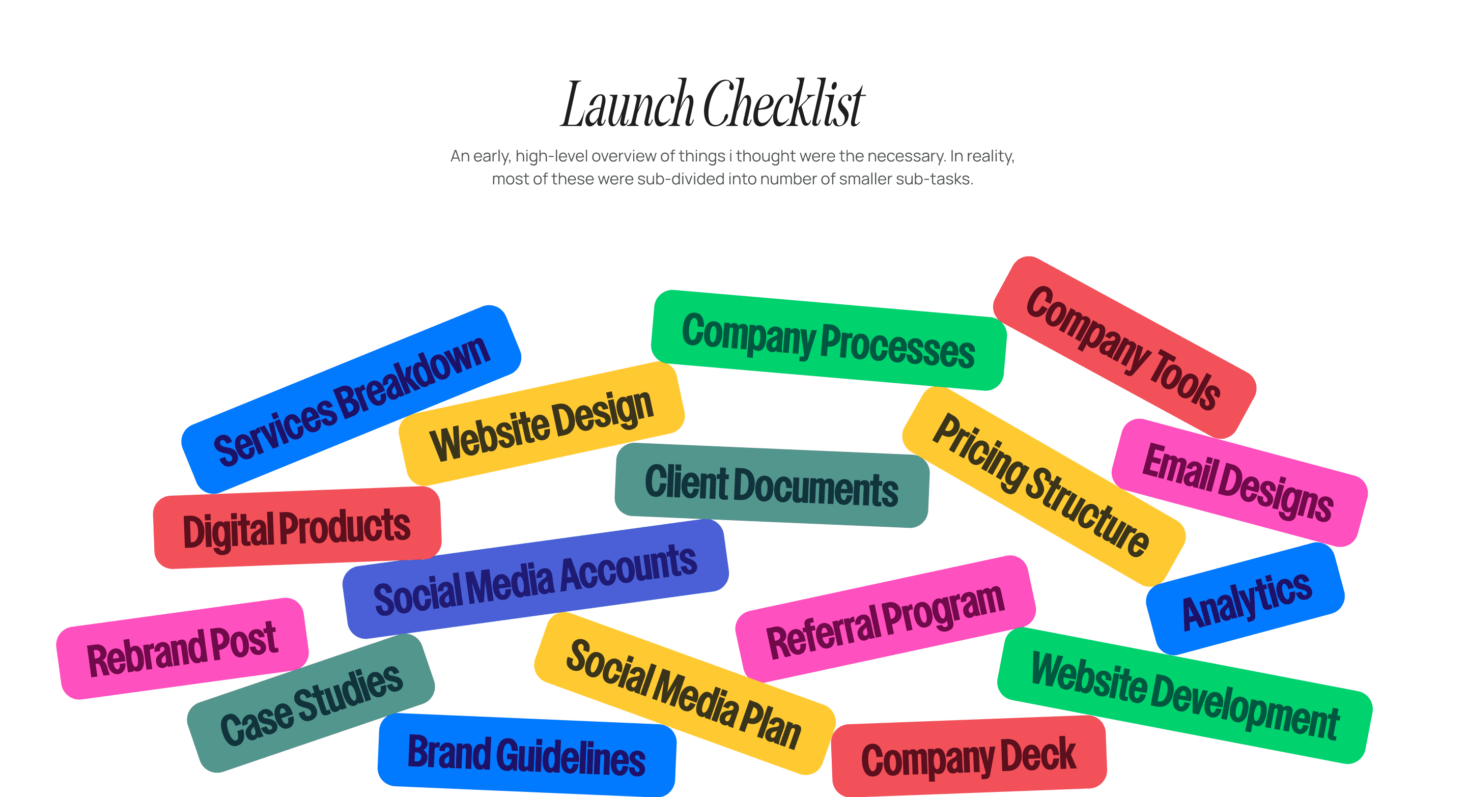
With the help of Basecamp, I built a launch checklist and broke it down into real deliverables—identity, website, case study system, socials, decks, internal docs, ops—the whole iceberg, not just the tip. The list, however, kept growing. Every time I thought of something, I added it. Every time someone else thought of something, I added that too. Pretty soon we had a document that looked less like a to-do list and more like a threat.
Alongside this, we set ourselves an ambitious challenge to launch on “New Year’s Day”. (Sadly, the list won and our launch was delayed by a couple of months).
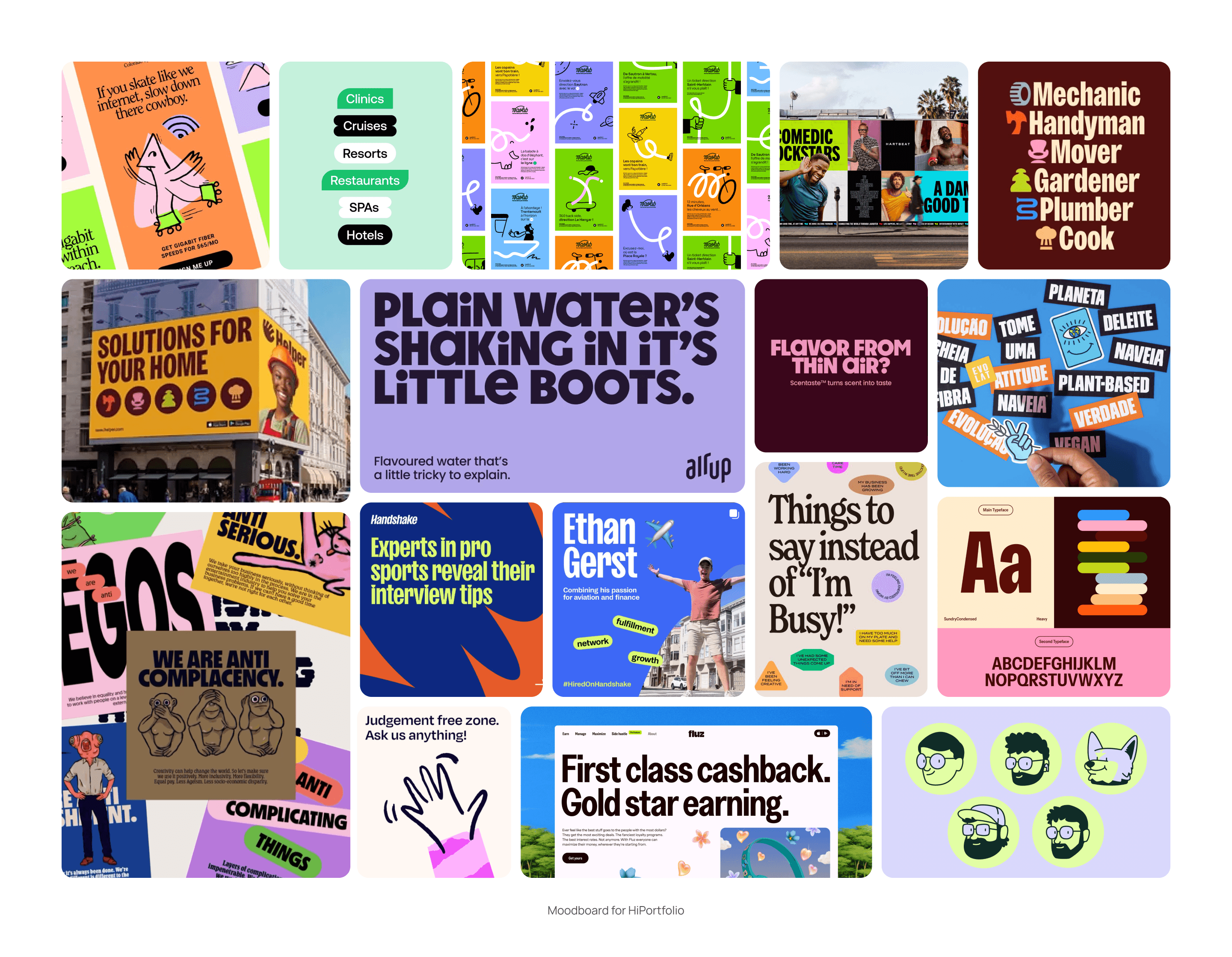
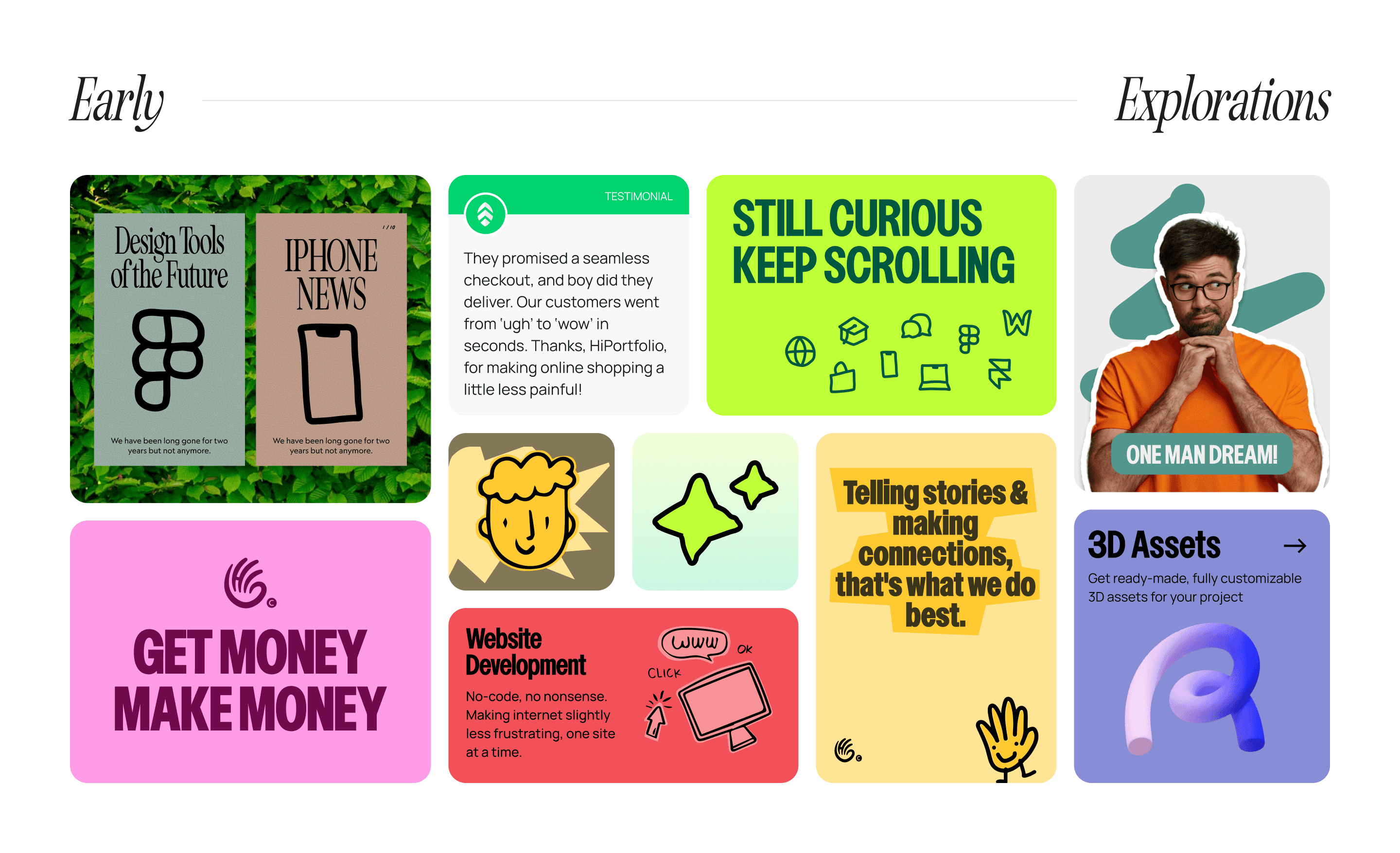
With the wheels in motion, I took the lead on defining the brand’s initial look and feel that will reflect our values and positioning. Early explorations leaned into what “unapologetic and brave” looked like in practice: louder colors, striking fonts, and layouts that were structured enough to feel intentional but chaotic enough to feel alive. The only problem? Inspiration is both fuel and sabotage. We collected so much reference material that, at times, it genuinely blurred our taste, like, wait… is that good in general or good for us, specifically?
Some of it worked, some of it was terrible, but all of it was damn sure necessary.
The Chaos
Basecamp, checklists, moodboards, and the end of vibes
Once the baseline was clear and we were happy with the structure and philosophy in place, we needed to actually, you know, do something with it. Which meant answering the least glamorous but most important question in any project: who's doing what, and when are they doing it by?
With the help of Basecamp, I built a launch checklist and broke it down into real deliverables—identity, website, case study system, socials, decks, internal docs, ops—the whole iceberg, not just the tip. The list, however, kept growing. Every time I thought of something, I added it. Every time someone else thought of something, I added that too. Pretty soon we had a document that looked less like a to-do list and more like a threat.
Alongside this, we set ourselves an ambitious challenge to launch on “New Year’s Day”. (Sadly, the list won and our launch was delayed by a couple of months).
With the wheels in motion, I took the lead on defining the brand’s initial look and feel that will reflect our values and positioning. Early explorations leaned into what “unapologetic and brave” looked like in practice: louder colors, striking fonts, and layouts that were structured enough to feel intentional but chaotic enough to feel alive. The only problem? Inspiration is both fuel and sabotage. We collected so much reference material that, at times, it genuinely blurred our taste, like, wait… is that good in general or good for us, specifically?
Some of it worked, some of it was terrible, but all of it was damn sure necessary.
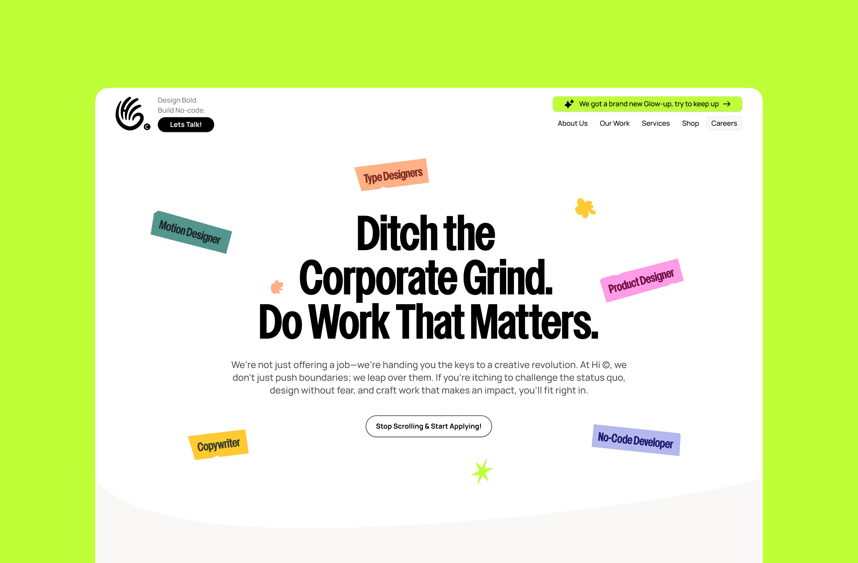
Headline
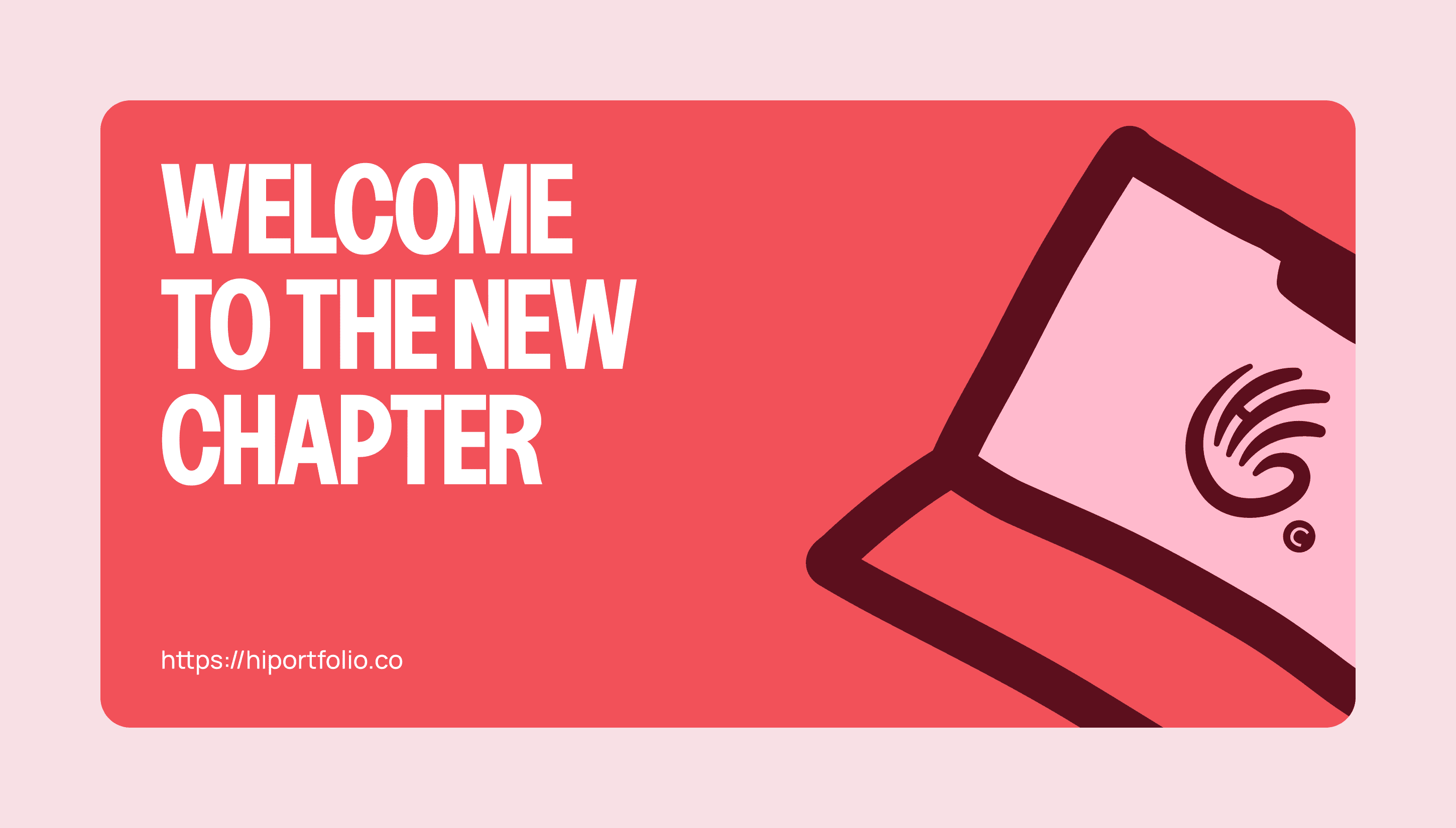
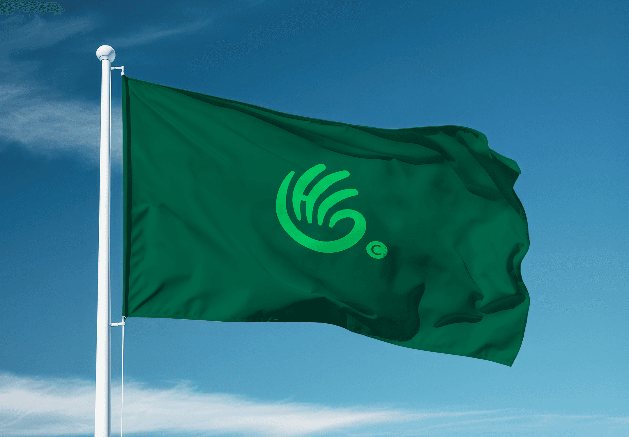
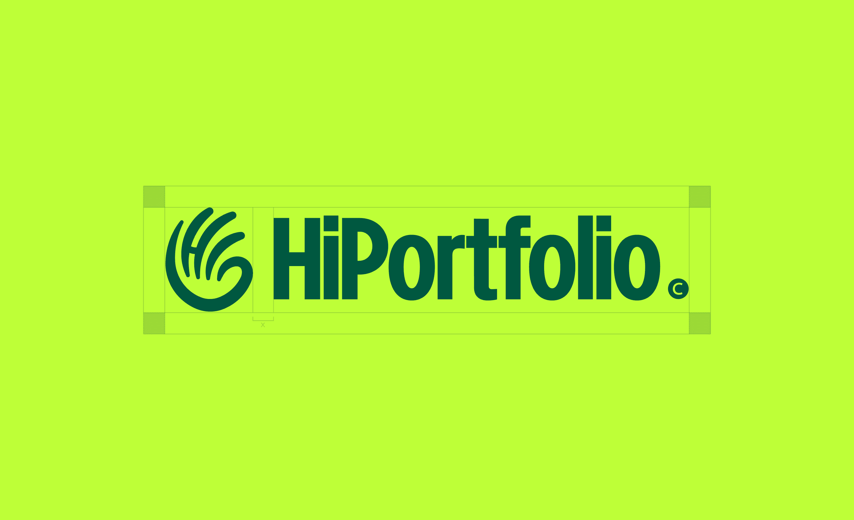
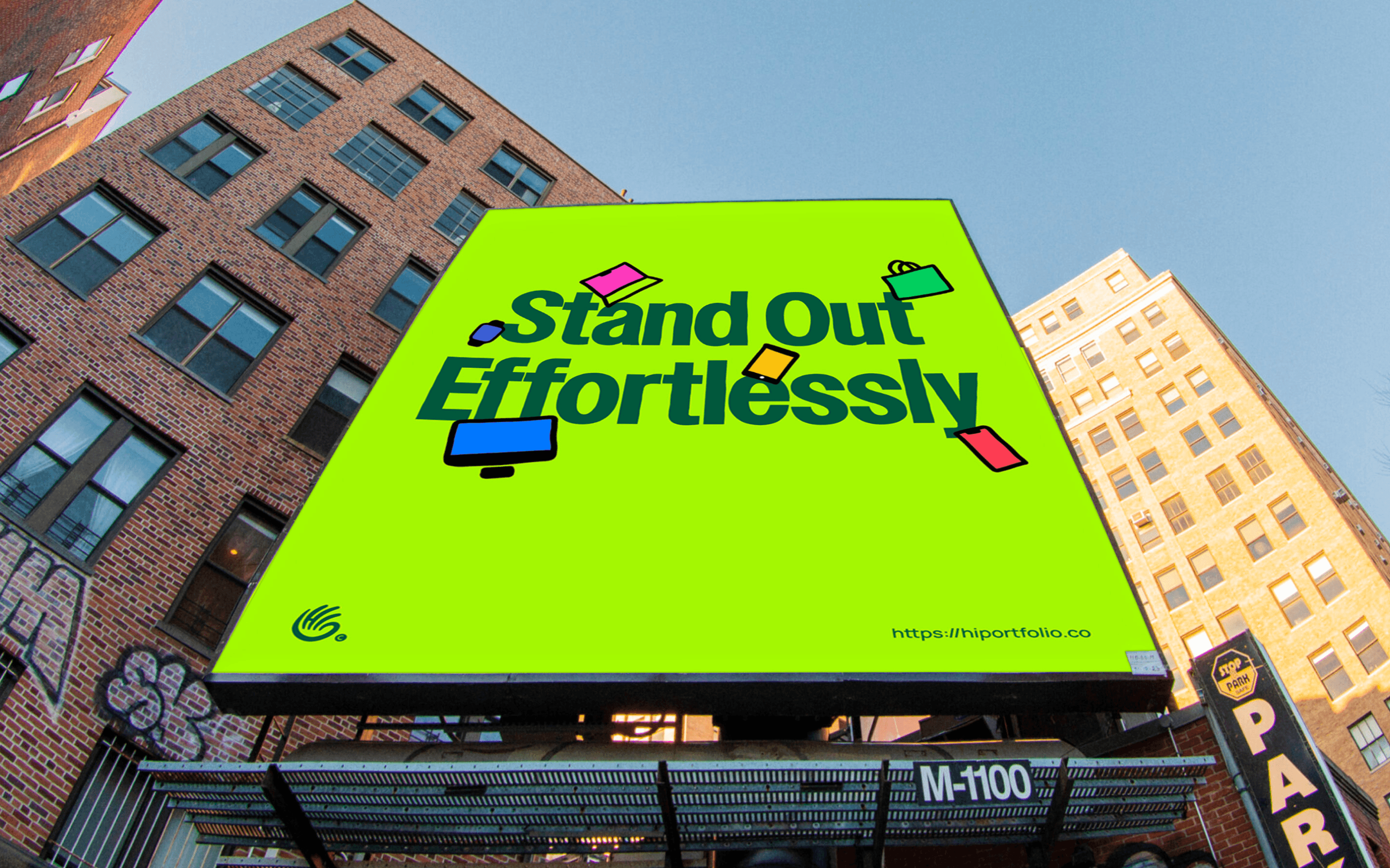
The early explorations gave us a direction. A vibe. A sense that we were circling something interesting. Almost every detail became a debate, for we cared too much to have a mishap. First step was locking down the new, sweet sweet logo for the brand. There were ton of options, for the style, usage and application in regards to everything digital and physical. Off course we had to nail that down and boy did we. The overall hand resemblance, the stroke arches and subtle swish in “Hi” were all deliberate decisions which allowed freedom throughout its application. Once that was done, rest of details followed.
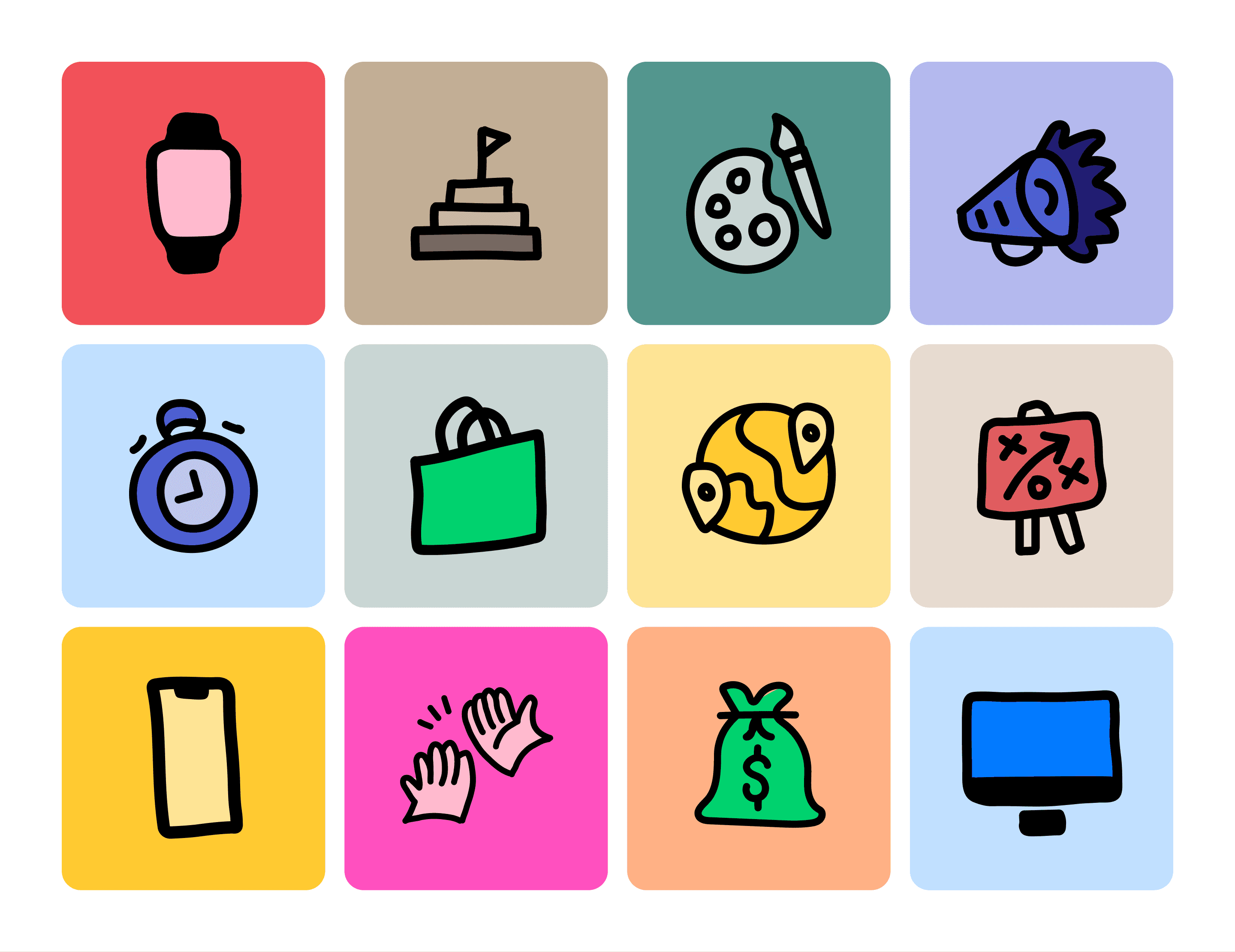
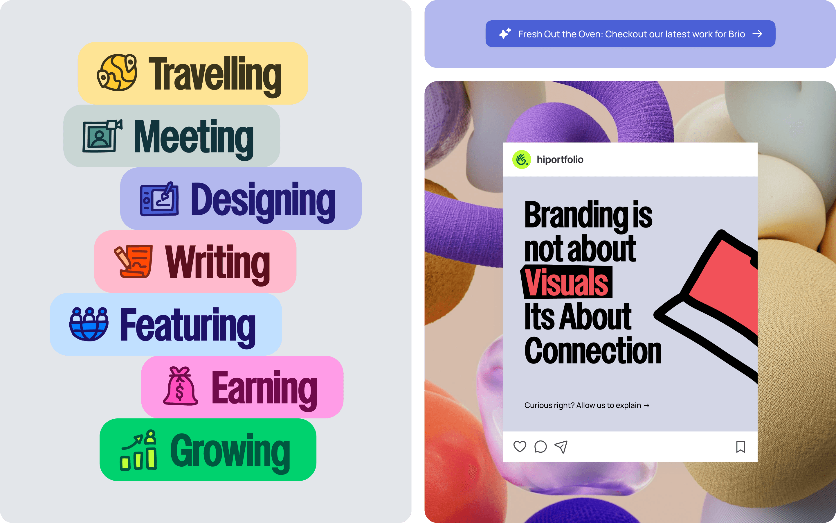
The hand-drawn illustrations that now feel so obviously 'us'? Those took weeks. The squiggles had to squiggle the right way. The wobbles needed personality, not sloppiness. There's a version of this brand where the illustrations look charmingly neat. We discarded that version as soon as we came to it and found the one where they felt just right.
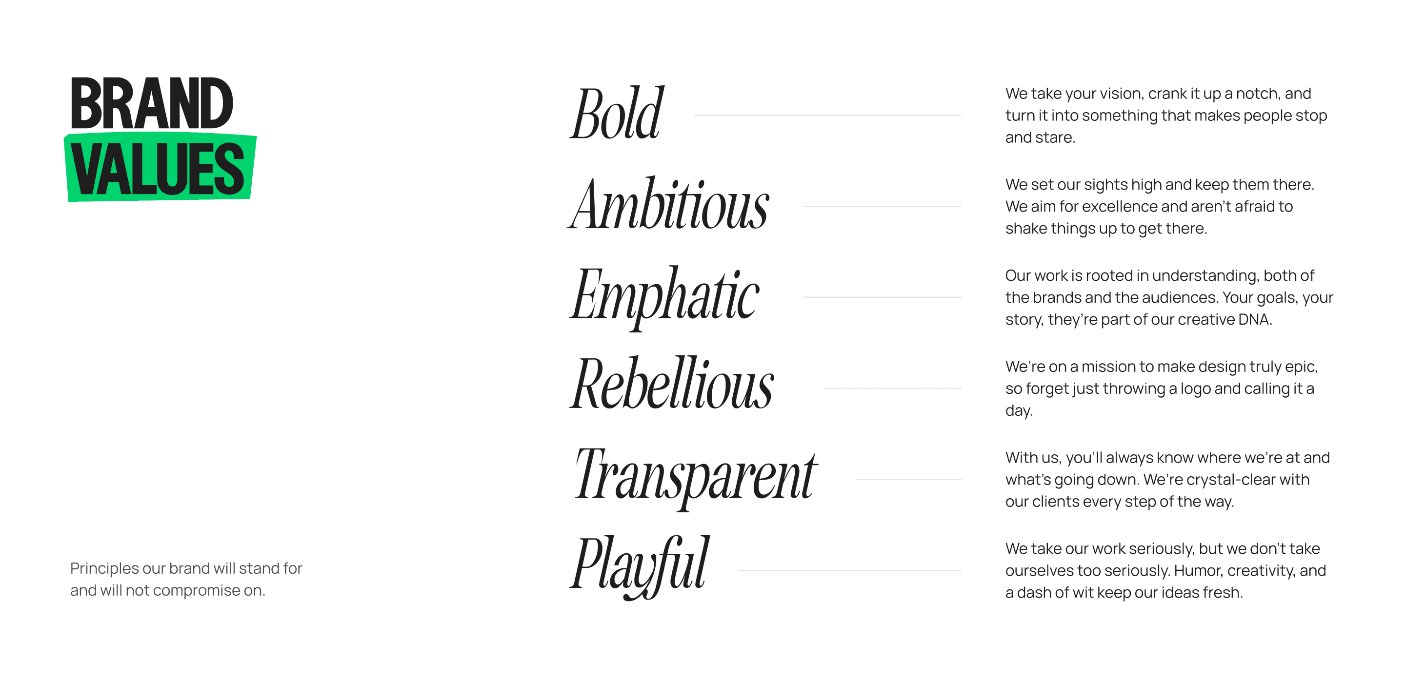
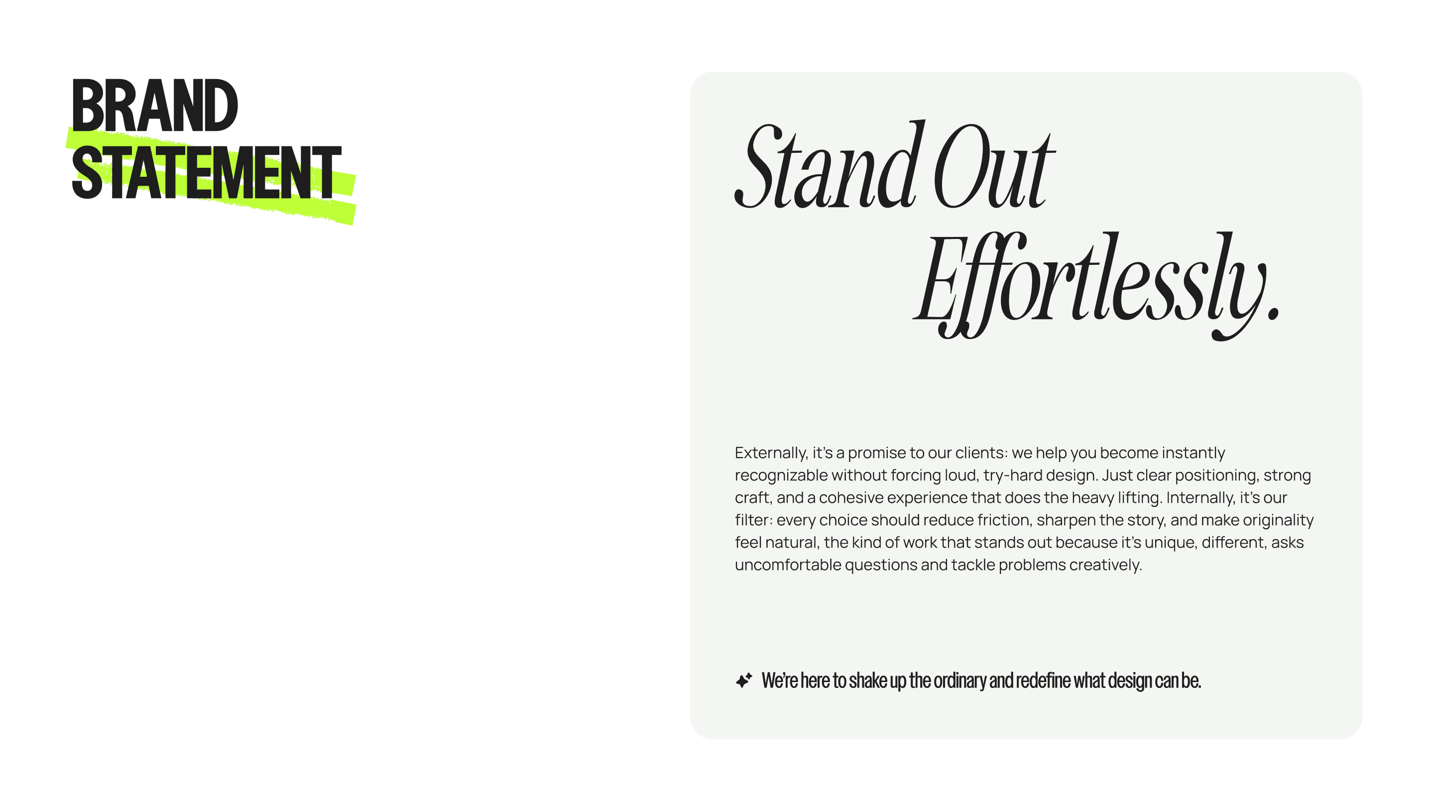
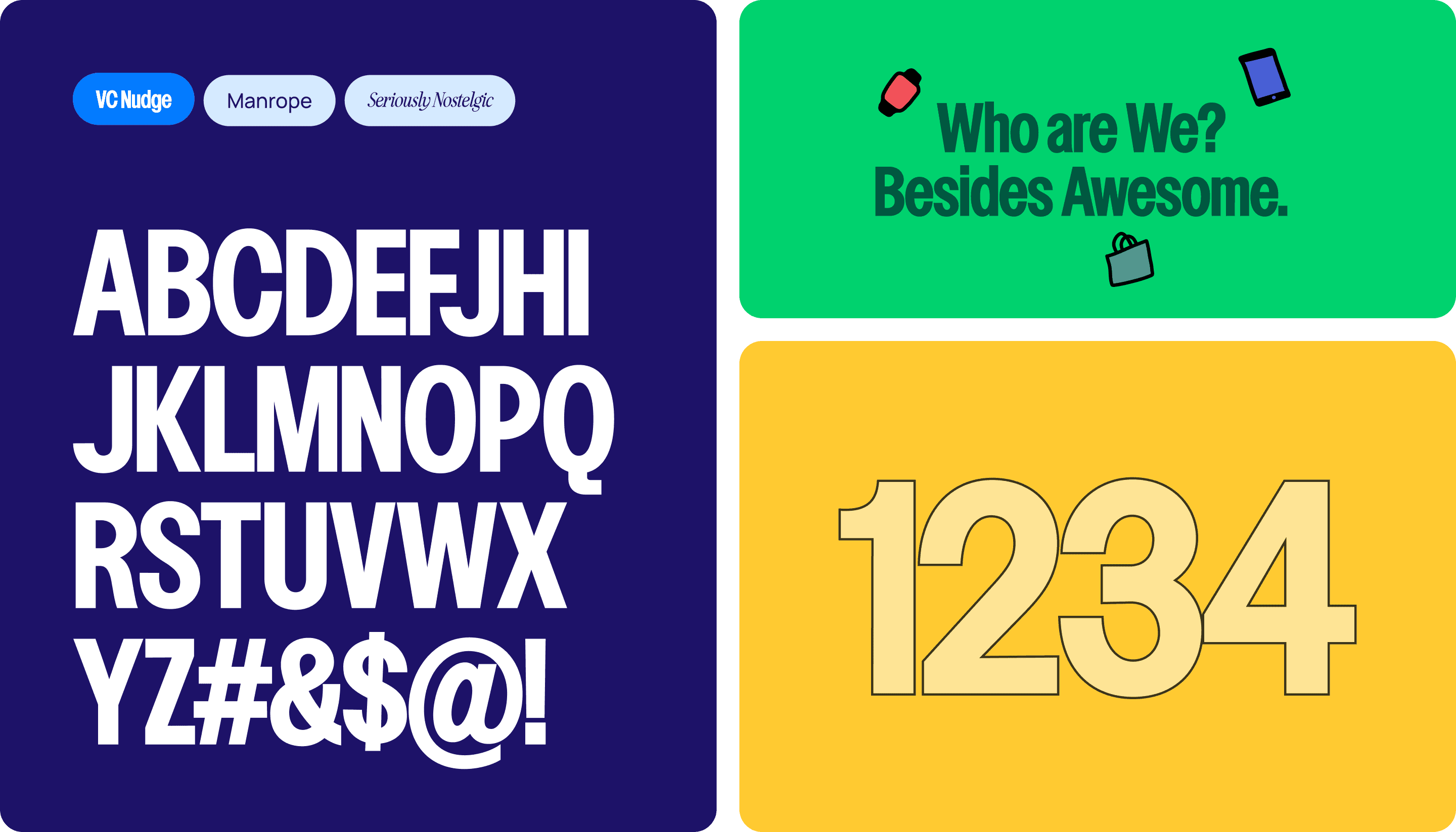
The same thing happened with everything else. We kept coming back to this idea of deliberate roughness and tension, where sharp lines meet expressive strokes, structure flirting with chaos. For the typography, we landed on VC Nudge for headlines because it has this jagged, almost aggressive energy that refuses to be ignored. But a brand that only shouts is just noise. So we paired it with Manrope—clean, quiet, ruthlessly legible. Together, they feel like us: bold enough to get in the room, grounded enough to actually say something once we're there. These two do the heavy lifting but we also added a clean cursive font called Seriously Nostalgic. Its there to inject some classy high-end feel if need, predominantly for the occasional social media use, if needed.
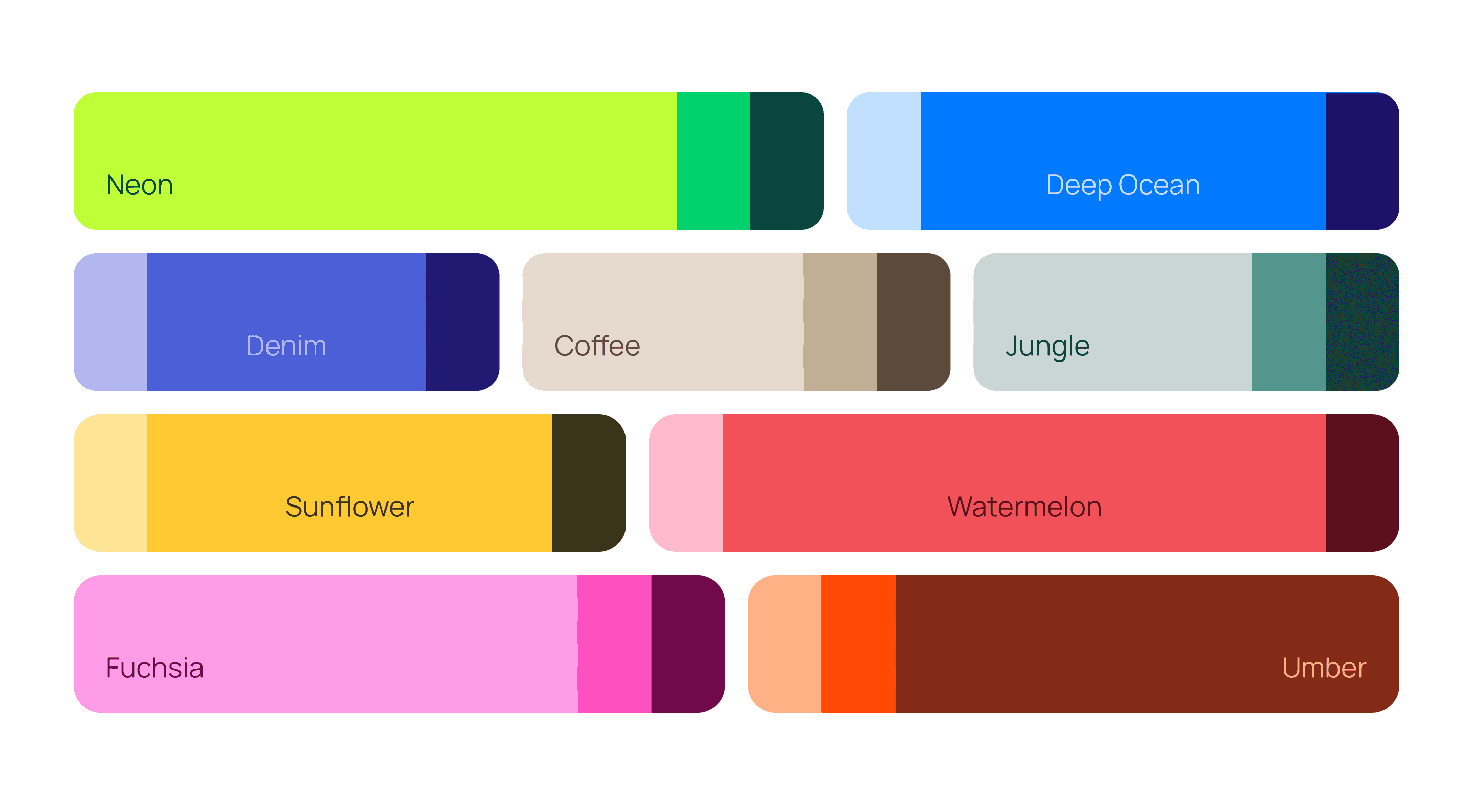
The color palette took even longer to settle. Nine colors. Which, objectively, is too many. Most brands pick three, maybe four, and call it a day. But I kept finding shades that felt essential. A magenta that vibrates to deep charcoal for when we need to shut up and be serious. Each one earning its place by doing something the others couldn't.
While building the illustrations, I always had a clear idea to how our shapes had to move and act a certain way. Quick, snappy and squiggle effects that mirror our brand’s high-energy and zing. A small flicker, a bold twitch, just enough to make you feel the pulse of what we do.
Behold, the brand new HiPortfolio…
Headline
The early explorations gave us a direction. A vibe. A sense that we were circling something interesting. Almost every detail became a debate, for we cared too much to have a mishap. First step was locking down the new, sweet sweet logo for the brand. There were ton of options, for the style, usage and application in regards to everything digital and physical. Off course we had to nail that down and boy did we. The overall hand resemblance, the stroke arches and subtle swish in “Hi” were all deliberate decisions which allowed freedom throughout its application. Once that was done, rest of details followed.
The hand-drawn illustrations that now feel so obviously 'us'? Those took weeks. The squiggles had to squiggle the right way. The wobbles needed personality, not sloppiness. There's a version of this brand where the illustrations look charmingly neat. We discarded that version as soon as we came to it and found the one where they felt just right.
The same thing happened with everything else. We kept coming back to this idea of deliberate roughness and tension, where sharp lines meet expressive strokes, structure flirting with chaos. For the typography, we landed on VC Nudge for headlines because it has this jagged, almost aggressive energy that refuses to be ignored. But a brand that only shouts is just noise. So we paired it with Manrope—clean, quiet, ruthlessly legible. Together, they feel like us: bold enough to get in the room, grounded enough to actually say something once we're there. These two do the heavy lifting but we also added a clean cursive font called Seriously Nostalgic. Its there to inject some classy high-end feel if need, predominantly for the occasional social media use, if needed.
The color palette took even longer to settle. Nine colors. Which, objectively, is too many. Most brands pick three, maybe four, and call it a day. But I kept finding shades that felt essential. A magenta that vibrates to deep charcoal for when we need to shut up and be serious. Each one earning its place by doing something the others couldn't.
While building the illustrations, I always had a clear idea to how our shapes had to move and act a certain way. Quick, snappy and squiggle effects that mirror our brand’s high-energy and zing. A small flicker, a bold twitch, just enough to make you feel the pulse of what we do.
Behold, the brand new HiPortfolio…
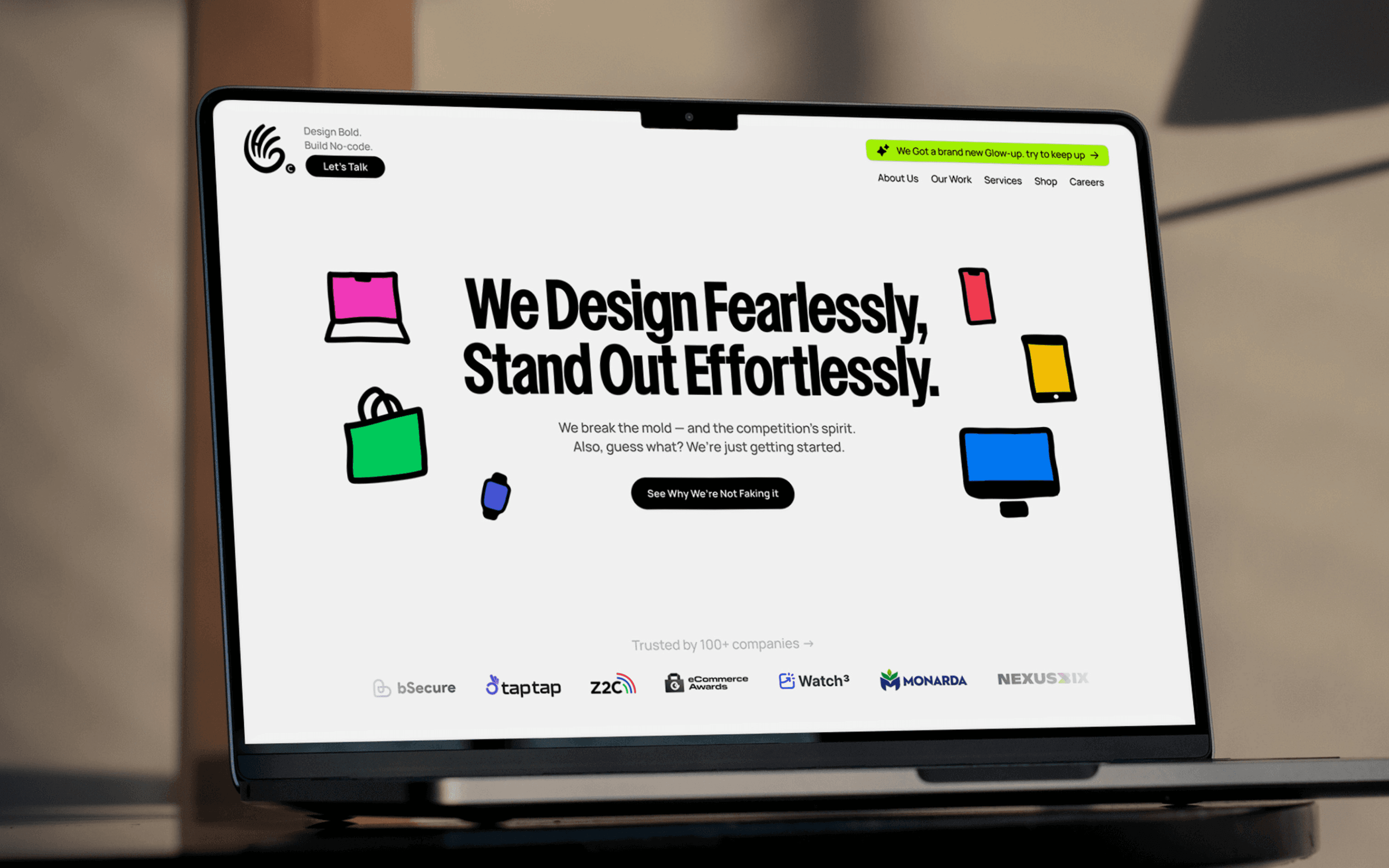
The Shipping
What’s a brand without a website?
Once we somewhat locked the identity, the next challenge was turning it into something real people could experience—website, case studies, and all the collateral that makes an agency feel legit beyond a logo file.
The copy took forever. Not because we couldn't write, but because we had to sound like us without trying too hard. Too edgy and we'd come off like a spoiled brat. Too soft and we'd blend into every other agency on the block. The balance was maddening.
The case studies were their own beast. We had to document work we'd already done, work we were proud of but present it in a way that made sense to someone who'd never heard of us. What's obvious to the person who built it is never obvious to the person seeing it for the first time. Getting it right took weeks longer than we'd planned.
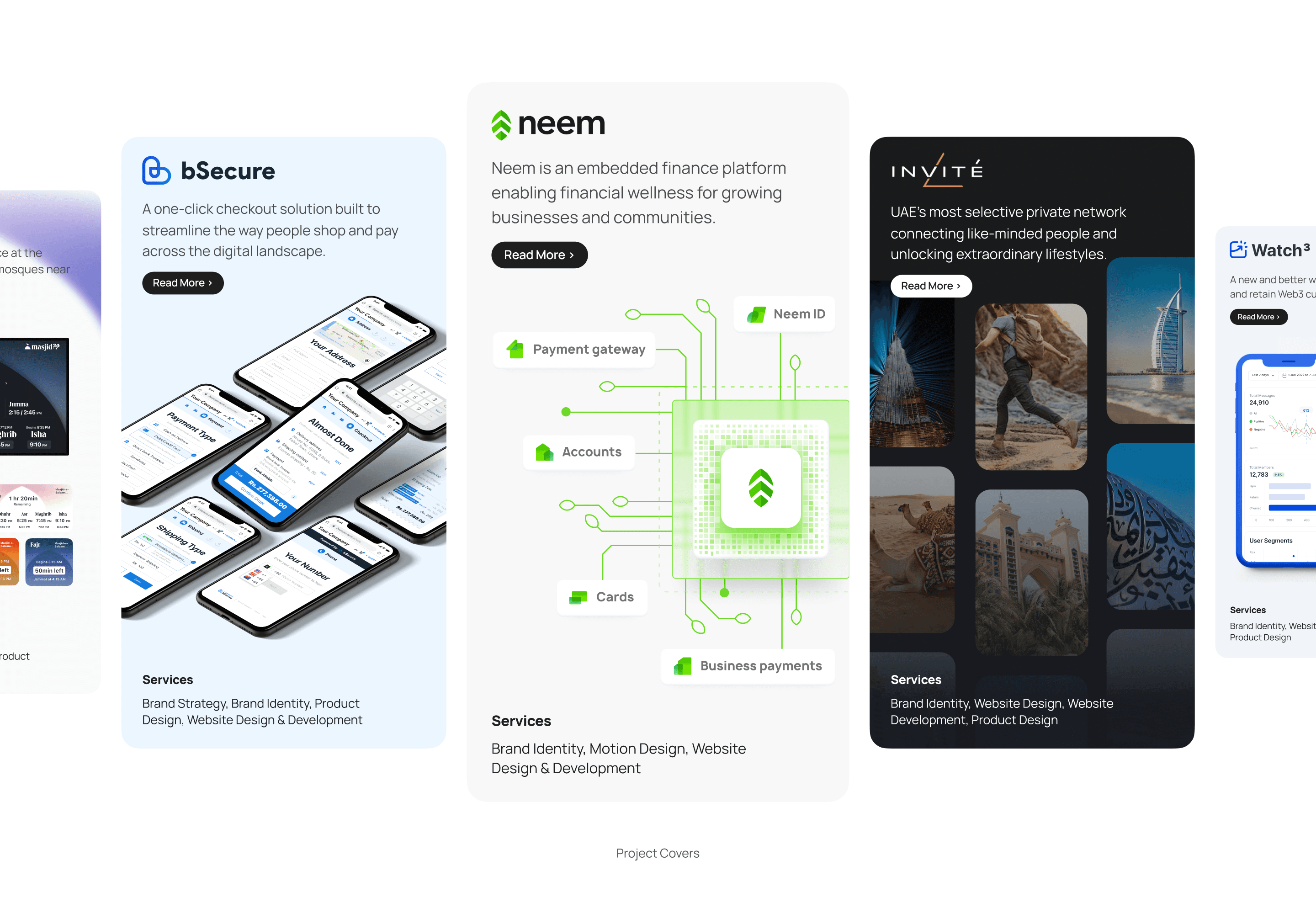
The project cards were certainly a self-induced challenge. I didn't want generic thumbnails pulled from the case studies as most agencies do. So, I went the extra mile and created unique, custom cards for each and every project while matching the vibe of the work inside. It took forever but they are absolutely gorgeous to look at so i guess well worth the effort.
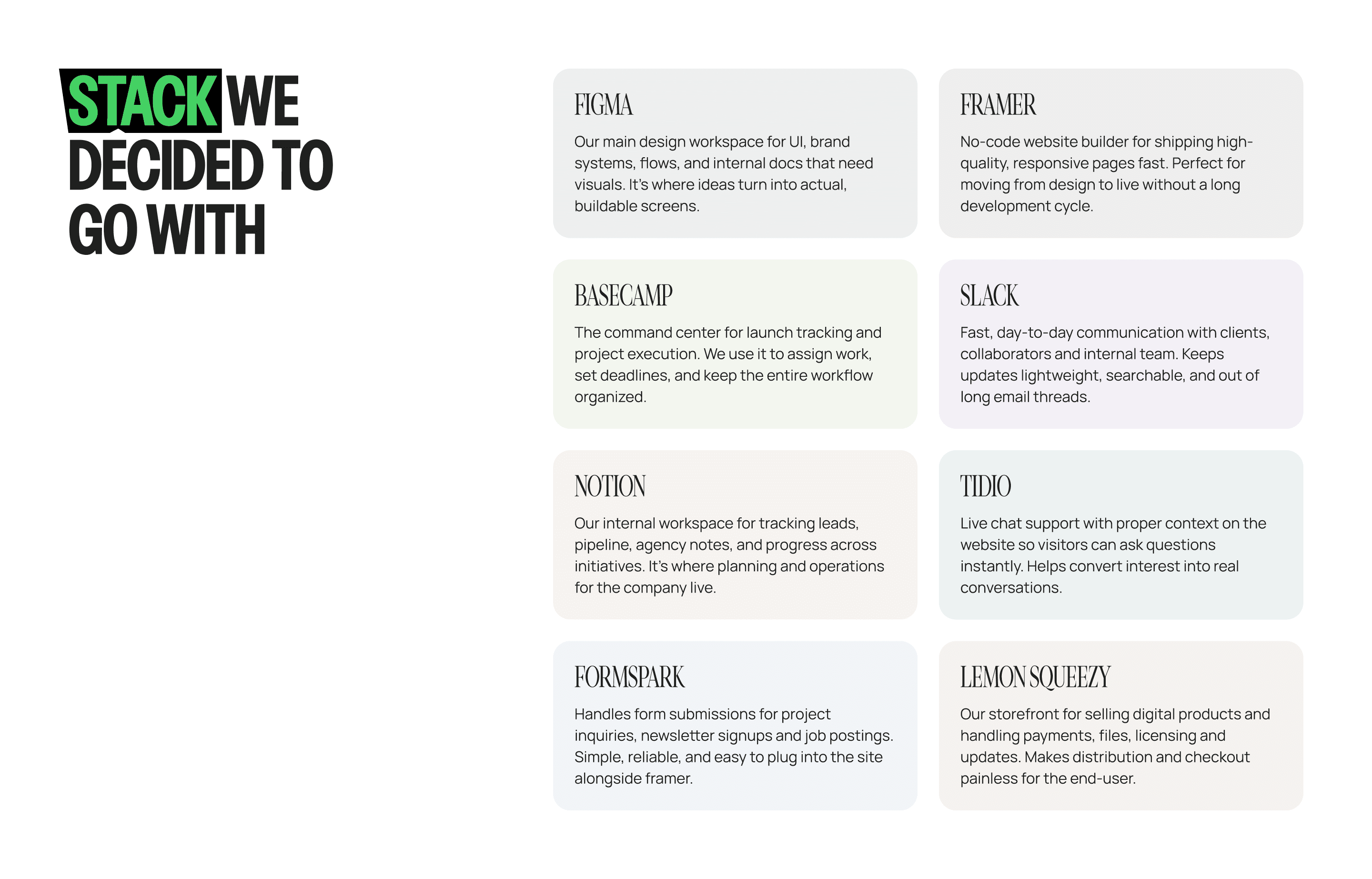
It was close to December when the design was finally done, so without much time left, I quickly started the development. We chose Framer for a few reasons: speed, familiarity, and the ability to quickly change things which was important when you’re still refining details right up until launch.
The Shipping
What’s a brand without a website?
Once we somewhat locked the identity, the next challenge was turning it into something real people could experience—website, case studies, and all the collateral that makes an agency feel legit beyond a logo file.
The copy took forever. Not because we couldn't write, but because we had to sound like us without trying too hard. Too edgy and we'd come off like a spoiled brat. Too soft and we'd blend into every other agency on the block. The balance was maddening.
The case studies were their own beast. We had to document work we'd already done, work we were proud of but present it in a way that made sense to someone who'd never heard of us. What's obvious to the person who built it is never obvious to the person seeing it for the first time. Getting it right took weeks longer than we'd planned.
The project cards were certainly a self-induced challenge. I didn't want generic thumbnails pulled from the case studies as most agencies do. So, I went the extra mile and created unique, custom cards for each and every project while matching the vibe of the work inside. It took forever but they are absolutely gorgeous to look at so i guess well worth the effort.
It was close to December when the design was finally done, so without much time left, I quickly started the development. We chose Framer for a few reasons: speed, familiarity, and the ability to quickly change things which was important when you’re still refining details right up until launch.
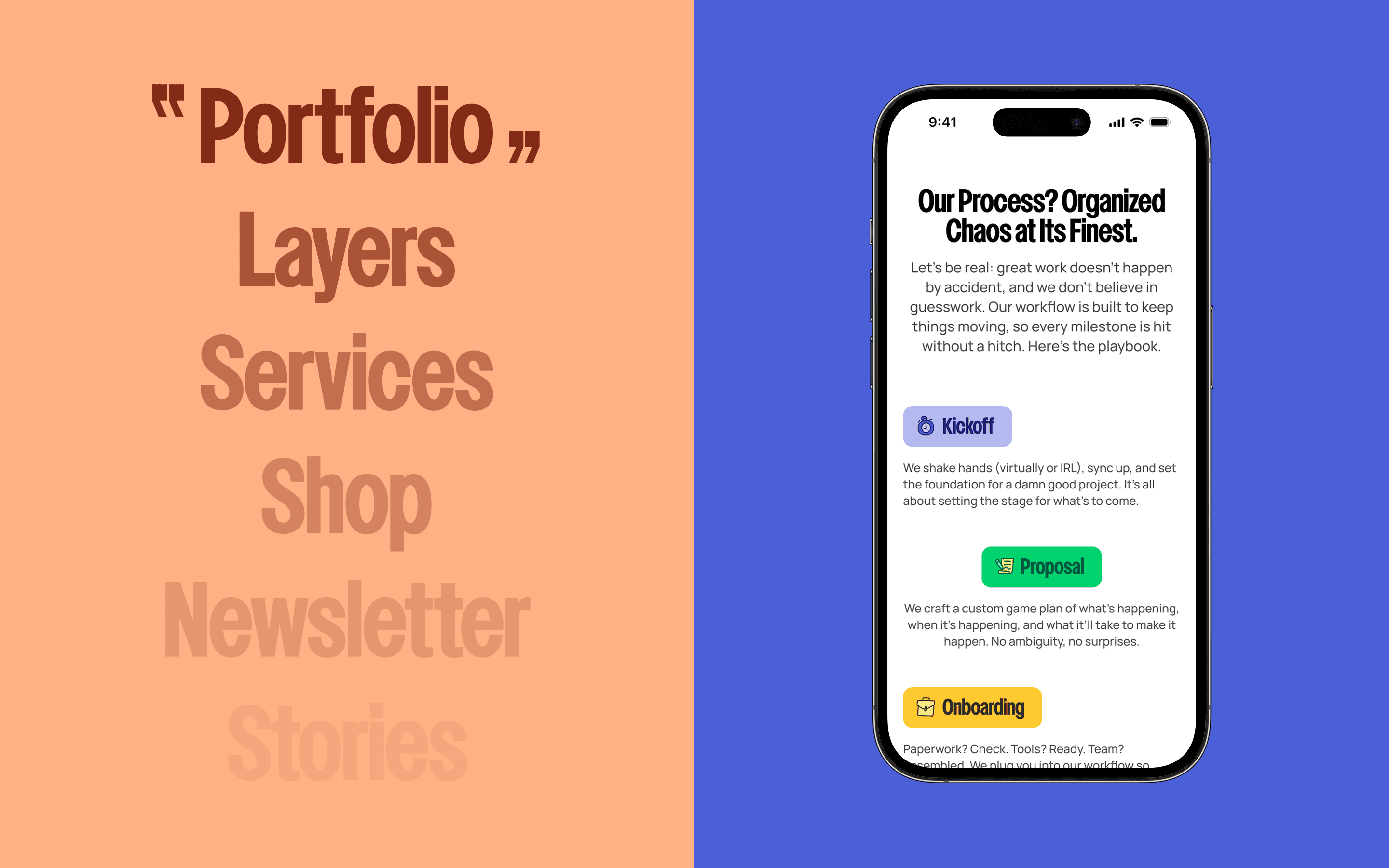
The Launch
And then, We Were Live!
The website was almost done when the new year arrived. The deadline passed, the scope kept expanding, and we made the only decision that didn’t compromise the work: delaying the launch by a couple of months so we could finish properly, test it, and get real feedback without rushing the parts people don’t notice until they break.
The extra time also gave us space to finish everything else. The collateral nobody sees but everyone eventually notices. Internal docs that would help us actually run the place, decks for pitching, digital products we'd been talking about for months—icon packs, templates, assets—finally took shape, and we set up a store to sell them along with publishing them for free on the Figma Community which turned out to be its own kind of marketing.
Furthermore, we locked down the processes which were a big help later on. Things like how referrals would work, social content delivery and speed, client onboarding from start to finish, every service module broken down into timelines that made sense to us and, more importantly, to the clients as well.
March rolled around and we were ready.
March 23rd, 2025. That was the day. We hit publish, held our breath, and waited to see if anyone noticed.
They noticed.
The launch post went crazy—140x our usual impressions in a single day. The site pulled 100+ unique visitors daily for the entire first month. Strangers, not just friends. People who found us somehow, from somewhere. We got featured on sites we'd been stalking for inspiration—A1, Landbook, places where agencies we admired had their work showcased. Our little experiment was suddenly not so little.
But traffic is just traffic. The site had to actually work. It had to do what we built it to do: bring in the right people, the ones who'd trust us with their own brands.
The rest of the year answered that question.
We did 4x the revenue in the three quarters after launch compared to the same period before. Our highest-earning year in three years of running this crazy thing. The site wasn't just pretty, it was working. All those months of wandering, all those debates over design choices, all the nights spent wondering if any of it mattered...
Turns out, it kinda did!
Reflections & Learnings
"Believe you can and you're halfway there" — Theodore Roosevelt
Oh gosh, where should i even start. This launch was definitely the hardest thing i have professionally done from every angle. Hard in ways I didn't expect. The design part? I knew that would be a challenge. I've spent enough years in this industry to know that creating something of this class and scale doesn't come easy. But the design turned out to be almost the easy part compared to everything else. Managing expectations—my own, my co-founder's, the team's, the clients on the side while we were trying to rebuild the entire business.
The biggest lesson for me was how much of great work is actually orchestration: setting standards, navigating messy situations, creating processes people can easily follow, and helping people beside me do their best work without unnecessary burdens. None of this would’ve shipped without the team effort and the people who stayed locked in when it got tough.
I’ve always dreamed of running an agency since stepping foot in the creative agency so this was sorta dream come true moment. If there’s one takeaway here, it’s that the taste gets you started, but structure is what gets you to the finish line. As exhausting as it was, building HiPortfolio proved something important that if we can set a standard, and build around it alongside right people, you can achieve special things. At the end, i just wanna shamelessly say....
🎶 I wanna thank me for believing in me
I wanna thank me for having no days off
I wanna thank me for, for never quitting 🎶

Hey, Internet Wanderer!
Glad to have you here!
Tap here to open the menu...
Bringing ideas to life at HiPortfolio
Tap here to open the menu...
Ideas over opinions, always!
Tap here to open the menu...
Back to Projects
Hey, Internet Wanderer!
Glad to have you here!
Tap here to open the menu...
Bringing ideas to life at HiPortfolio
Tap here to open the menu...
Ideas over opinions, always!
Tap here to open the menu...
Think . Design . Ship
Reachout
abdulrehmanriaz003@gmail.com
Think . Design . Ship
Reachout
abdulrehmanriaz003@gmail.com
Think . Design . Ship
Reachout
abdulrehmanriaz003@gmail.com
Think . Design . Ship
abdulrehmanriaz003@gmail.com