Status
Open to Work
bSecure
Establishing the checkout experience as the standard
How can we position bSecure as the market standard for online shopping and craft an experience that puts clarity and easiness at the forefront of an online checkout?
Brand Introduction
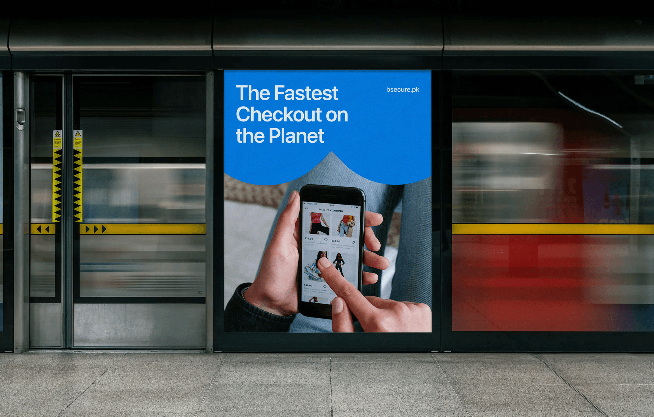
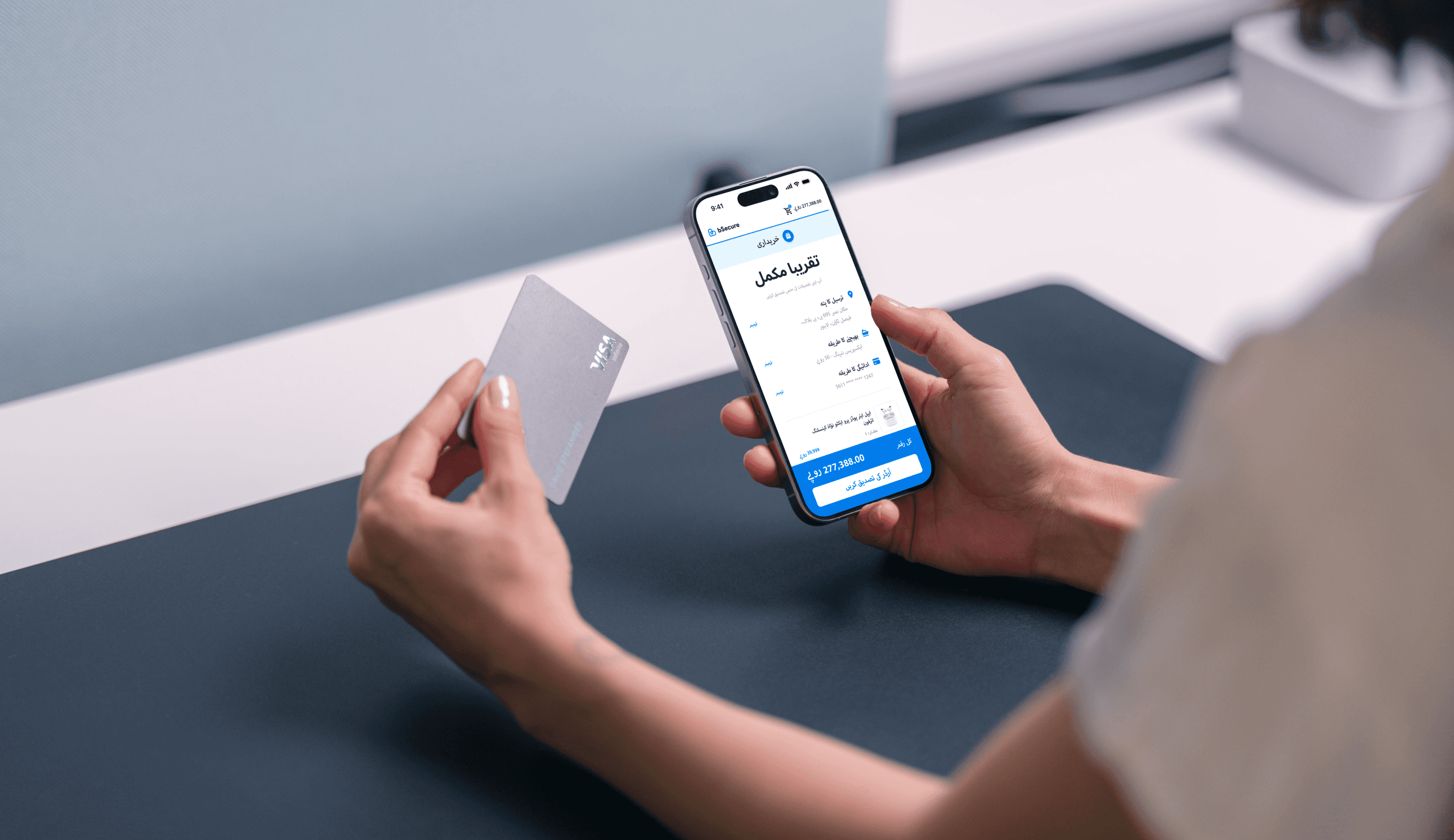
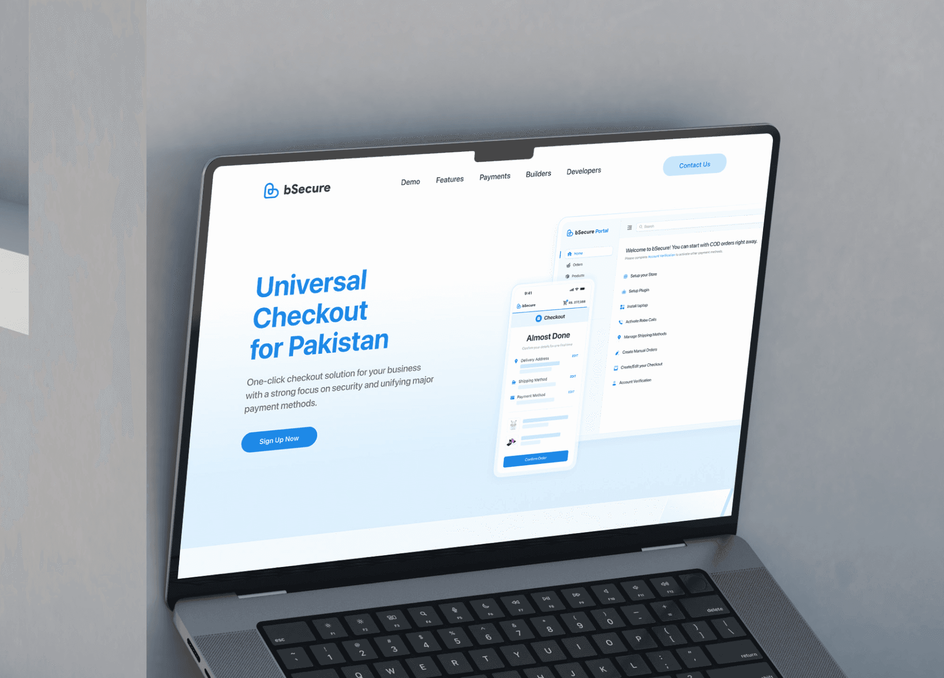
bSecure is a one-click checkout solution for selling products all across the globe instantly, bringing everything together that’s required to manage and streamline your product checkout for an instant buying experience. A security-centric approach with every transaction encrypted and never compromising on transparency of user needs and expectations.
Ask Ai for Overview
My Role
Product Design
Brand Identity
User Research
Highlights & Impact
8% increase in G2N conversion rate.
64% faster than existing checkout.
33% increase in processed orders after launch.
80% adoption rate among the merchants.


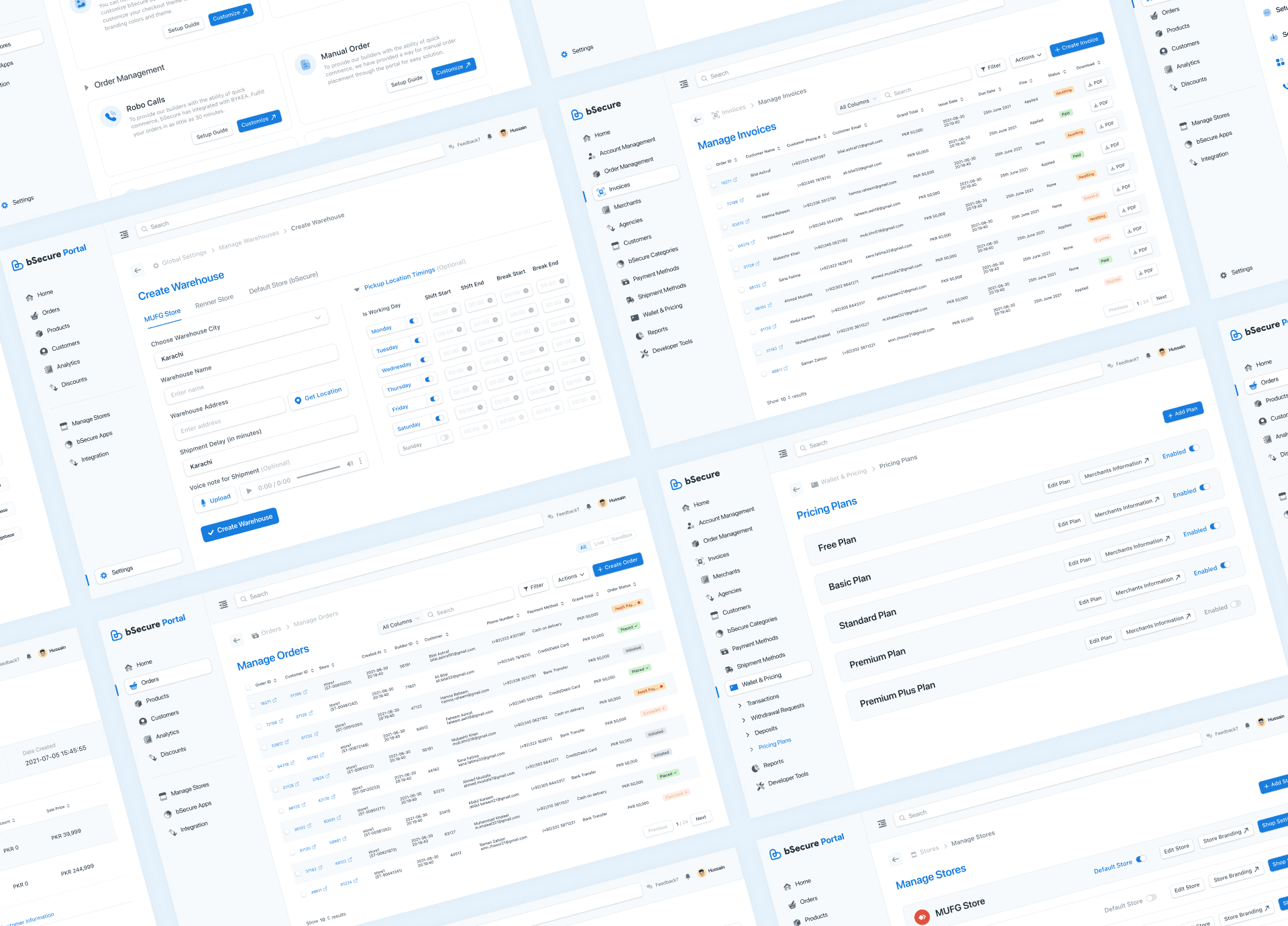
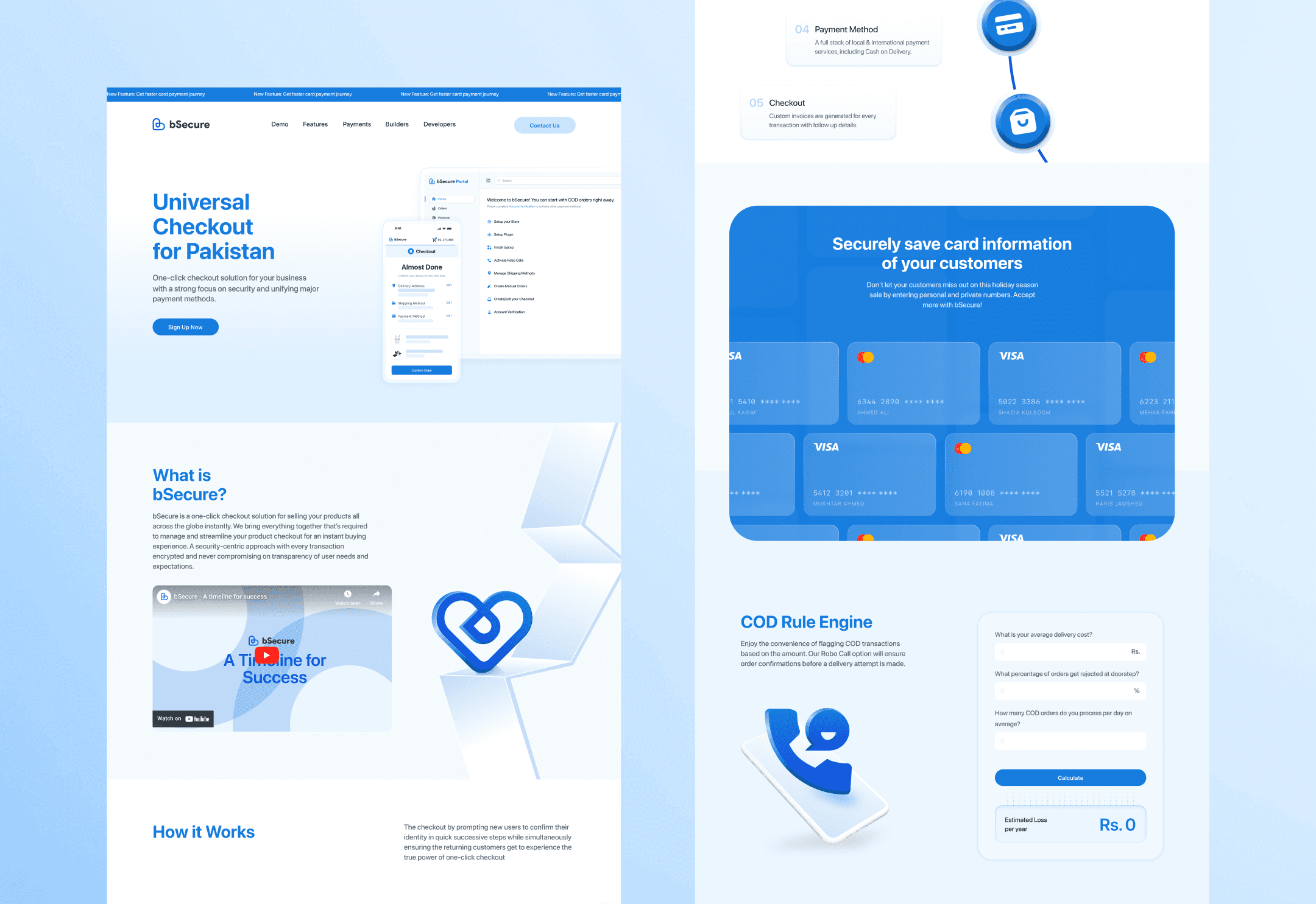
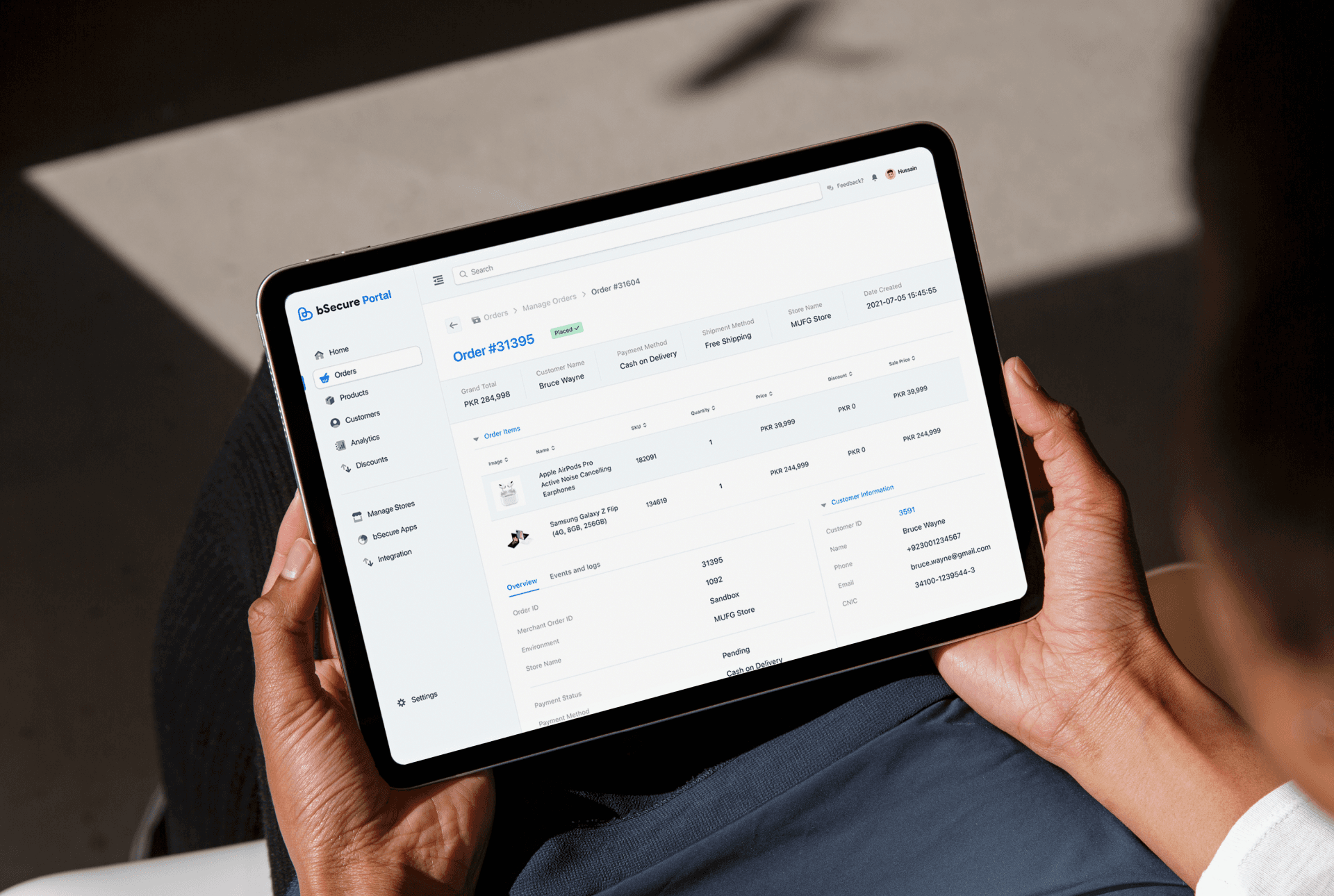
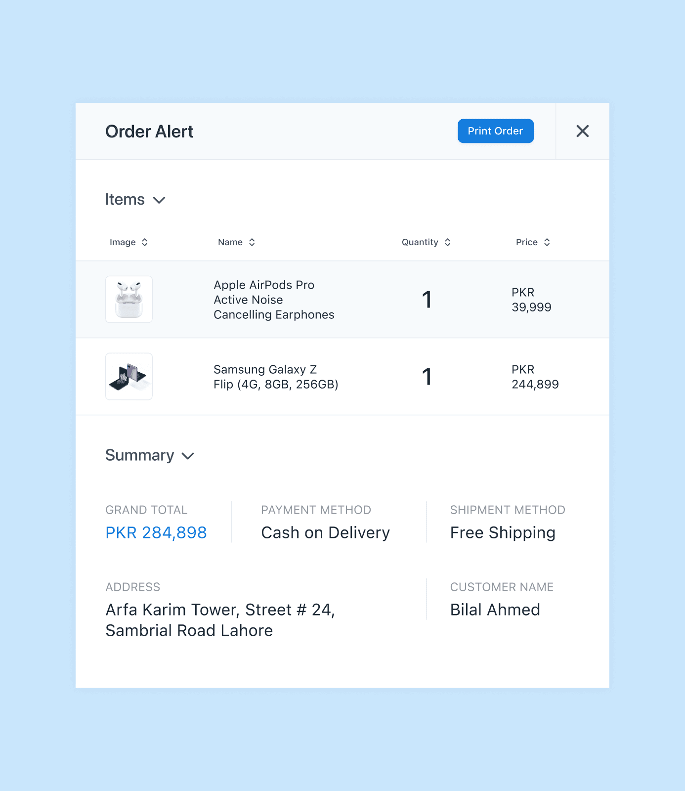
I joined bSecure as a fresh graduate, as the company’s second designer working primarily on the checkout experience side. On the design side, the core service was the checkout solution, and along with that was a dashboard for the merchants, an internal dashboard where we manage the entire system in regards to the merchants, customers, and everything related and also an online instant shop revolving around promoting our merchants.
Safe to say, the initial few weeks went very quickly with me focusing entirely on learning the nuances of the fintech and e-commerce world, external and internal regulations, dependencies and processes and most importantly the working of the entire system harmoniously. It was a steep learning curve to be able to digest this much information but ultimately it was priceless when i got more hands-on in shipping new stuff and gradually improving the already existing foundations.
Quickly sharing some snapshots of the general work i did in the upcoming one and a half year, before moving into the actual crux of the case study of how we established the checkout as a market standard by impressively increasing the checkout conversion rate by whopping 8%.
Team
1 Growth Manager
1 Data Analyst
1 Product Lead
1 Project Manager
1 Product Designer (Me)
Timeline
Jan 2022 - Mar, 2023
What We Observed
Acclaim of the best checkout seemingly falling a tad-bit short
During the bed in period, the more i became familiar with the journey and its nuances, more it became clear that there was a lot of room for improvement in regards to the overall experience. While new features and demands were going live periodically, it was clear and already under discussion that our checkout journey is probably in need for an overhaul as some key issues repeatedly kept popping up that needed some further attention.
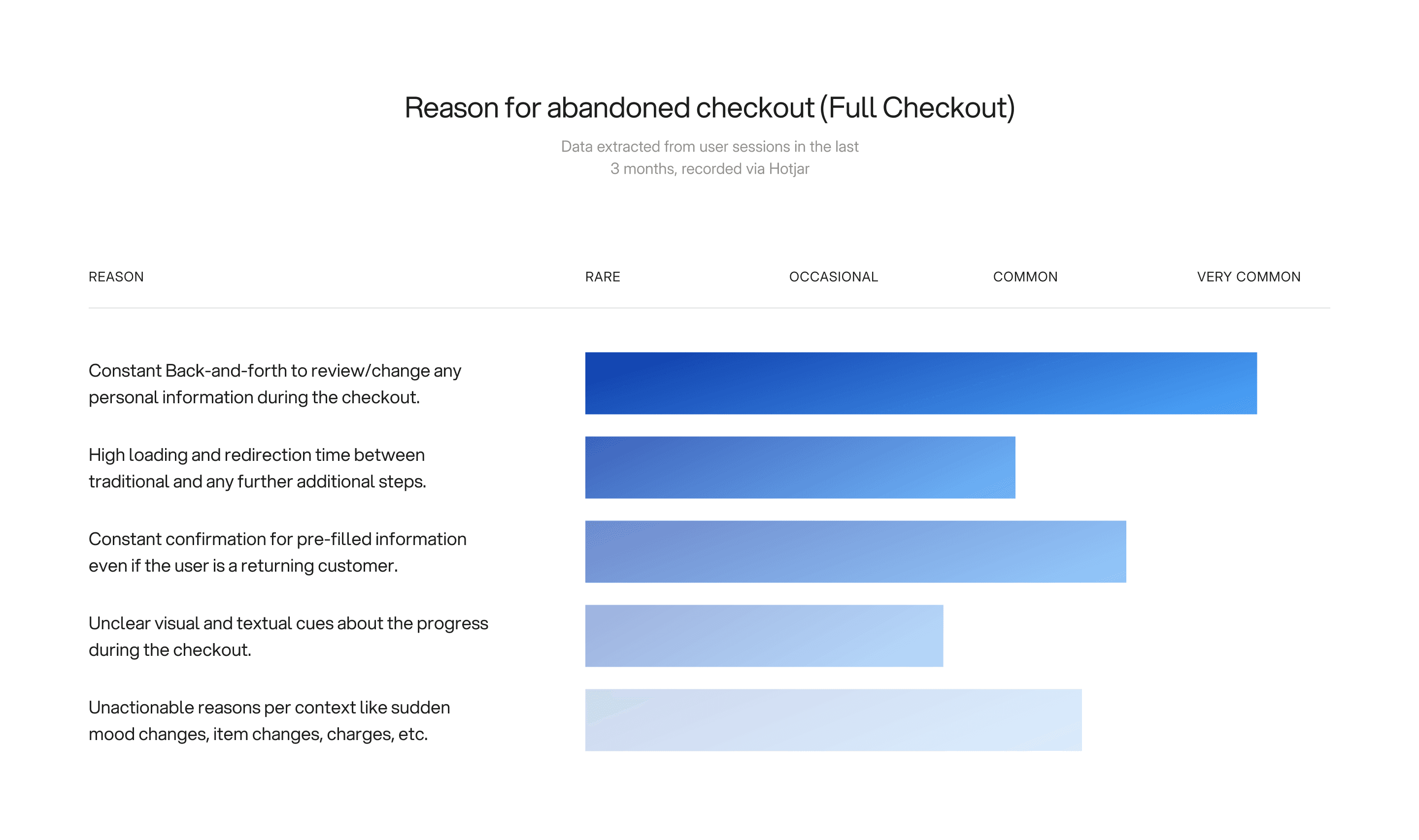
Checkout is where bSecure wins or loses trust. Even small unnecessary friction (extra screens, slow redirections, unexpected fields) can negatively impact the conversion, especially in the local market where cash on delivery and delivery reliability heavily influence the purchase behavior. On paper, the journey looked “complete” and logically structured, Start → Login → OTP → Address → Shipping → Payment Method → Review → Place Order. But in practice, it felt heavy. There were too many moments where users had to stop, re-orient, confirm prefilled information again, or bounce back and forth just to review and change details. Add the loading and redirection time between steps, and the entire experience started to feel like friction stacking on friction. We weren’t just asking for information, we were taxing users with time, uncertainty, and repetition.
At that point, it was clear that we needed to slow down and properly identify what was actually driving abandonment and what parts of the journey were silently doing the most damage. So we shifted into analysis mode: pulling funnel and timing data, reviewing real recorded sessions via Hubspot, and mapping where users hesitated, looped back, or dropped off. The ultimate goal was to pin down the underlying causes of abandonment, and build a baseline we could measure every future improvement against.
Headline
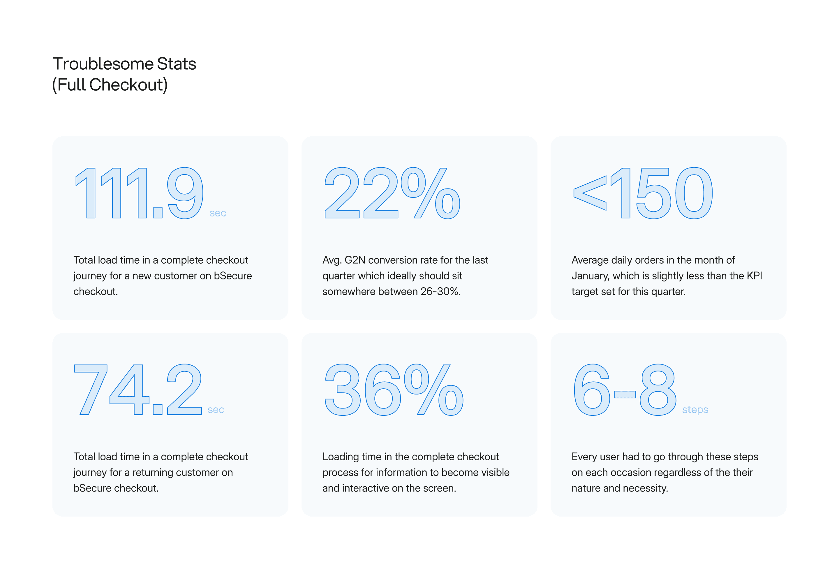
The abandonment themes and high-level metrics gave us a clear signal, but not as much a broader explanation as needed since there could be hidden factors we might be completely oblivious to. Checkout performance isn’t just “conversion rate went down”; it’s where time is leaking, when users lose confidence, and how the experience behaves when conditions aren’t ideal internally and externally. So we went deeper and treated checkout like an full fledged system: we broke the journey into success vs failure paths, measured completion time distribution (not just averages), audited every control state (loading, error, retry, back navigation), and stress-tested the flow across devices, browsers, network quality, and real-world contexts.
From there, we started quantifying the nitty-gritty: number of redirects per session, average time cost per redirect, latency between steps, and where the UI lacked any proper communication (especially on slower networks or lower-end devices). We also segmented performance by geography (cities/countries), because network reliability and payment behavior aren’t uniform. The goal was to isolate what was “user decision” versus what was “system friction,” and build a baseline that made the problem undeniable and most importantly measurable.
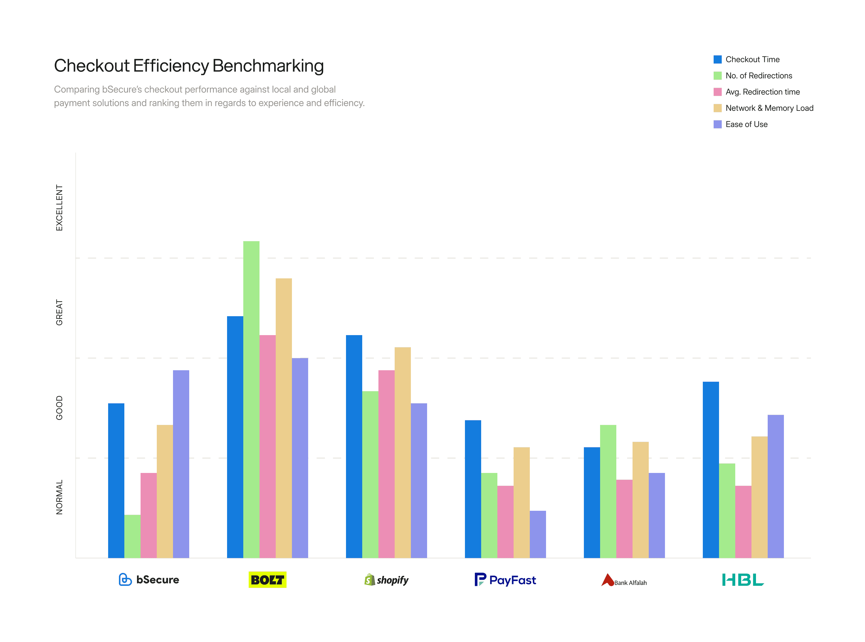
Once we had that internal diagnostic document, I benchmarked it against both direct and adjacent competitors, local and international, with platforms including Bolt, PayFast, Shopify’s payment gateway, bank gateways like Alfalah and HBL, and wallets like NayaPay and SadaPay. Not to copy the flows and designs, but to compare behavioral and performance expectations like how much they ask upfront, how they handle retries, number of redirections, and how quickly users can recover from a mistake. All this really sharpened the gap and clarified the opportunity we had in front of us and with the problem fully mapped, we were ready to decide what to fix first, what to simplify, and what changes would create the biggest step-change in completion and confidence.
Where We Landed
Fewer steps, Faster feedback, Smarter defaults
By the time we wrapped research and benchmarking, the direction became hard to ignore: the biggest drop-offs weren’t caused by a single “bad screen”, they came from compounding friction. Too many steps, too many redirects, too many moments where users had to stop and re-confirm what they’d already provided. Plus when you combine that with real-world conditions (slower networks, inconsistent latency and outside integrations), the experience just became too long.
Two opportunity areas stood out immediately:
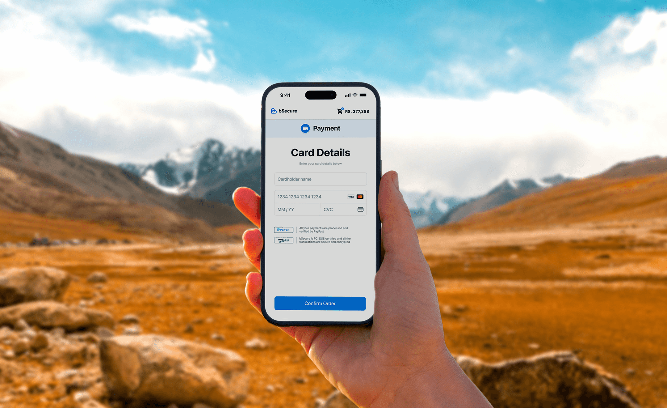
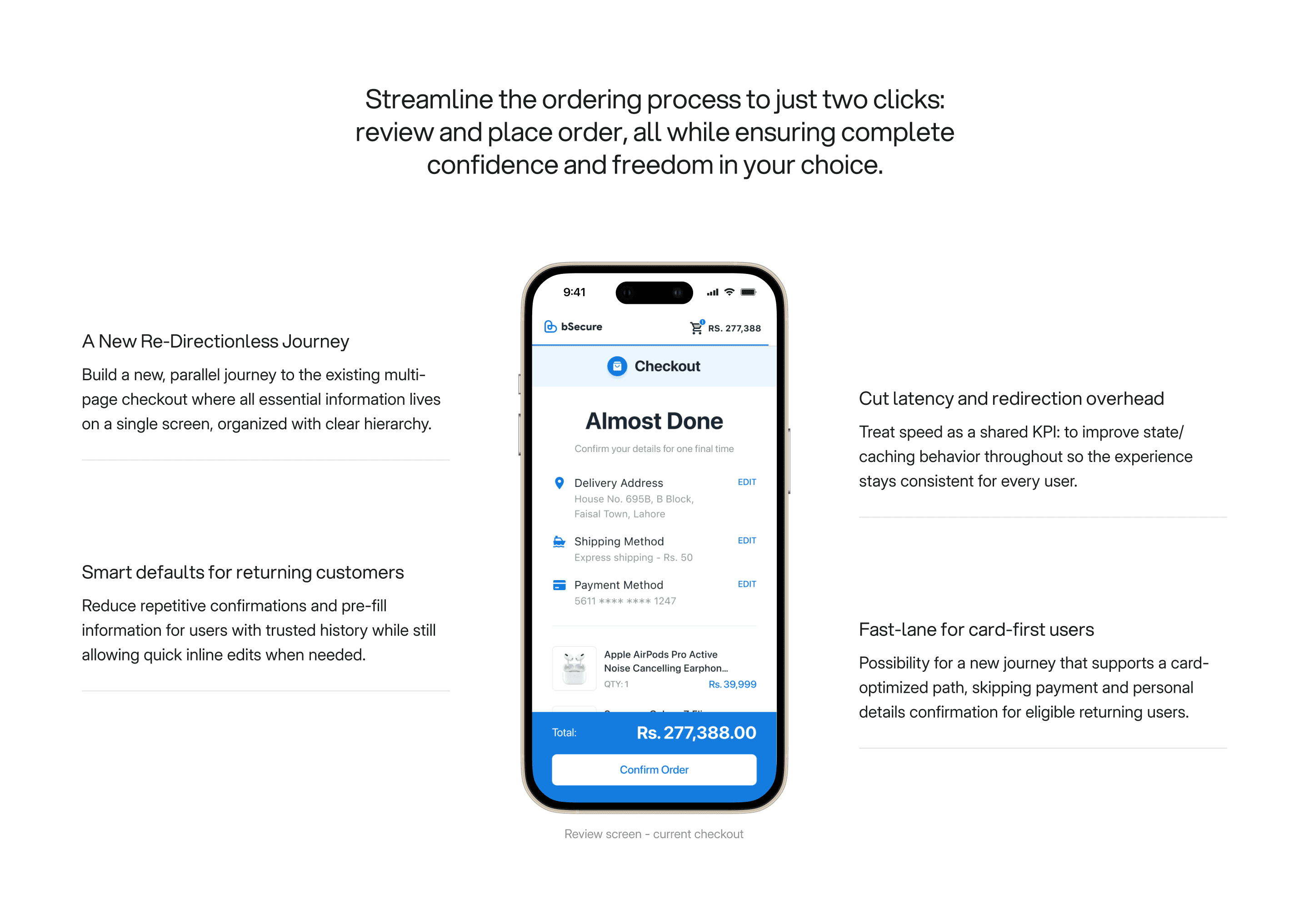
First, we needed a faster, simpler success path for users who already had history with us. One stat in particular shaped our thinking: 64% of pre-payment orders were being placed via debit/credit card. That opened up an interesting possibility beyond “revamp the flow”: for the right returning customers, checkout could evolve into a more direct, intent-based journey, without having to confirm or choose a payment method manually.
Second, we learned that a meaningful portion of the friction was system latency and step transition overhead, which meant this couldn’t be solved in design or research alone. We pulled engineering in early to audit redirects and data refresh behavior, and started aligning on improvements that would later reduce latency through better caching and state handling. In parallel, we also identified smaller but high-impact rules to simplify the experience for trusted returning users, like completely skipping the confirmation steps when someone had completed a successful pre-payment purchase recently (within the last 30 days).
Here is where we landed after 5 weeks of constant research and testing,
Headline
Moving to a new journey was a foundational shift in how the product behaved. We were essentially introducing a new checkout philosophy alongside the existing one, and that meant every small decision had outsized impact. On the design side, adoption had to feel natural, the experience needed to be instantly understandable, noticeably faster, and still familiar enough that users didn’t pause and get confused. At the same time, we had to keep the expectations and goals aligned, reducing friction without compromising trust and clarity at every part of the journey.
On the engineering side, the challenge was just as real. Running two journeys in parallel meant the system had to support two different interaction models at the same time. Previously, the flow collected and sent information step-by-step after each confirmation. In a one-page model, information needed to be captured, validated, and transmitted in a more consolidated way, with key checks happening in real time without relying on page transitions to trigger authentication or validation. That required new thinking around how data moved through the system, and how we ensured accuracy while users were still actively editing. I’ll unpack that mechanism later in the case study.
In terms of scope, this wasn’t limited to new screens. It included restructuring the logic, redefining hierarchy, aligning states, working through edge cases across devices and platforms, and coordinating rollout strategy for merchants, all within a two-month window. With the direction clear and the constraints real, I needed a decision framework before jumping into pixels.
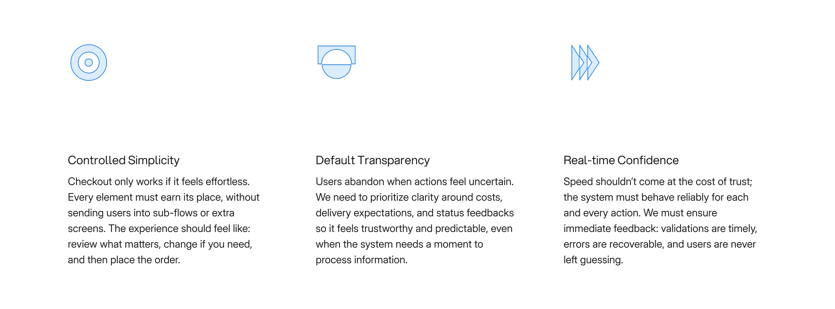
So before designing anything, I defined a small set of design principles to guide every tradeoff, keeping my decisions consistent across the entire experience. These were...
Designing the Solution
From principles to pixels: how I structured the work
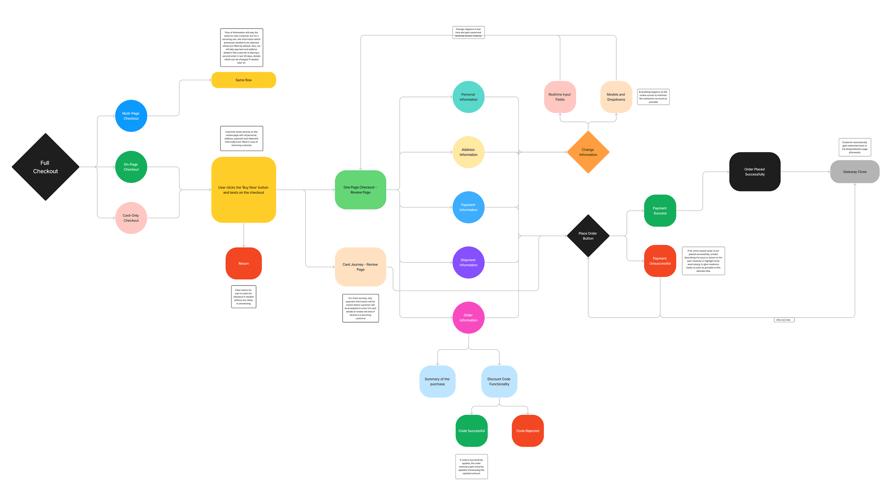
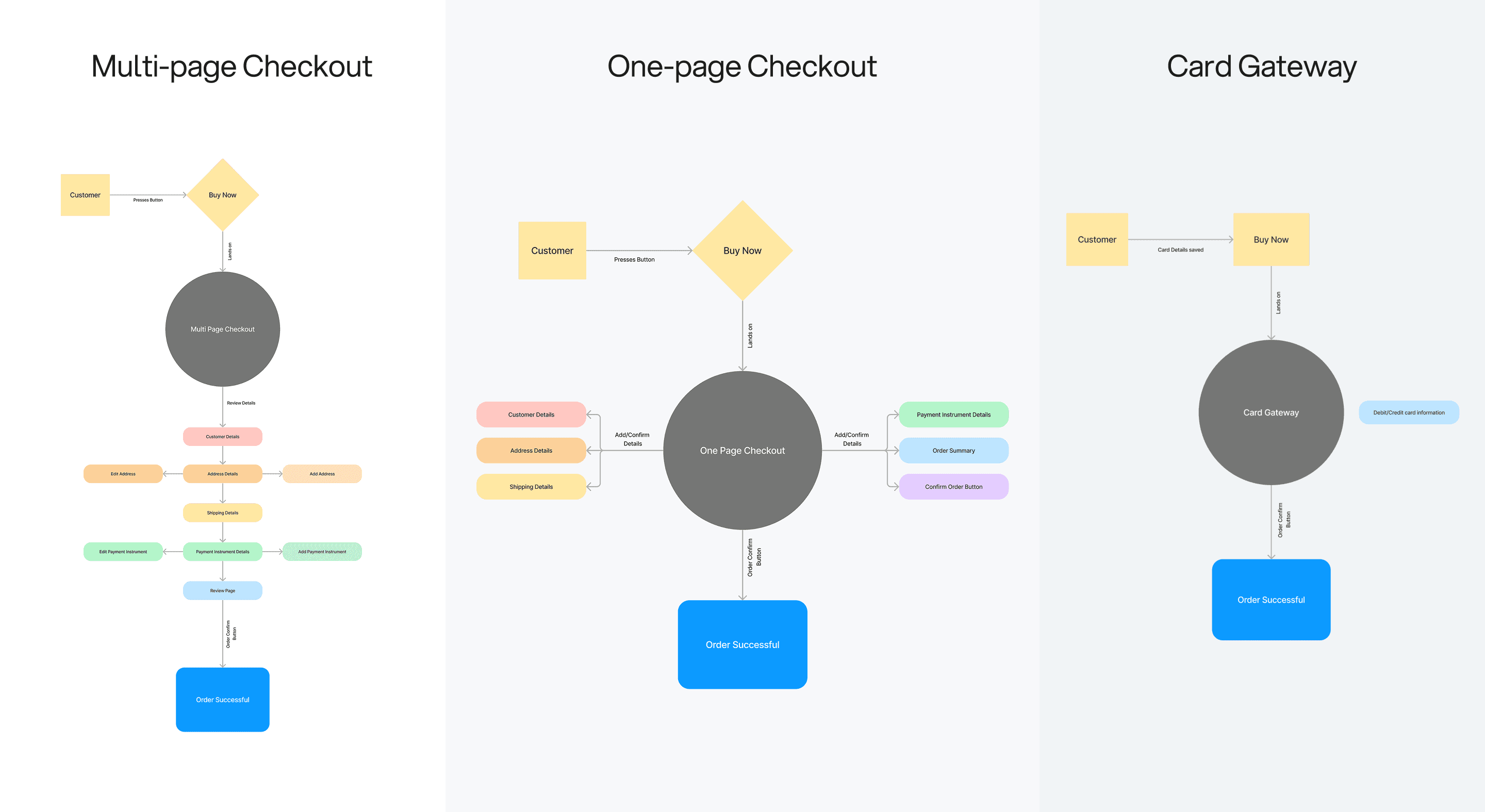
Once the principles were locked in and everyone was aligned, I shifted into execution mode, starting from the inside out. I first created a business requirement diagram to map the entire system: what information was needed, where it’s going to come from, what dependencies existed (internal and external), and what had to remain consistent across both journeys. I’ll share a trimmed version of that diagram here, the full doc isn’t included due to business constraints, but the structure is almost the same.
With the system mapped, I moved into defining the flow design for each new path we were building in parallel, the one-page checkout and the card journey. The goal was to make every path feel intentional, not like a variation of the old flow. These diagrams weren’t just for design clarity; they became the backbone for alignment with engineering. I used them to walk the team through every state and edge case so they could design and adjust APIs around how the new experience would actually behave.
A big part of that alignment was defining how interaction with information would work on a single page. On a multi-step flow, saving and validation happens naturally after each screen. On a one-page flow, it had to be deliberate. The model we aligned on was simple: while a user is actively editing a field, the UI stays in an “in-progress” state — and only when the field becomes inactive (i.e., the user finishes editing) do we commit changes, trigger validation, and refresh the review page with the latest confirmed information. This allowed the experience to stay fast and stable without bombarding the backend with unnecessary calls mid-typing for extra confirmations.
To keep expectations clear, we deliberately avoided adding secondary actions or navigation buttons on the page. The interface needed to communicate one obvious end state: review everything here, then Place Order. Fewer buttons meant fewer mental branches, and less chance users assumed a redirect or “next step” was required.
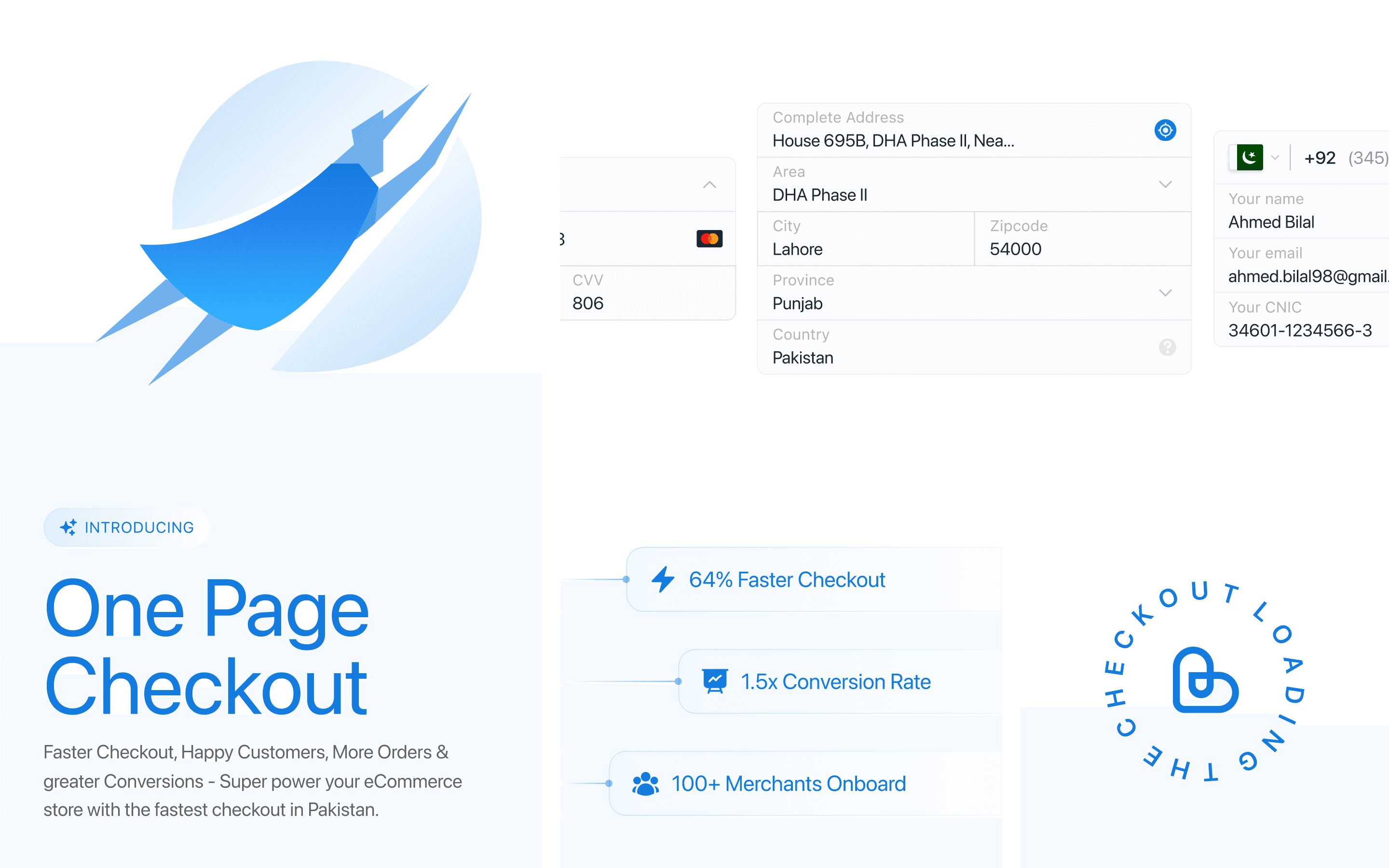
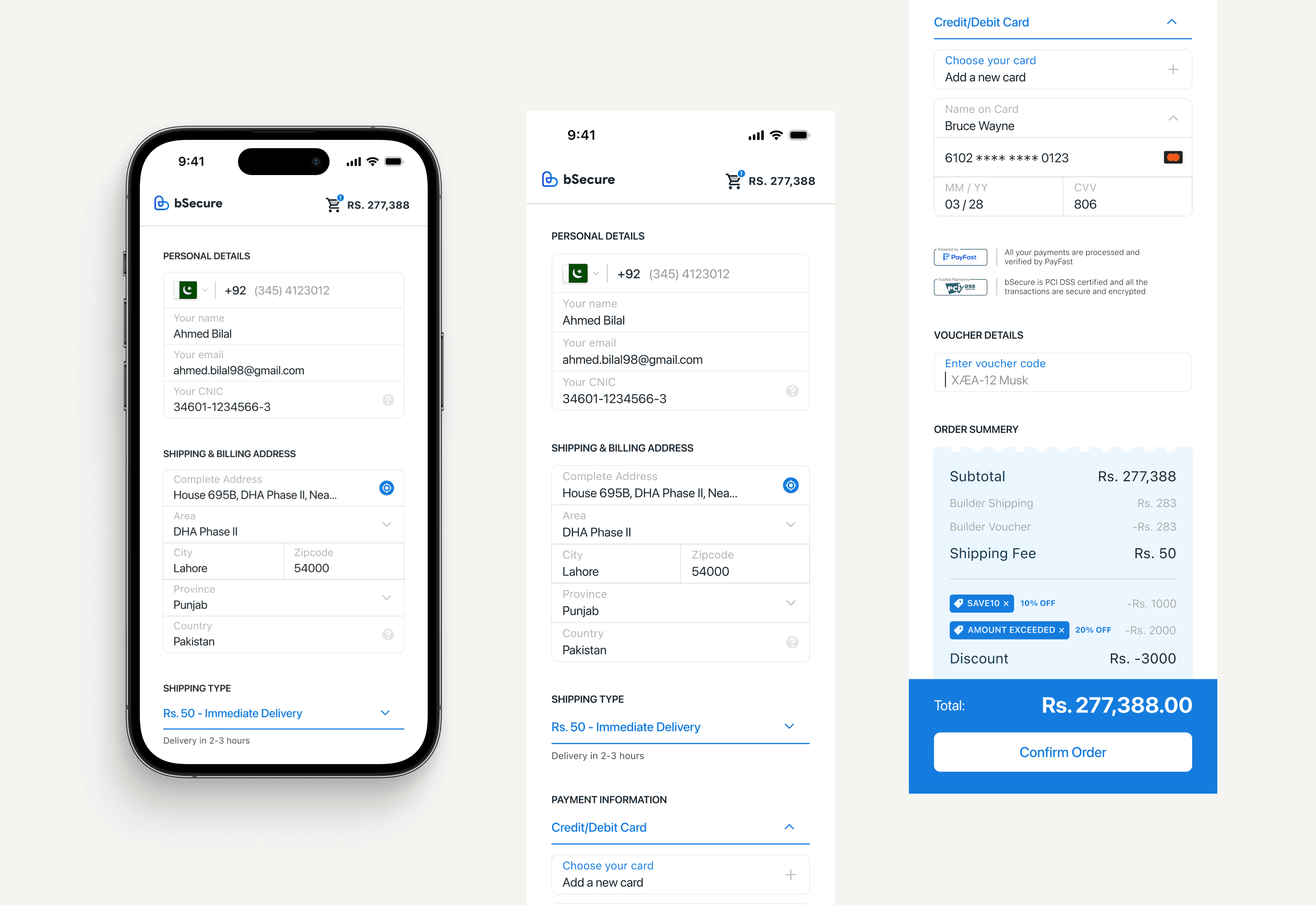
Once the flows and interaction logic were agreed, moving into actual interface design became much more straightforward. The design system was already established, so the focus was turning the BRD and flows into a clean interface that matched our principles. Here are the final look and feel of the One Page Checkout
Headline
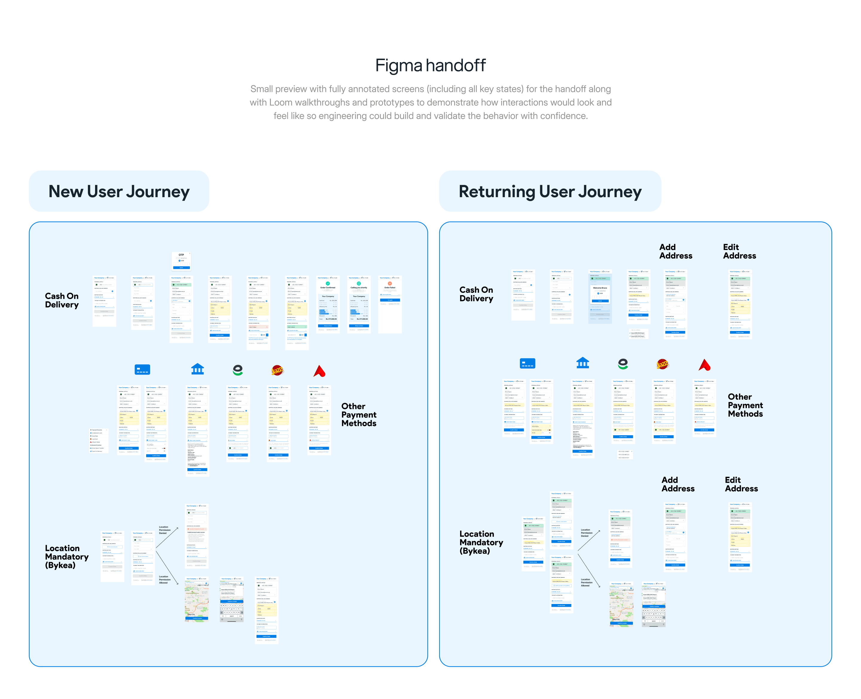
As the interface came together, a big part of the work was making sure the one-page experience didn’t feel like everything dumped on one screen. I introduced a new input grouping pattern that treated each information group (personal details, address, shipping, payment method, summary) as its own concise unit. Alongside that, I added a proper landing/loading state for the first moment a user lands on the review page, so the experience felt intuitive and engaging thus minimizing the uncertainty about whether information was static or not. From there, we designed the interactions to cover every realistic scenario: editing existing details, adding new information, deleting or replacing entries, and validating updates while keeping the experience calm, predictable, and most importantly fast.
The launch itself was equally deliberate because this wasn’t a small design tweak, it was a new journey running in parallel to an already existing journey used by 300+ merchants. We first rolled it out in a staging environment and tested heavily for the first three days to catch obvious logic and state issues. After that, we released a beta and enabled it for selected 10 merchants for the first week to validate it under real-world traffic, devices, and network conditions. As expected, we found few bugs and issues especially around interaction smoothness and the timing of real-time updates but we resolved them quickly through tight, rapid iteration. After roughly 10 days of continuous diligence of behaviour and metrics, we formally released One-page checkout to all merchants and guided them on how to activate it on their store without requiring any workflow change on their end.
Impact & Conclusion
A welcome change in checkout performance and adoption
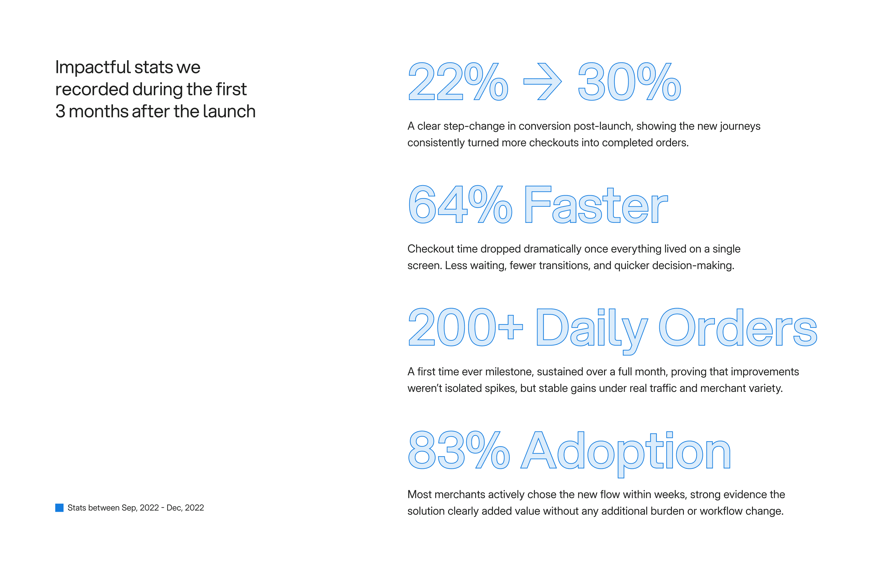
We rolled out the One-page checkout and the card gateway in September 2022, and the impact was immediate and most importantly sustained. Within the first quarter post-launch, we saw a clear lift in checkout efficiency and conversion, with the new journeys materially reducing friction and time-to-complete compared to the legacy multi-step flow. Beyond customer outcomes, the strongest signal of success came from adoption: merchants quickly shifted towards the one page checkout due to better conversion rate and speed of the overall checkout. By the end of November, around 80% of merchants had moved to One-page checkout, validating that the solution worked not only in controlled testing, but in real stores with real operational constraints.
In the grand scheme, this wasn’t a design improvement. It was a foundational upgrade to one of the most business-critical moments in the product, delivered through tight collaboration across design, product, and engineering. What started as a persistent KPI risk turned into a measurable turnaround, and the combined effort over roughly half a year resulted in a checkout experience that was faster, clearer, and easier to adopt and manage for every stakeholder involved.
Learning & Conclusion
Learnings beyond the checkout
This project reshaped how I think about design in a business environment. The biggest lesson was that meaningful outcomes don’t come from one isolated area, instead they come from solving the right bottleneck or taking advantage of a right opportunity in a collaborative space. I learned how to navigate difficult situations, how to keep momentum when multiple teams are involved, and how to balance speed with the level of trust every stakeholder demands.
It also sharpened how I gather insights. Not everything comes from direct interviews, some of the most useful intel came indirectly through patterns in behaviour, repeated friction points in reviews, and the small signals that show up when you watch users try to complete a task under real conditions. Translating that into action meant aligning people first: making sure everyone was working from the same understanding of the problem, the same baseline, and the same definition of success.
Shipping something this large, under real constraints, with real stakes and business on the line is always a huge challenge and i’m proud of how the highs and lows of this overall 5 month effort proved fruitful. And while the story didn’t end there (we continued to ship major stuff in the months that followed), this was my first deep experience of what design actually means which is always what Steve Jobs said:
”Design is not just what it looks like and feels like. Design is how it works”

Hey, Internet Wanderer!
Glad to have you here!
Tap here to open the menu...
Bringing ideas to life at HiPortfolio
Tap here to open the menu...
Ideas over opinions, always!
Tap here to open the menu...
Back to Projects

Hey, Internet Wanderer!
Glad to have you here!
Tap here to open the menu...
Bringing ideas to life at HiPortfolio
Tap here to open the menu...
Ideas over opinions, always!
Tap here to open the menu...
Think . Design . Ship
Reachout
abdulrehmanriaz003@gmail.com
Think . Design . Ship
Reachout
abdulrehmanriaz003@gmail.com
Think . Design . Ship
Reachout
abdulrehmanriaz003@gmail.com
Think . Design . Ship
abdulrehmanriaz003@gmail.com
