

Project Information
Project Information
Project Information
What I worked on...
What I worked on...
What I worked on...
User Research, Design System, UI/UX Design, Usability Testing
User Research, Design System, UI/UX Design, Usability Testing
User Research, Design System, UI/UX Design, Usability Testing
Standard Chartered Bank (Pakistan) Ltd. is the oldest and largest international bank in Pakistan. It is also the first international bank to be awarded Islamic banking license and the first to open an Islamic banking branch.
The purpose of the case study is the revamp and upgrade the mobile application of Standard Chartered Bank making it a good experience for customers while also keeping it aligned with the existing brand value and online presence.
Quick Review
Incase you have a short amount of time and need a quick overview of what I accomplished in this case study, here is a 50 sec video highlighting the major aspects of this project,
Problem Statement
After the boom of online banking in the last decade, it became crucial for almost every brand to make their online experience smooth and easy. However, if we compare the mobile banking of SC to its other media like the website or social media, let alone compare it to its competitors, it simply lacks the desired sleekness and modernism that the users are accustomed to in most of the online platforms.
However, the app does okay from a functional perspective with users able to execute most of the basic functionality, but unfortunately, it’s still not enough for it to be a desirable online banking solution.
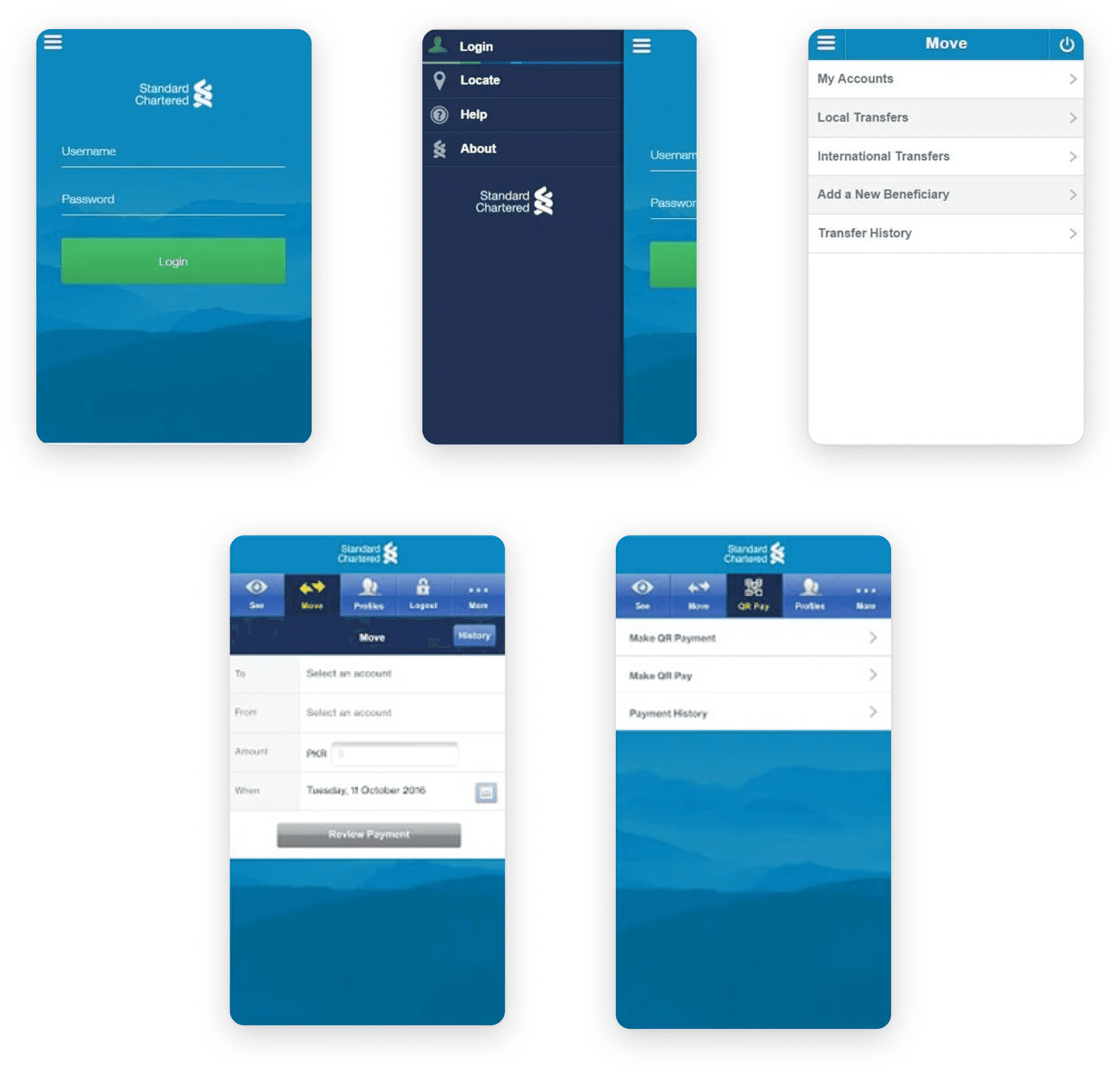
Current User Interface
Potential Solution
After carefully studying the current user interface of the application, it was clear that the application is certainly not up to the mark and the functionality is much more confusing and difficult than it should be.
So, I decided to start from scratch and basically revamp and upgrade the entire mobile application of Standard Chartered Bank in a traditional way(the UI/UX way) while keeping a close eye on the functionality of existing flows and outer dependencies so my solution can actually be good, scalable and implementable in the real world.
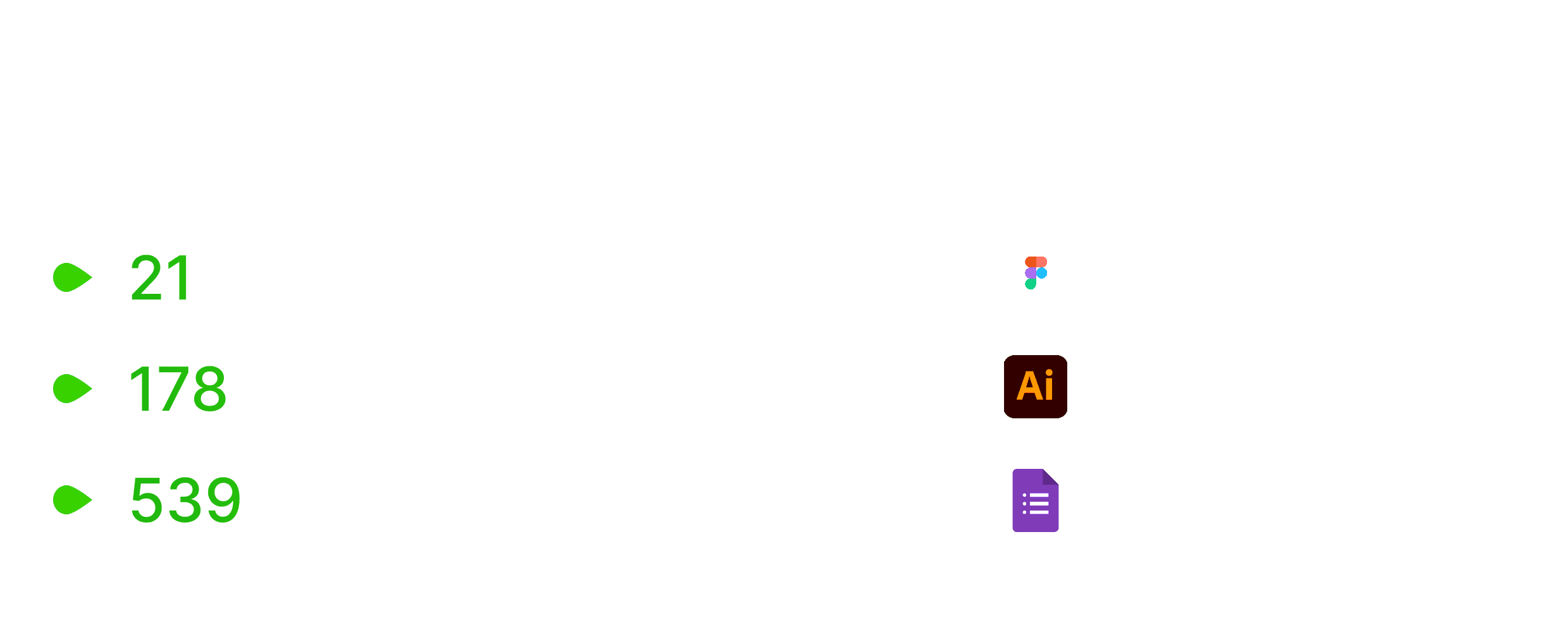
As the sole designer working on this, I was responsible for its every aspect. Overall, the design process followed was somewhat the traditional one but in reality, all of this was happening together since I was the only designer working on this. Moving towards my design process and what I accomplished through it,
Insights from Users
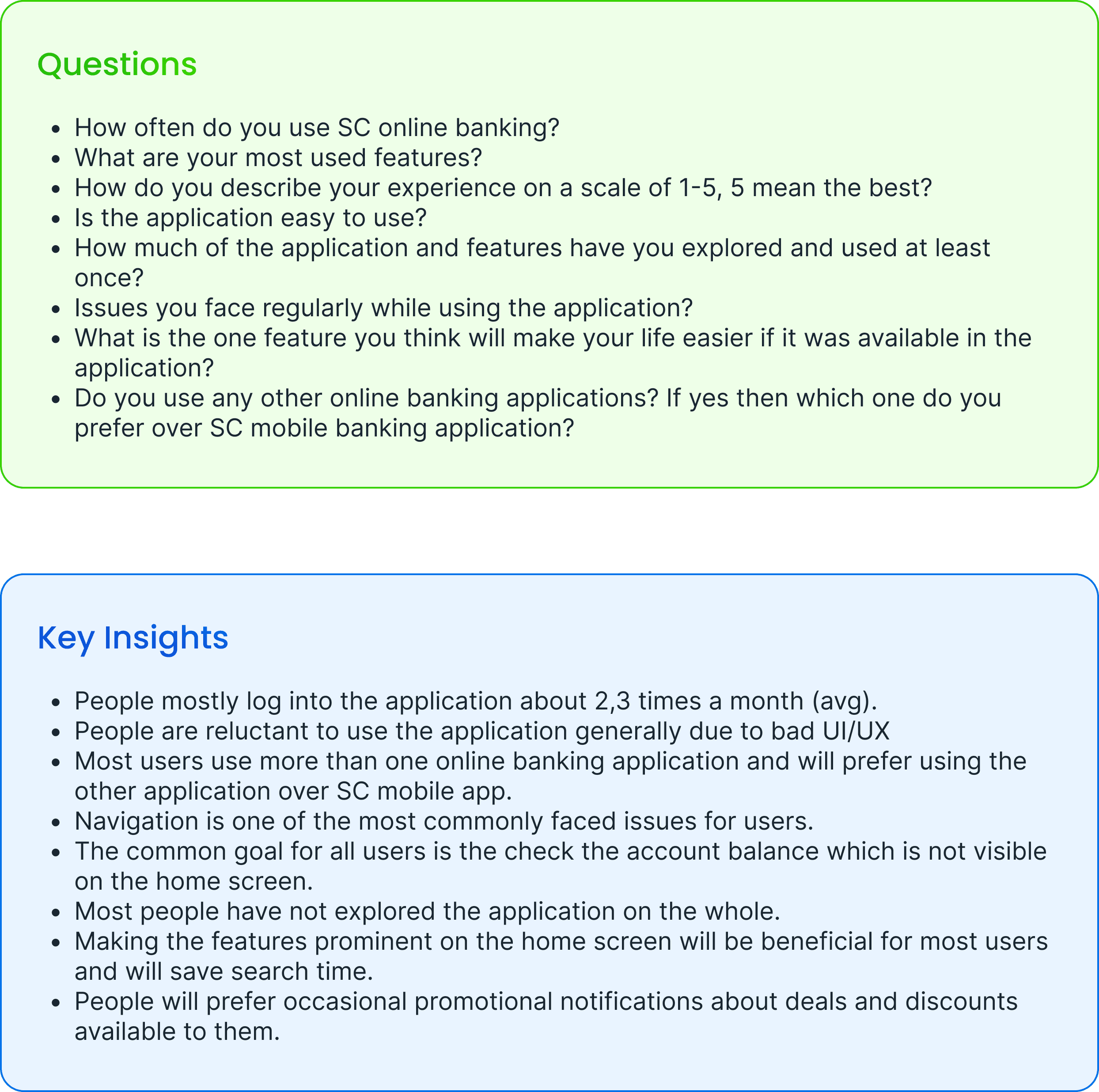
This phase was highly focused on finding out the user’s behavior, goals, and motivation through qualitative and quantitative analysis. The main goal was the get clarity on users’ pain points and the expectations users have with the application. For qualitative analysis, I interviewed users over calls, and for quantitative analysis, I relied on a google form and WhatsApp messaging.
Defining the Requirements
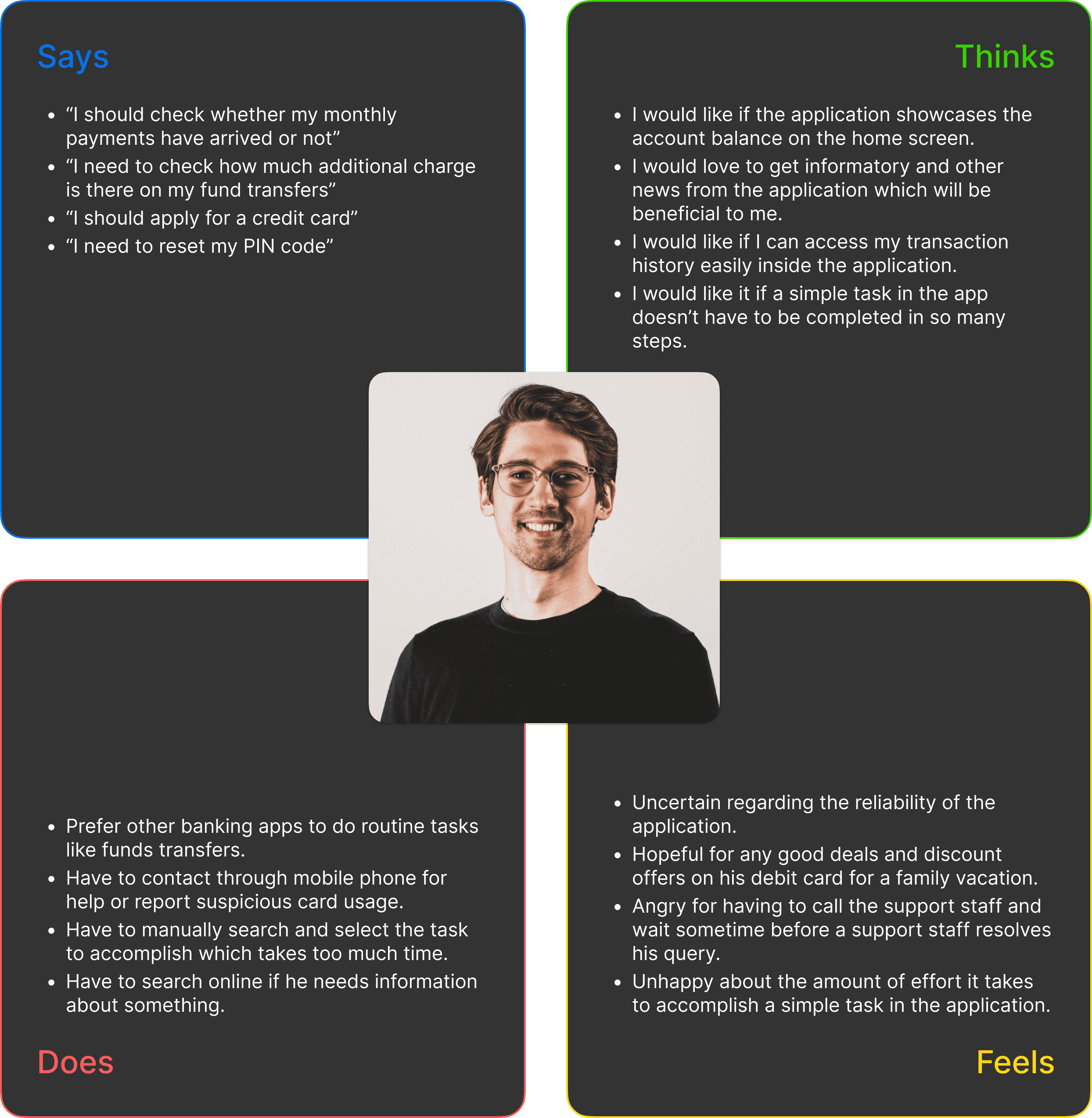
This phase was highly focused on getting clarity and drilling down on the findings of the previous phase. Here, I started with creating user personas which ultimately was beneficial in locking down the core areas where the main focus should be and how top a priority they are.
Empathy Mapping
Overall Review and Insights Gained
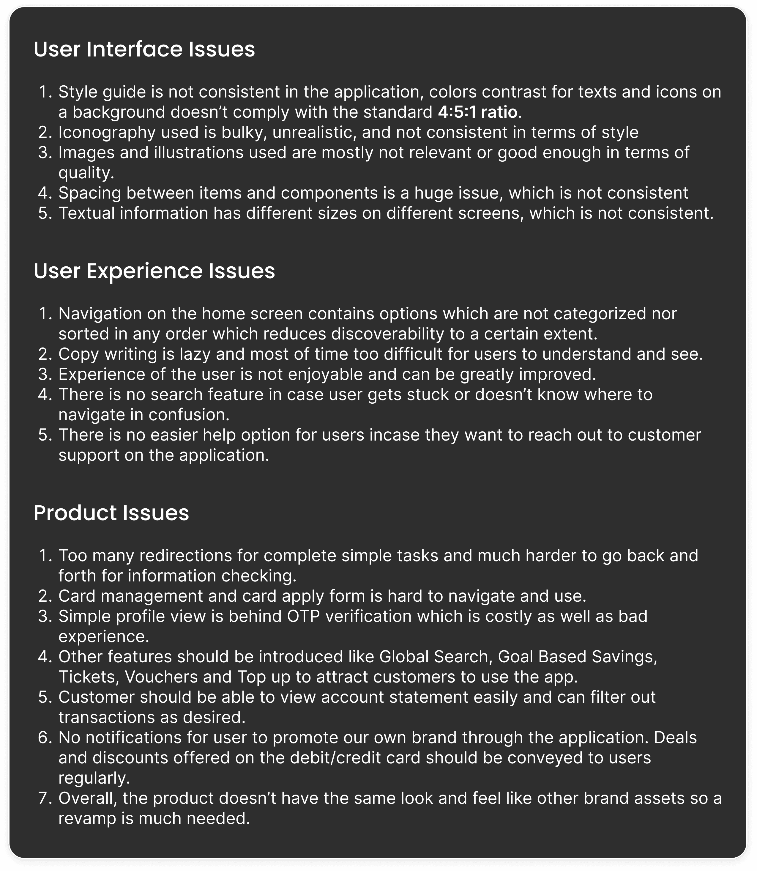
After the whole discovery and define phase, we knew what the issues were but in order to improve something, one must understand the inner and outer limits along with dependencies of the services being provided to users. Therefore, it was necessary to do the competitor analysis to better understand in what areas can we actually improve the current flows and what incentives are they offering their customers. Below are the competitors I researched and analyzed followed by the complete list of issues that needed to be addressed in the revamp.
Informed Ideation
After identifying problems, analyzing feature requirements and extensive competitors review, it was time to sketch some ideas to actually pull this all off. The first and most major part was to create a information hierarchy for better navigation which was one of the major issues creating confusion among user. Not only we needed to better the already existing flows, we also had to introduce couple of new features so all this information needed to be better organized for user to easily navigate and access. Below is the information architecture created for better understanding the information hierarchy and user flows inside the revamped application.
System Architecture

Created in Figjam
After creating the mapping and categorization of features and overall application, another key factor was to optimize the flows of existing features and make them slightly less confusing, lesser redirections and fewer user-required actions so the usage becomes easy and efficient (keeping QOC Notation in mind). So, it was important for the user to understand the current happenings, what he/she did to reach that point, and how many processes in left for completing any task. Here, the competitor analysis really came in handy because I had more than enough data for understanding how a single feature’s BRD and user flow work in multiple applications and what are they doing differently. That basically set the design tone for using engaging sliders, progress bars, and popups and making the navigation easier for users so there can be no usability issues while keeping the cognitive load as minimal as possible.
Finalizing the Designs
After completing research, analyzing feature requirements, and understanding the architecture, the focus shifted to implementing all of the above in design. So, I started with creating a design system that can be scalable and stay true to the existing Standard Chartered identity. After creating the style guide and selecting digital assets for the design, I started designing the user interface. Here, the key was the keep the design as simple as possible because,
“Simplicity, carried to an extreme, becomes elegance” - John Franklin
Style Guide
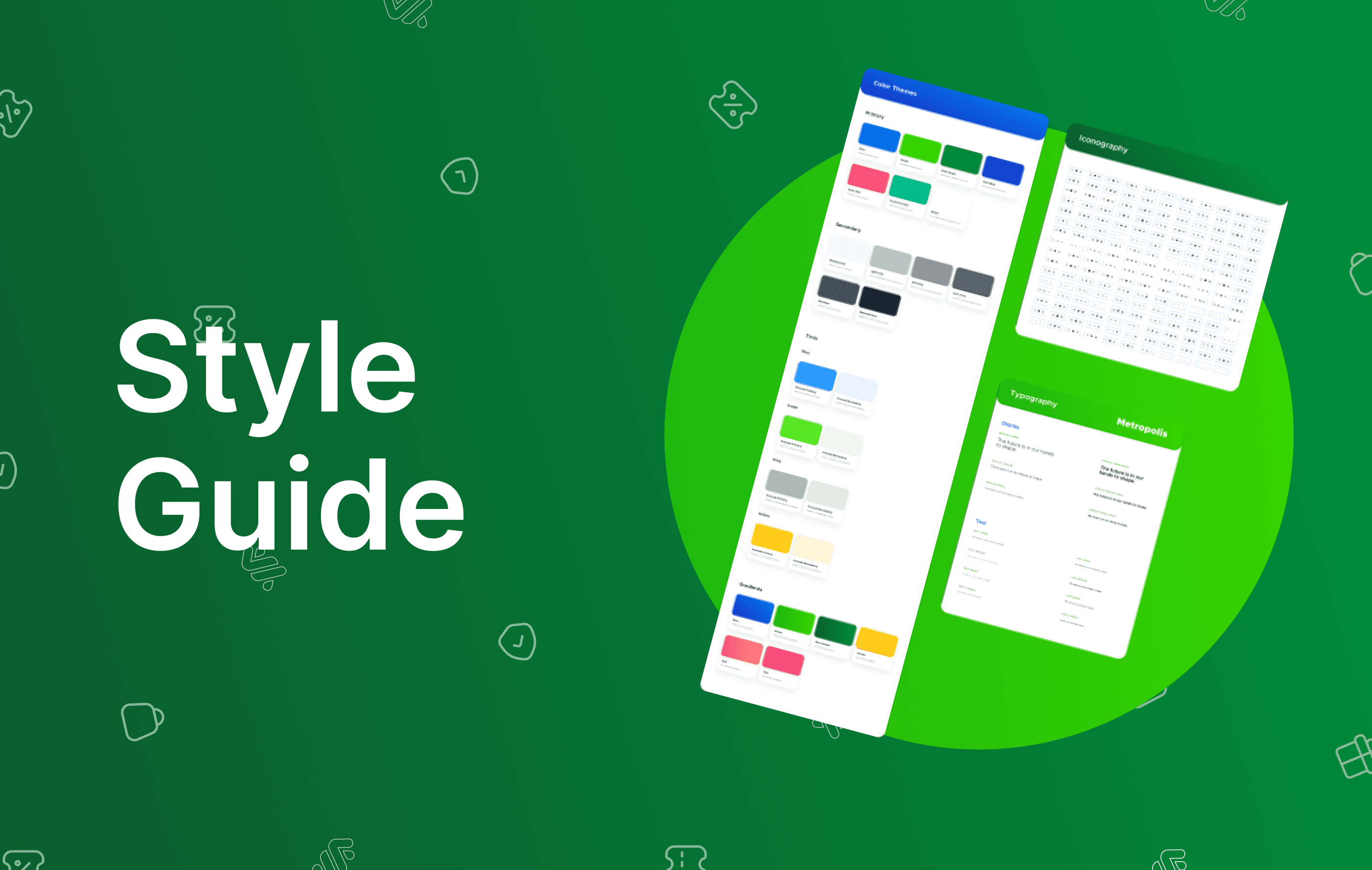
There are a lot of design systems available which could have improved the time span of the project but all of the system needed to reflect the brand identity from each pixel to each corner. So, I started from scratch and created the style guide for the application which included complete color styles, typography, and digital assets like icons, images, and illustrations.
Design System
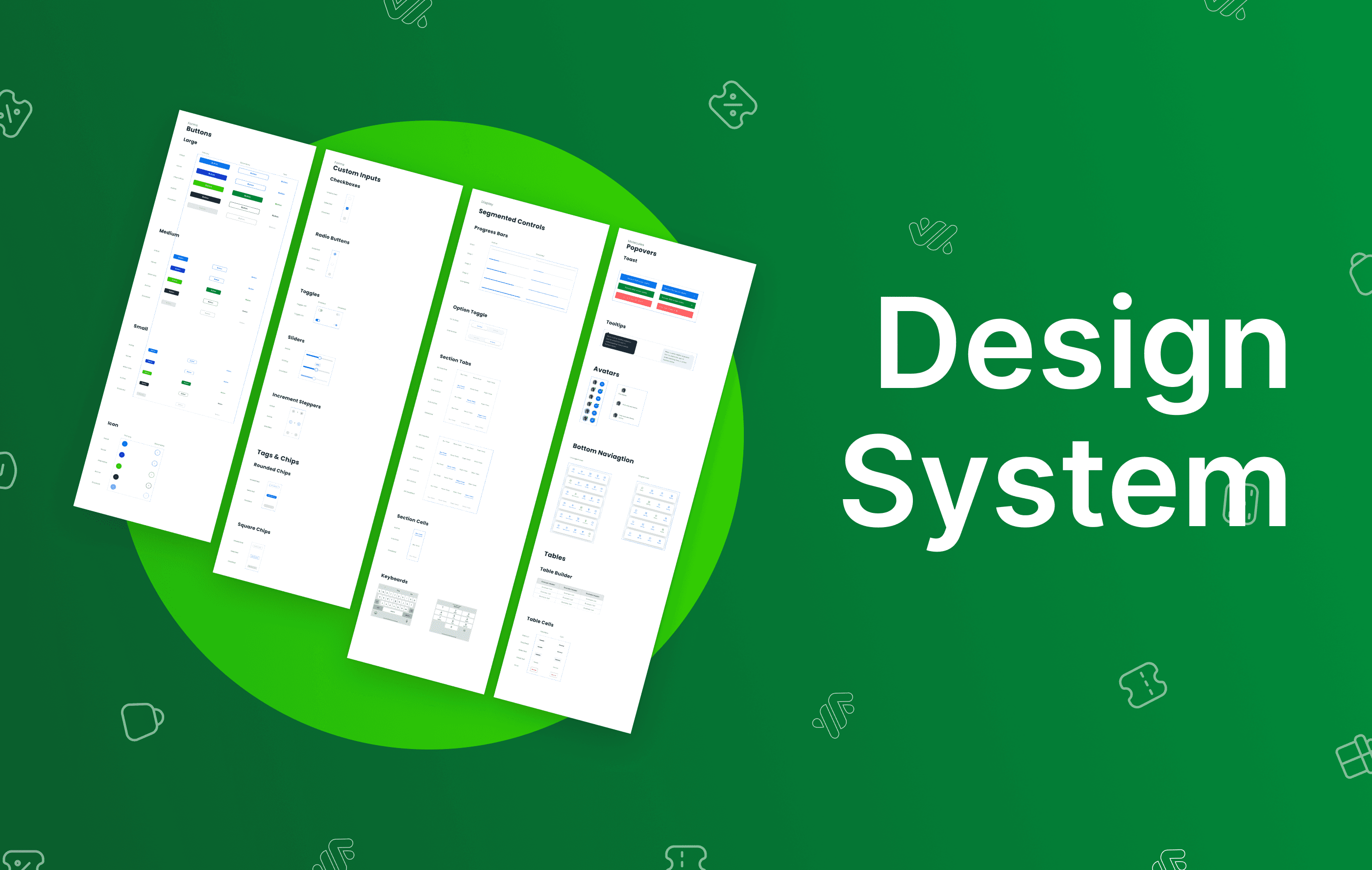
After the style guide was done, I moved on to the essential components required for a mobile application, which included buttons, forms, segmented controls, checkboxes, progress bars, etc. It sure was time-consuming but the reusability and flexibility it provided through variants were much needed. After the system was completed, it was finally time to move on to the user interface aspect of the revamp, to actually apply what I was working on for a few months.
New User Interface
All of this became overwhelming since I was the only designer working on this but when designing the UI, it eventually did feel fruitful because I was actually solving a problem faced by thousands of people. As per high-fidelity prototyping, the plan was to follow what I learned, keeping my design rationale in check and making sure my design decisions were consistent. Now, behold...


Total 178 screens, all created in Figma
BRD Optimization Result
One of the key thing I mentioned earlier was to optimize the current process flows, so a little sample of how a fund transfer currently happens vs how I have made the user journey along with their comparison,
Testing with Users
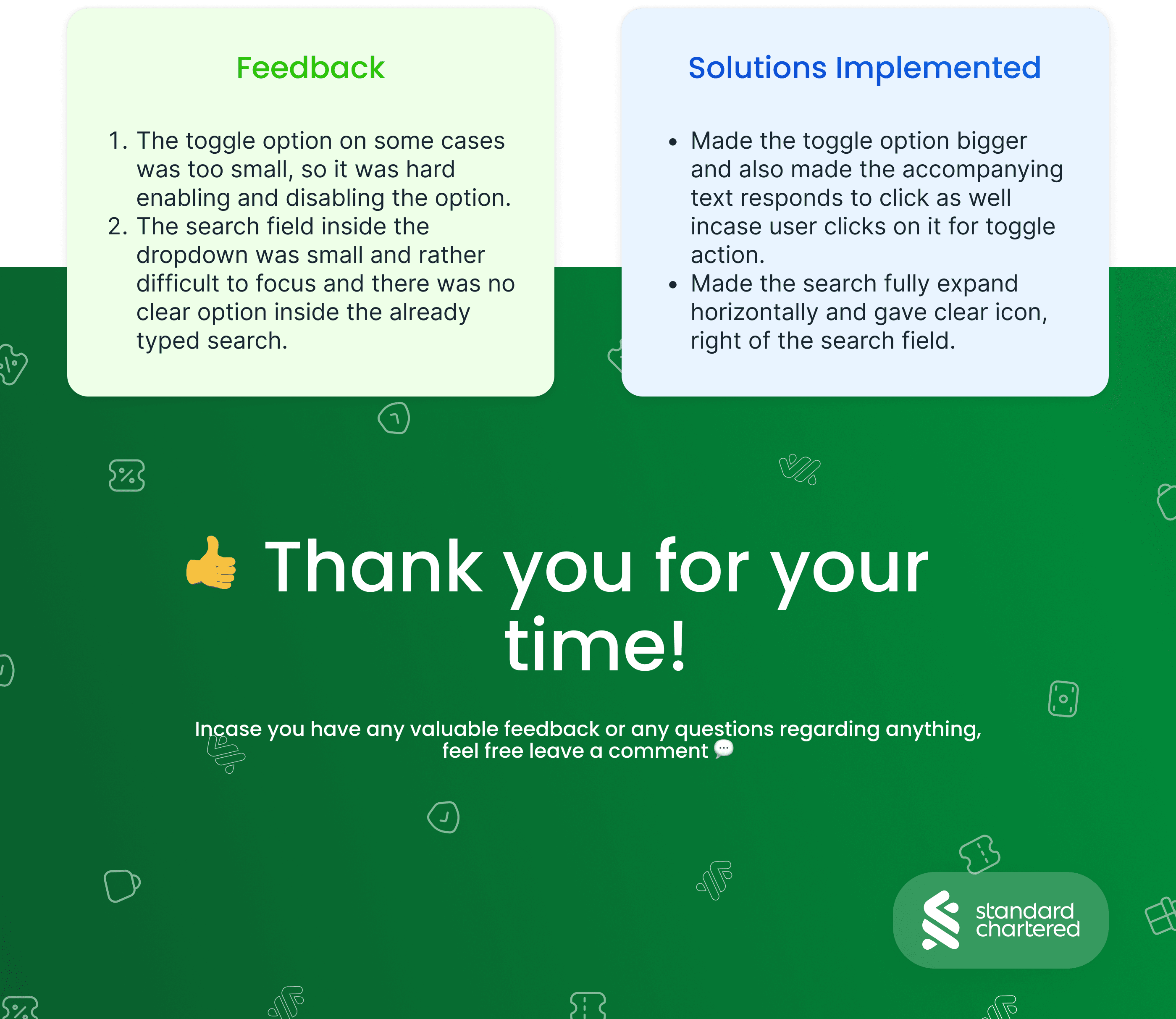
After months of effort, it was time for testing the prototype. I tested the product with a couple of users to understand has everything went according to research and planning and how easier the whole experience is compared to the current application. Except a couple of UI issues, the overall experience of the users was good and the major issues found in the earlier phases were sorted out

Standard Chartered Bank (Pakistan) Ltd. is the oldest and largest international bank in Pakistan. It is also the first international bank to be awarded Islamic banking license and the first to open an Islamic banking branch.
The purpose of the case study is the revamp and upgrade the mobile application of Standard Chartered Bank making it a good experience for customers while also keeping it aligned with the existing brand value and online presence.
Quick Review
Incase you have a short amount of time and need a quick overview of what I accomplished in this case study, here is a 50 sec video highlighting the major aspects of this project,
Problem Statement
After the boom of online banking in the last decade, it became crucial for almost every brand to make their online experience smooth and easy. However, if we compare the mobile banking of SC to its other media like the website or social media, let alone compare it to its competitors, it simply lacks the desired sleekness and modernism that the users are accustomed to in most of the online platforms.
However, the app does okay from a functional perspective with users able to execute most of the basic functionality, but unfortunately, it’s still not enough for it to be a desirable online banking solution.
Current User Interface

Potential Solution
After carefully studying the current user interface of the application, it was clear that the application is certainly not up to the mark and the functionality is much more confusing and difficult than it should be.
So, I decided to start from scratch and basically revamp and upgrade the entire mobile application of Standard Chartered Bank in a traditional way(the UI/UX way) while keeping a close eye on the functionality of existing flows and outer dependencies so my solution can actually be good, scalable and implementable in the real world.

As the sole designer working on this, I was responsible for its every aspect. Overall, the design process followed was somewhat the traditional one but in reality, all of this was happening together since I was the only designer working on this. Moving towards my design process and what I accomplished through it,
Insights from Users
This phase was highly focused on finding out the user’s behavior, goals, and motivation through qualitative and quantitative analysis. The main goal was the get clarity on users’ pain points and the expectations users have with the application. For qualitative analysis, I interviewed users over calls, and for quantitative analysis, I relied on a google form and WhatsApp messaging.

Defining the Requirements
This phase was highly focused on getting clarity and drilling down on the findings of the previous phase. Here, I started with creating user personas which ultimately was beneficial in locking down the core areas where the main focus should be and how top a priority they are.
Empathy Mapping

Overall Review and Insights Gained
After the whole discovery and define phase, we knew what the issues were but in order to improve something, one must understand the inner and outer limits along with dependencies of the services being provided to users. Therefore, it was necessary to do the competitor analysis to better understand in what areas can we actually improve the current flows and what incentives are they offering their customers. Below are the competitors I researched and analyzed followed by the complete list of issues that needed to be addressed in the revamp.

Informed Ideation
After identifying problems, analyzing feature requirements and extensive competitors review, it was time to sketch some ideas to actually pull this all off. The first and most major part was to create a information hierarchy for better navigation which was one of the major issues creating confusion among user. Not only we needed to better the already existing flows, we also had to introduce couple of new features so all this information needed to be better organized for user to easily navigate and access. Below is the information architecture created for better understanding the information hierarchy and user flows inside the revamped application.
System Architecture

Created in Figjam
After creating the mapping and categorization of features and overall application, another key factor was to optimize the flows of existing features and make them slightly less confusing, lesser redirections and fewer user-required actions so the usage becomes easy and efficient (keeping QOC Notation in mind). So, it was important for the user to understand the current happenings, what he/she did to reach that point, and how many processes in left for completing any task. Here, the competitor analysis really came in handy because I had more than enough data for understanding how a single feature’s BRD and user flow work in multiple applications and what are they doing differently. That basically set the design tone for using engaging sliders, progress bars, and popups and making the navigation easier for users so there can be no usability issues while keeping the cognitive load as minimal as possible.
Finalizing the Designs
After completing research, analyzing feature requirements, and understanding the architecture, the focus shifted to implementing all of the above in design. So, I started with creating a design system that can be scalable and stay true to the existing Standard Chartered identity. After creating the style guide and selecting digital assets for the design, I started designing the user interface. Here, the key was the keep the design as simple as possible because,
“Simplicity, carried to an extreme, becomes elegance” - John Franklin
Style Guide
There are a lot of design systems available which could have improved the time span of the project but all of the system needed to reflect the brand identity from each pixel to each corner. So, I started from scratch and created the style guide for the application which included complete color styles, typography, and digital assets like icons, images, and illustrations.

Design System
After the style guide was done, I moved on to the essential components required for a mobile application, which included buttons, forms, segmented controls, checkboxes, progress bars, etc. It sure was time-consuming but the reusability and flexibility it provided through variants were much needed. After the system was completed, it was finally time to move on to the user interface aspect of the revamp, to actually apply what I was working on for a few months.

New User Interface
All of this became overwhelming since I was the only designer working on this but when designing the UI, it eventually did feel fruitful because I was actually solving a problem faced by thousands of people. As per high-fidelity prototyping, the plan was to follow what I learned, keeping my design rationale in check and making sure my design decisions were consistent. Now, behold...


Total 178 screens, all created in Figma
BRD Optimization Result
One of the key thing I mentioned earlier was to optimize the current process flows, so a little sample of how a fund transfer currently happens vs how I have made the user journey along with their comparison,
Testing with Users
After months of effort, it was time for testing the prototype. I tested the product with a couple of users to understand has everything went according to research and planning and how easier the whole experience is compared to the current application. Except a couple of UI issues, the overall experience of the users was good and the major issues found in the earlier phases were sorted out
