

Project Information
Project Information
Project Information
What I worked on...
What I worked on...
What I worked on...
Market Research, Product Strategy, Competitor Analysis, High-Fidelity Prototypes, Brand Design
Market Research, Product Strategy, Competitor Analysis, High-Fidelity Prototypes, Brand Design
Market Research, Product Strategy, Competitor Analysis, High-Fidelity Prototypes, Brand Design
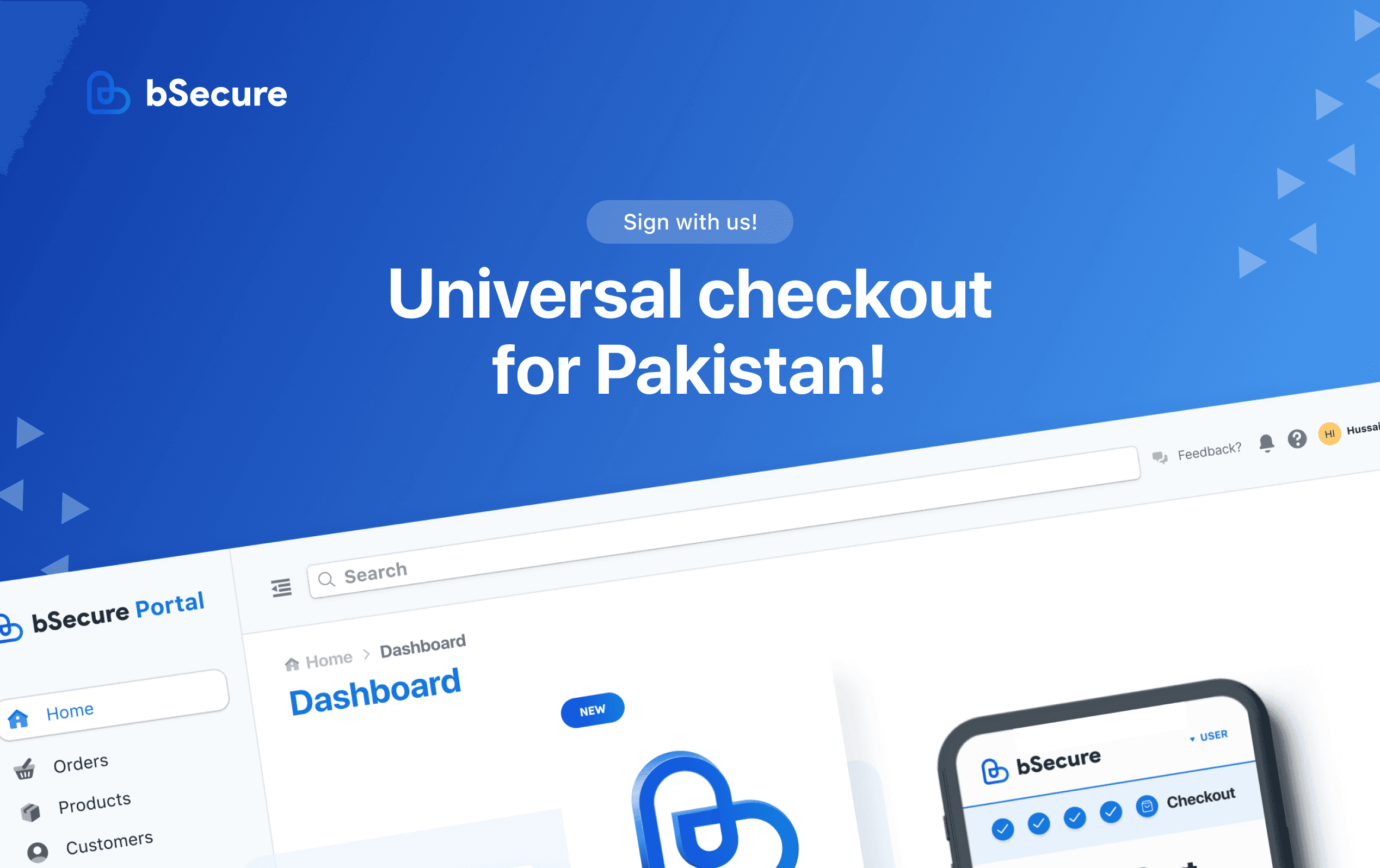
bSecure is a one-click checkout solution for selling your products all across the globe instantly. We bring everything together that’s required to manage and streamline your product checkout for an instant buying experience. A security-centric approach with every transaction encrypted and never compromising on transparency of user needs and expectations.
Along with a e-commerce plugins and bSecure dashboards for our merchants, we also have a complete checkout solution for our customers including state of the art features and security protection, guarantee of making your online shopping experience easy and quick.
My Role
Most of the time, my day to day includes researching about how to further improve the checkout journey and identifying any usability issues faced by the customers while placing orders online. Furthermore, I’m also responsible for managing the research and feature flows of our products and how each and every feature is build correctly and ultimately how everything will work together on customer, merchant and on bSecure side. Also, I'm managing the merchant and business portals being used by our team internally and by the 150+ merchants currently live with bSecure.
Over this course of more than a year, I have worked on some amazing projects including Recurring Payments, Fraud Detection, Multi Currency Support and Pricing Plan, where some of them are still in development pipeline and some are already being used by our merchants. For this case study, I’ll be focusing on one of our biggest challenges in the last year, which was Refining the Checkout Journey.
General Brand Design
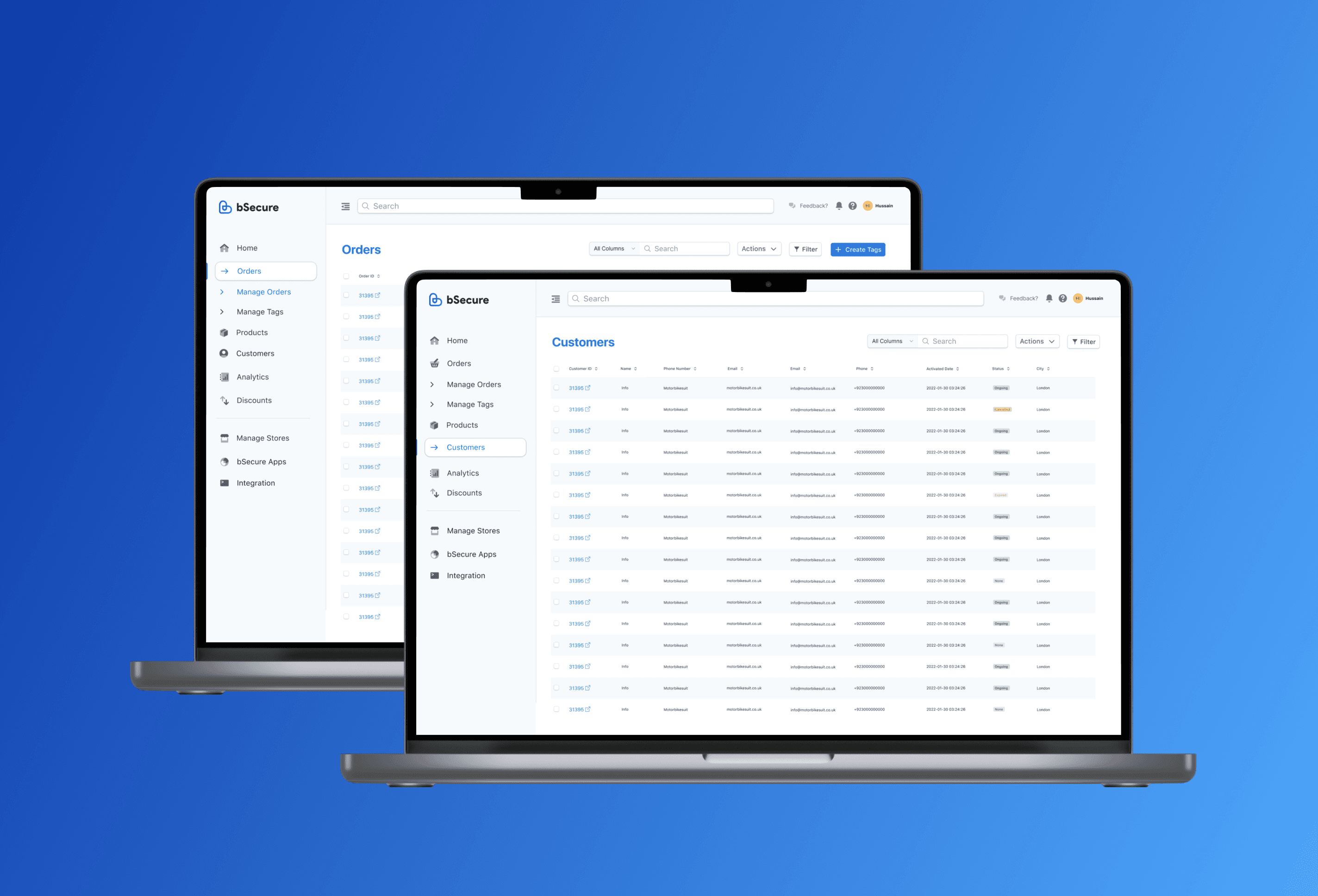
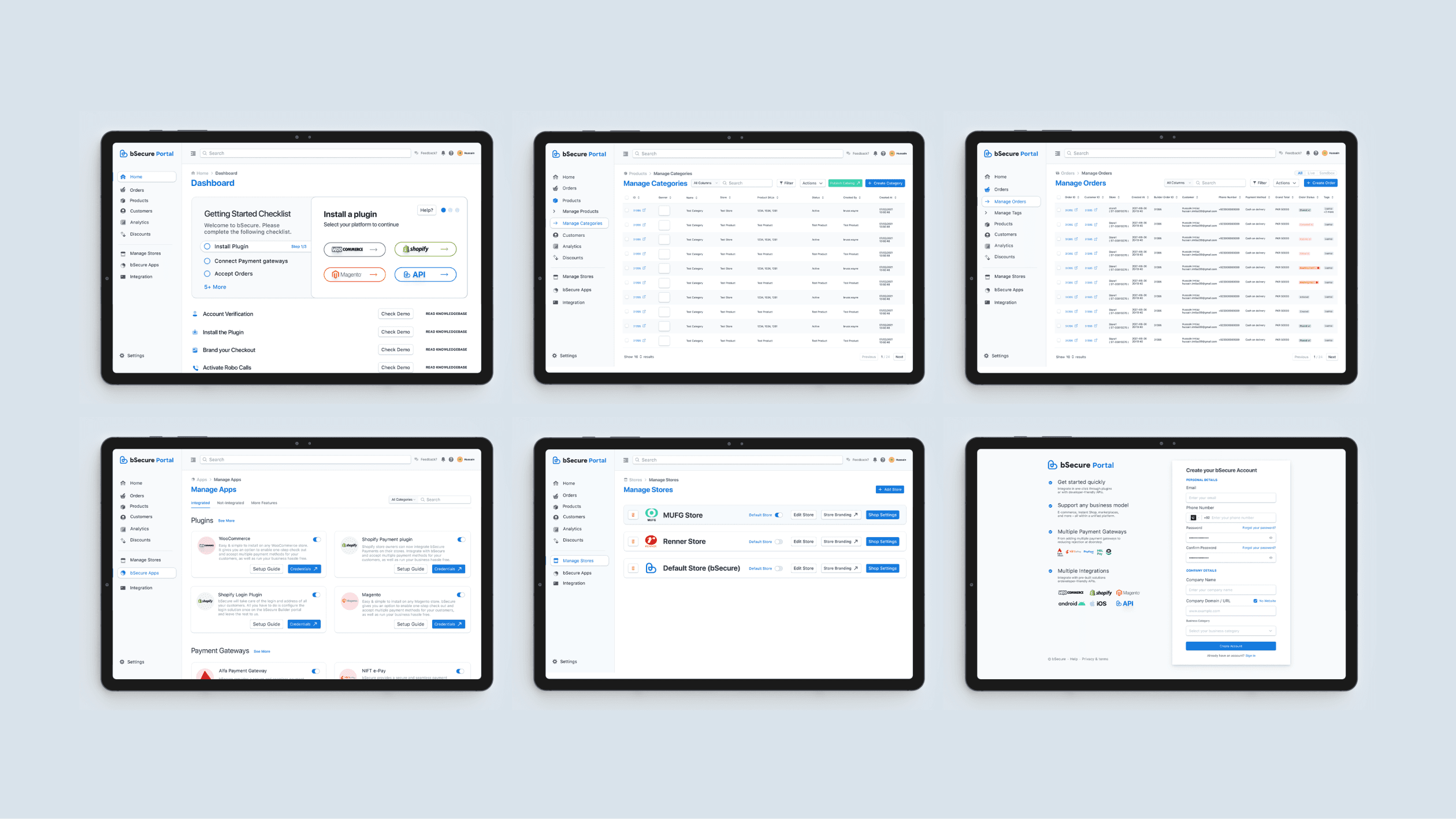
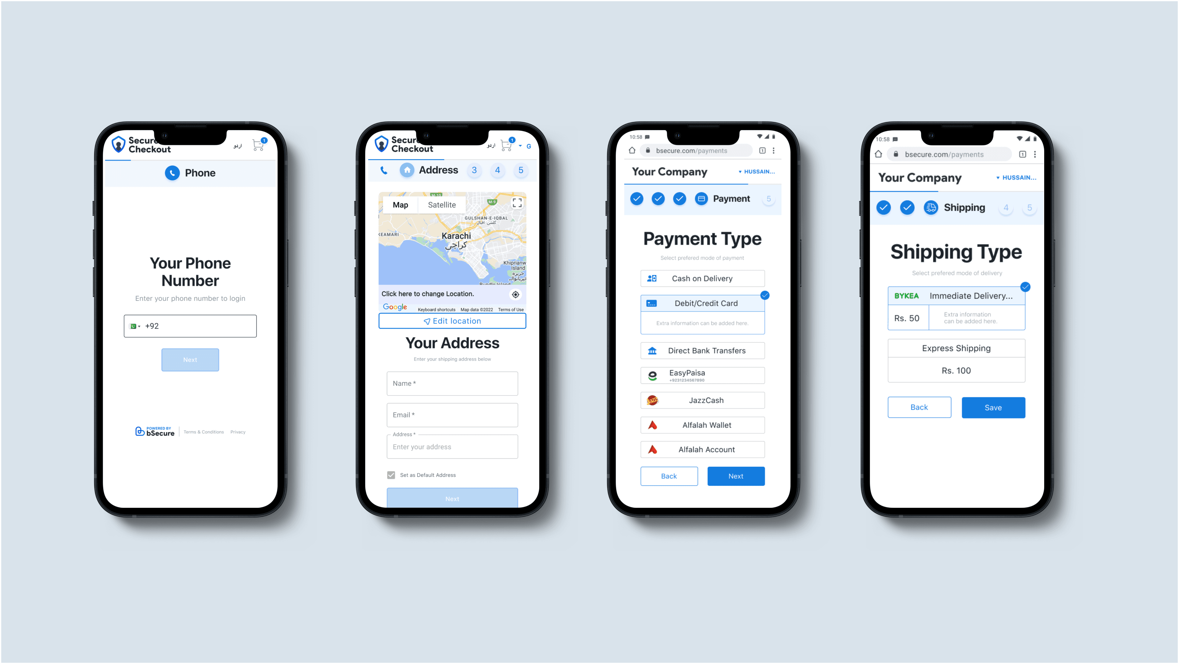
Before diving straight into the case study, I wanna share some random brand designs and the identity so you can get the sense of how the brand look and feel. Firstly inside the bSecure universe, we have a merchant portal which is used to manage everything related to an online store by the merchant. Some of the features we offer are order management, analytics, inventory management, gateway settings and checkout customizations. On the other hand, we have a separate portal entirely being used by our team to manage everything related to the business, like merchants, pricing, orders, customers etc. Here are some quick updated snapshots of brand designs which I have worked on,
The Challenge
In our first quarterly reviews, the internal analysis of our checkout journey revealed some interesting figures related to the efficiency of our checkout journey. The idea was to basically do the in depth analysis of our performance and later compare it with local and international competitors to understand our highs and lows. The whole process required analyzing users on each and every step of the process and identify the shortcomings and nature of those shortcomings.
The results shed light on some important factors like total time spent by user on each screen, steps involved in a successful order, processing time between every loading and redirection, etc. These basically confirmed that we needed some sort of strategy to improve our customer journey in order to improve our overall conversion rate and ultimately make the customer journey smooth and quick. Here, the goal was pretty vague and needed a lot of research and required some hard data to further consolidate our business decisions and our problem.
Quick Review
Incase you have a short amount of time and need a quick overview of what I accomplished in this case study, here is a 50 sec video highlighting the major aspects of this project,
Problem Overview
The original checkout journey needed the user to go through about 5-6 screens to ultimately arrive on the review page. The average amount of time took was a significant factor which couldn’t be overlooked and needed immediate improvement. Furthermore, every user doesn’t need to go through each and every step every time. I as a designer worked alongside our Product Lead and Project Manager to tackle this issue.
Problematic Stats
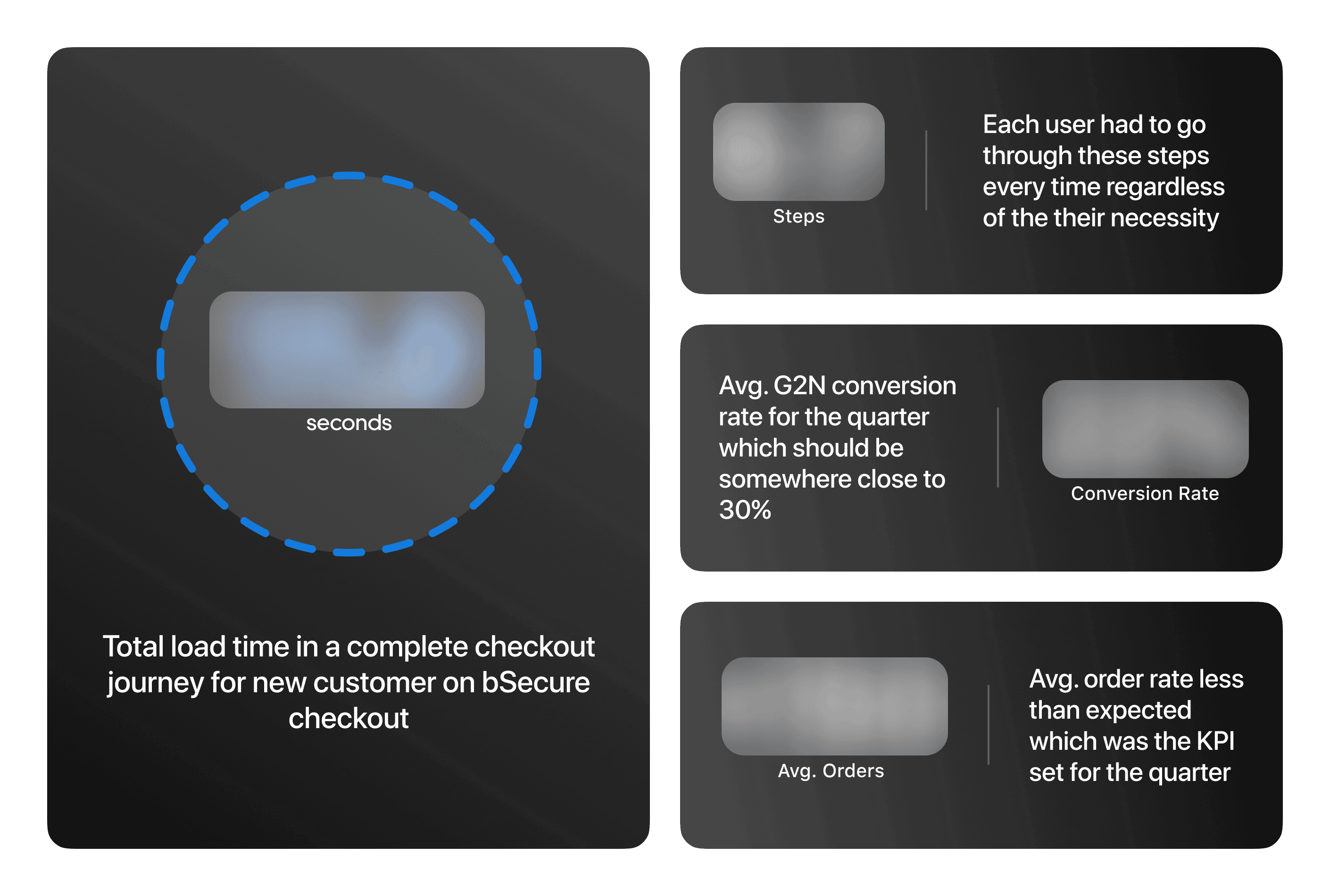
All the critical figures are blurred out for NDA reasons, if you need clarity regarding the figures for hiring purposes, kindly send me a message.
Goals
Refine our current user multi-page journey.
Separate journey where user doesn’t have to through each screen.
Reduce loading and redirection time.
Research & Ideation
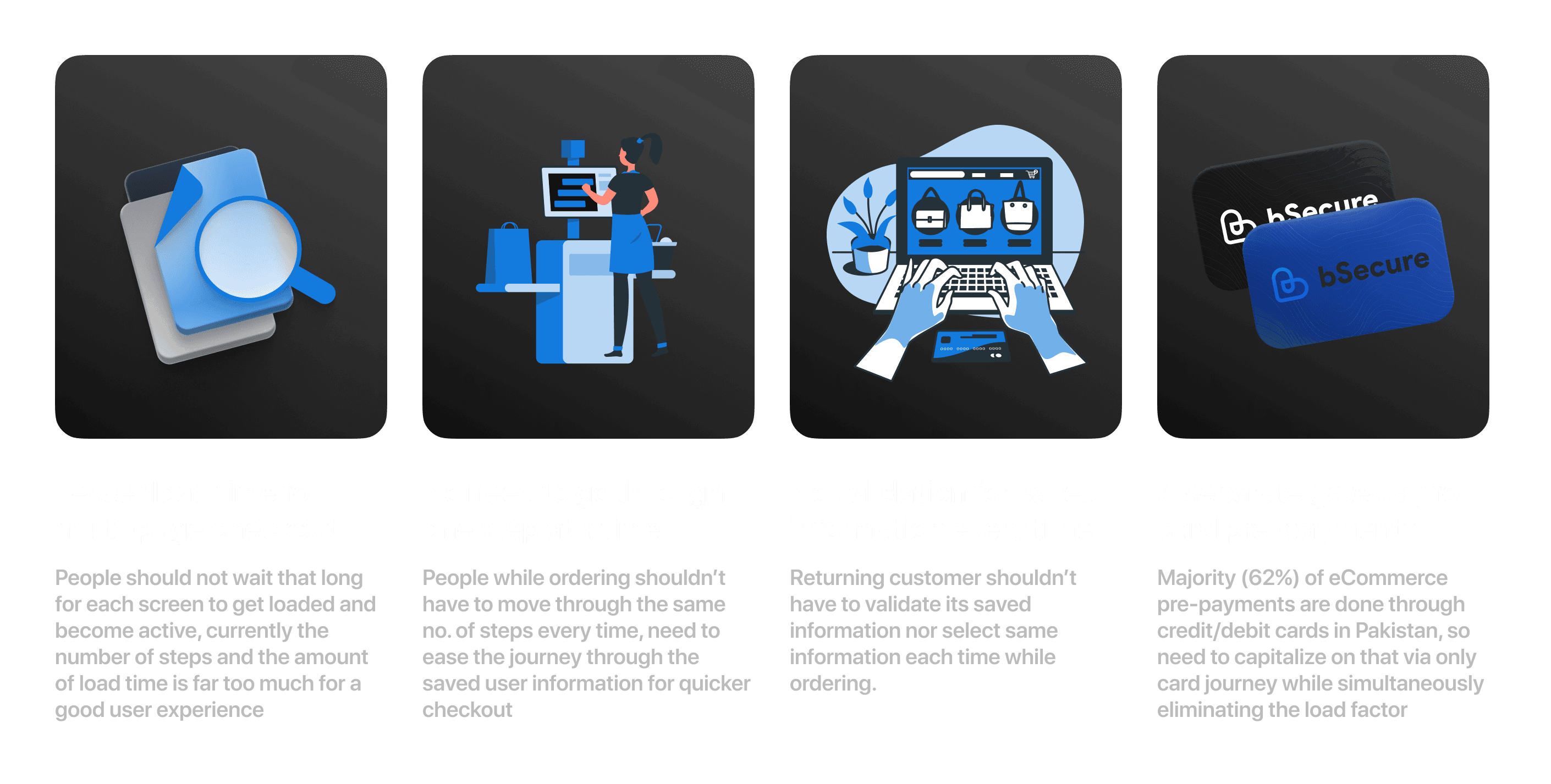
To accomplish such a task, a lot of research was required on every end of the product, especially around our users and merchants to better understand the issues and to de in-depth analysis before reaching to any concrete solution. For watching the existing user journeys and behavior of the users on those screens, we used HubSpot to watch checkout recordings for orders getting placed, abandoned and initiated orders. From the merchant side, it was necessary to do impact analysis of the whichever direction we planned on moving from all this. It was long process of analyzing hundreds of videos and after that, we basically concluded that,
Proposed Solution
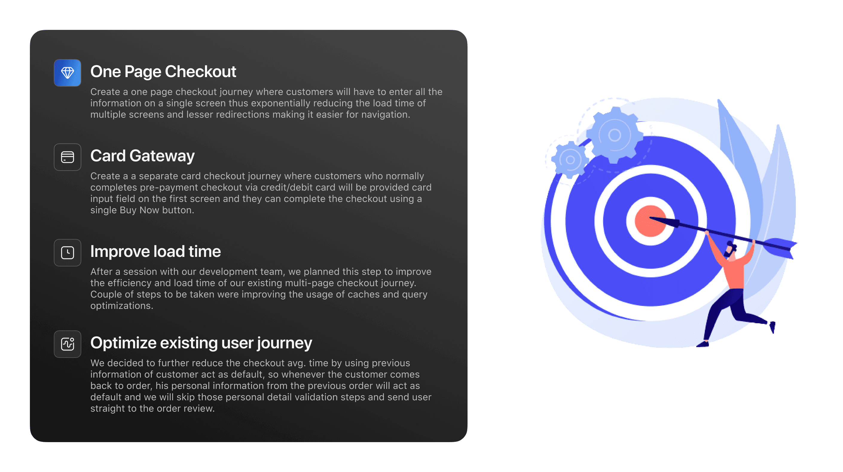
After research phase was over, our team sat down and did a complete summary of what we researched about, what is the impact on our existing product and importantly what is the proposed solution moving ahead. So, our list of action steps which we decided on were,
Design Principles
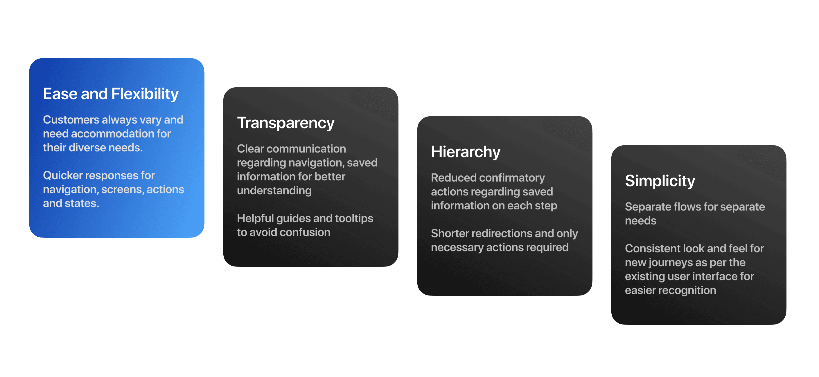
After the problem was identified and the solutions were decided, I came up with design principles that informed the solution and the following outcomes. This was done to ensure that the design rationale overall remains consistent as per the requirements and while recognizing the strategy to execute the proposed solution.
User Journeys
This was crucial step since crating a user journey where we feel like this is what we intended to do and so many factors were a stake considering the number of parties involved. Simultaneously, we needed to understand how the new journey will impact our existing product, how current features will work on the new journeys, can any impact be on external parties like Gateways, Partnered banks and finally understand how the existing APIs will handle information from a single screen considering previous information triggers were set on the screen navigation.
After couple of months of focused and committed work from the team and all parties involved, we reached a certain point where we identified the impact the new journeys will have and for that, we had to create separate APIs for handling live information with triggers set on the state of the components instead of screen redirection and how the changes in provided information needed to be shown on the same page and at the same time of the change so user doesn't get confused.
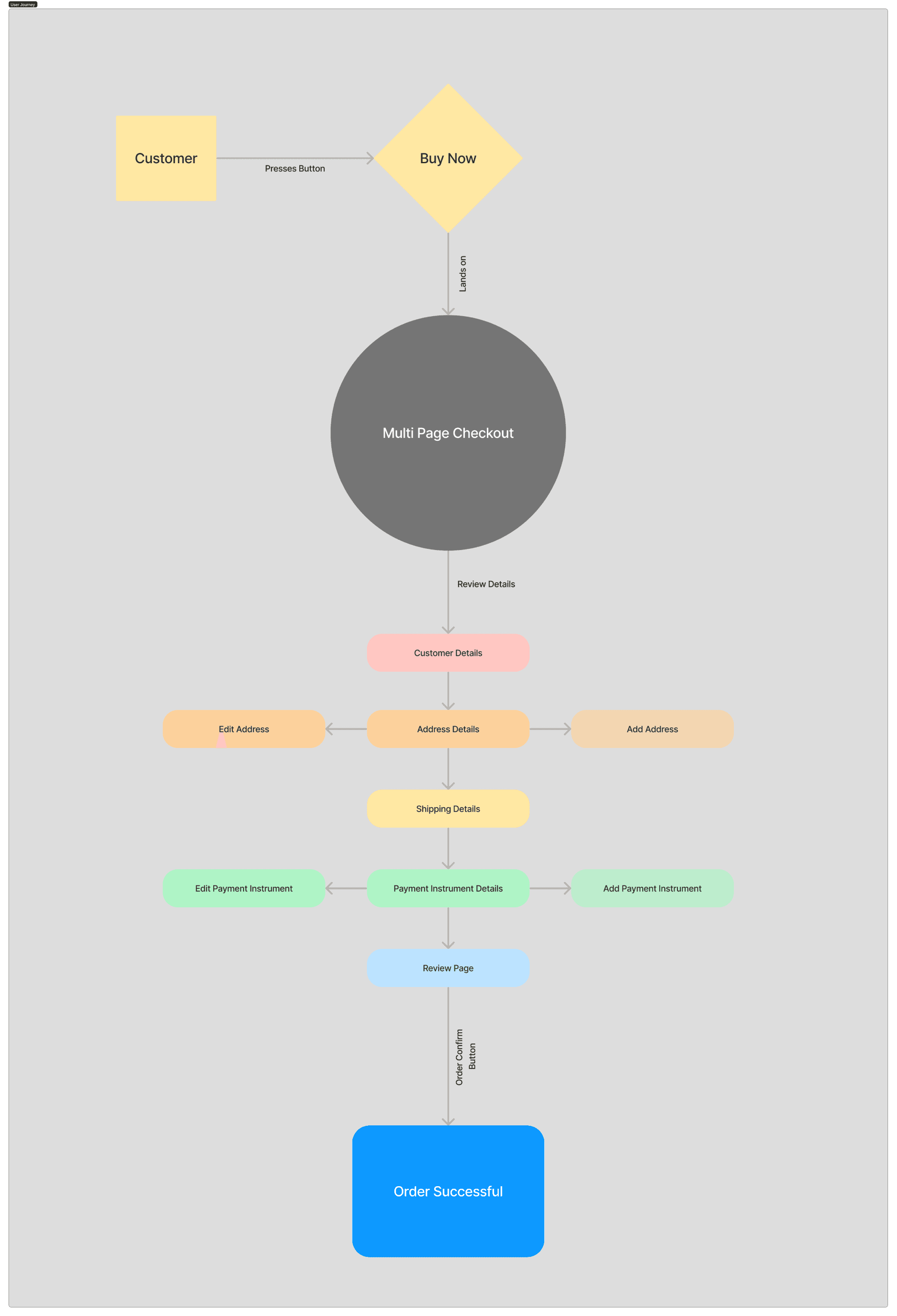
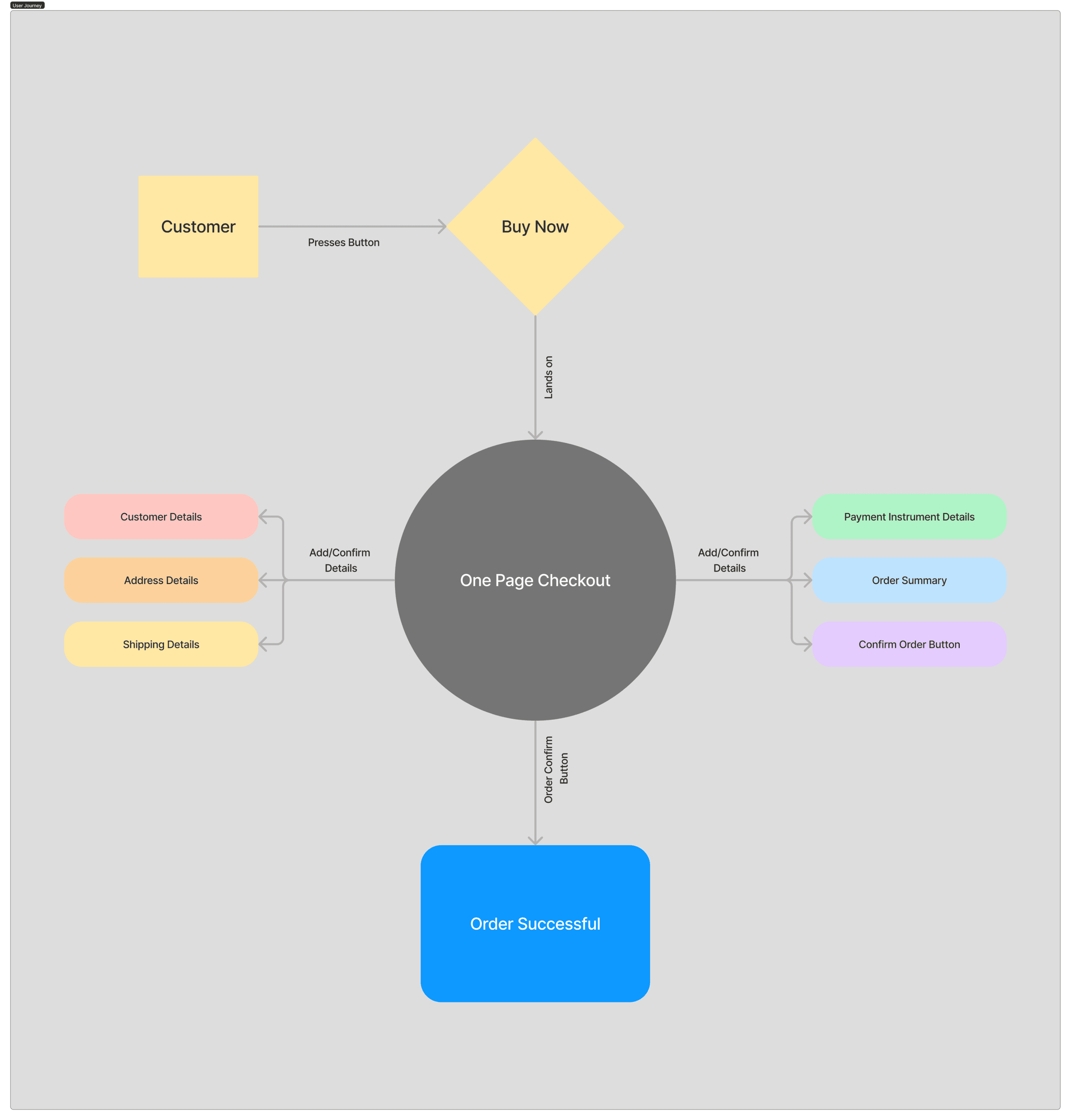
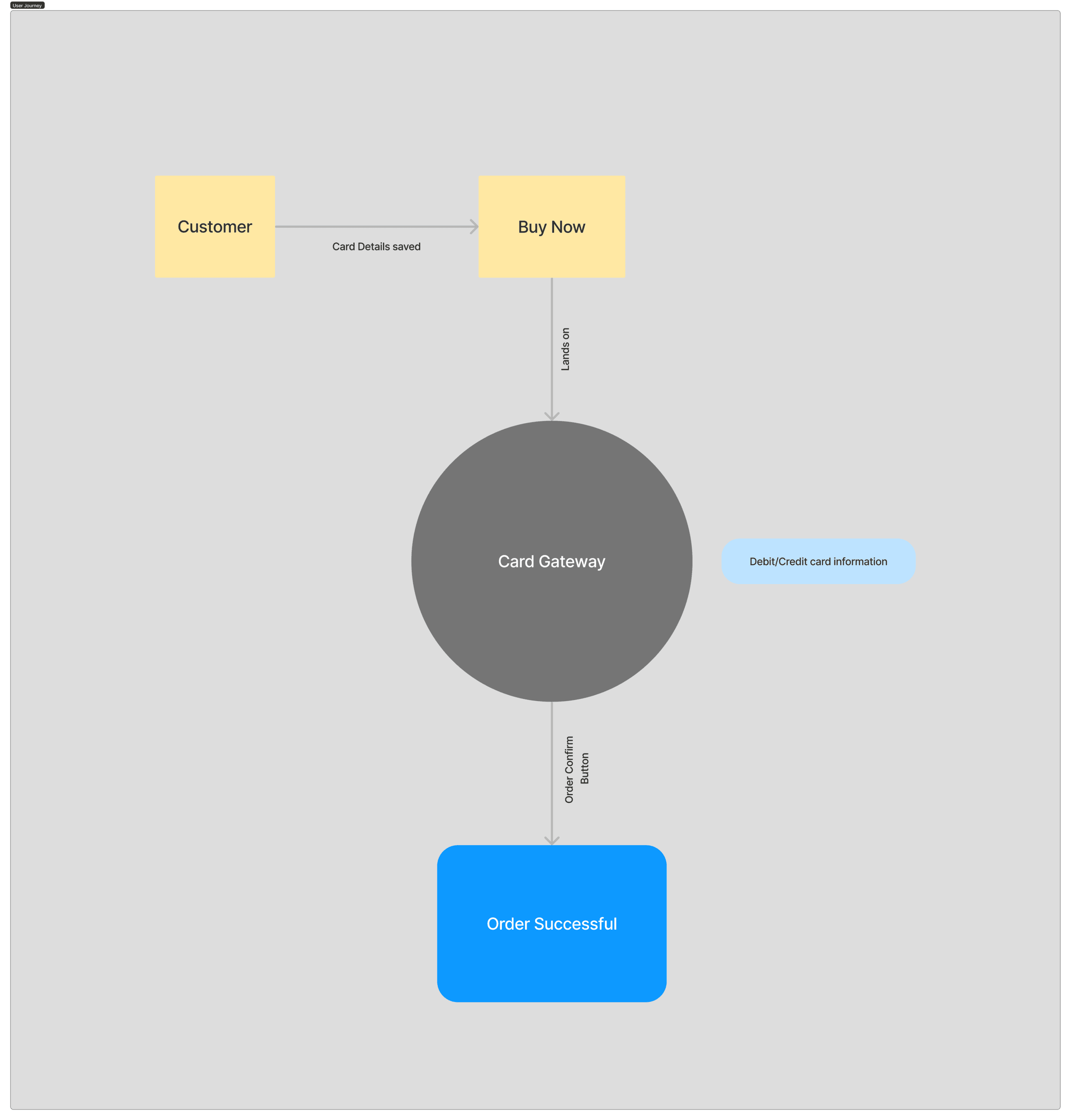
After that, we landed on how the user will use the new journeys and ultimately which information is crucial for user on that single page that needs to be shown and which is not that important that we can nest inside dropdowns and tabs. This was done so that the user understand the clear hierarchy of the page and doesn't have to put in the effort since the whole goal is the reduce the checkout time. Here is the simpler version of the information architecture explaining how all the journeys are different to each other in terms of information flow,
User Interface
After the we were happy with everything regarding the research, architecture and the flows, the next thing was the design phase for finally executing all this. Just like our multi-page checkout, the One Page Checkout will consist of 2 sub-journeys, separate for new and returning customers. However, the Card Journey will behave the same way in both scenarios considering nothing changes between the user flows for debit/credit card pre-payments. Presenting you the final user interface for our both new journeys,
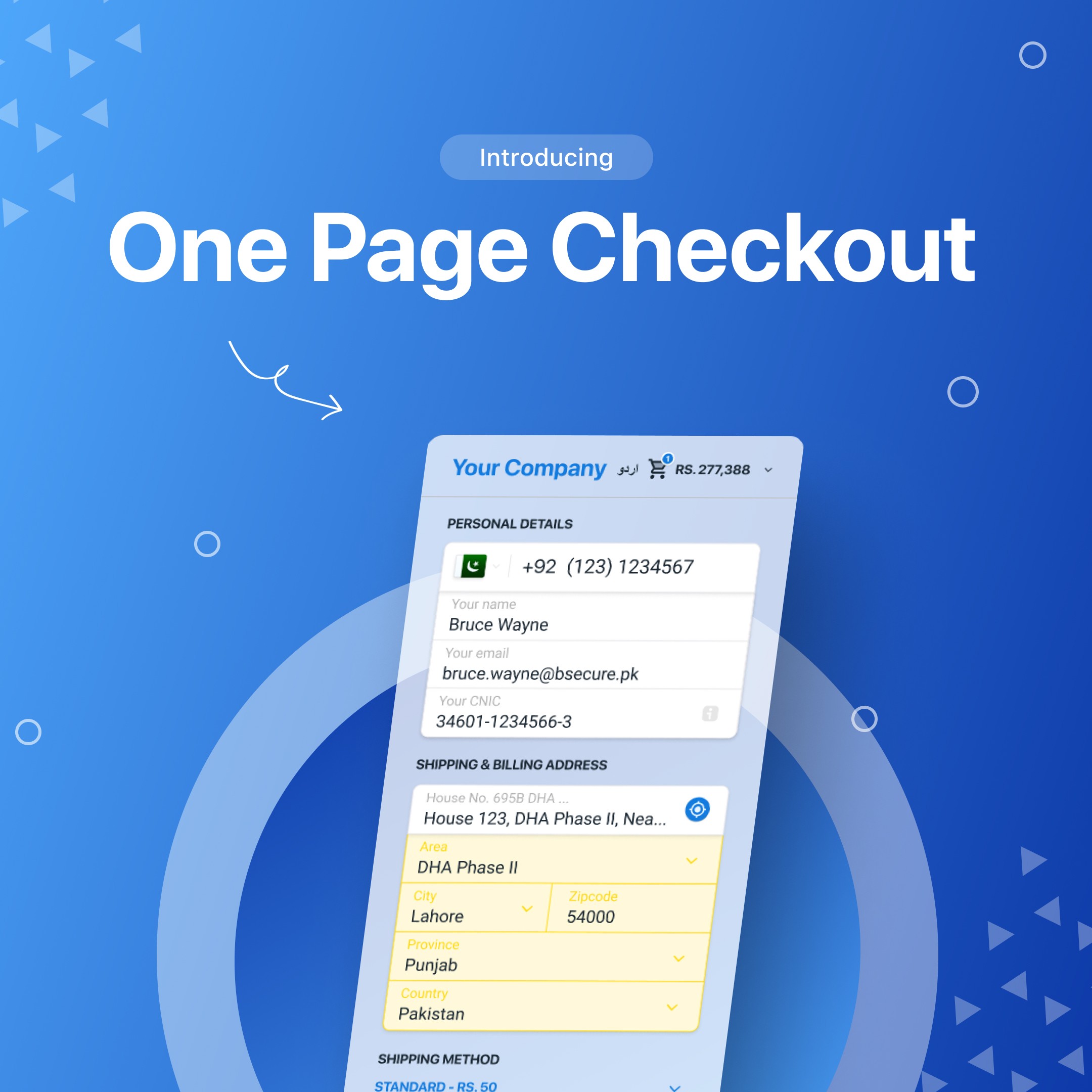
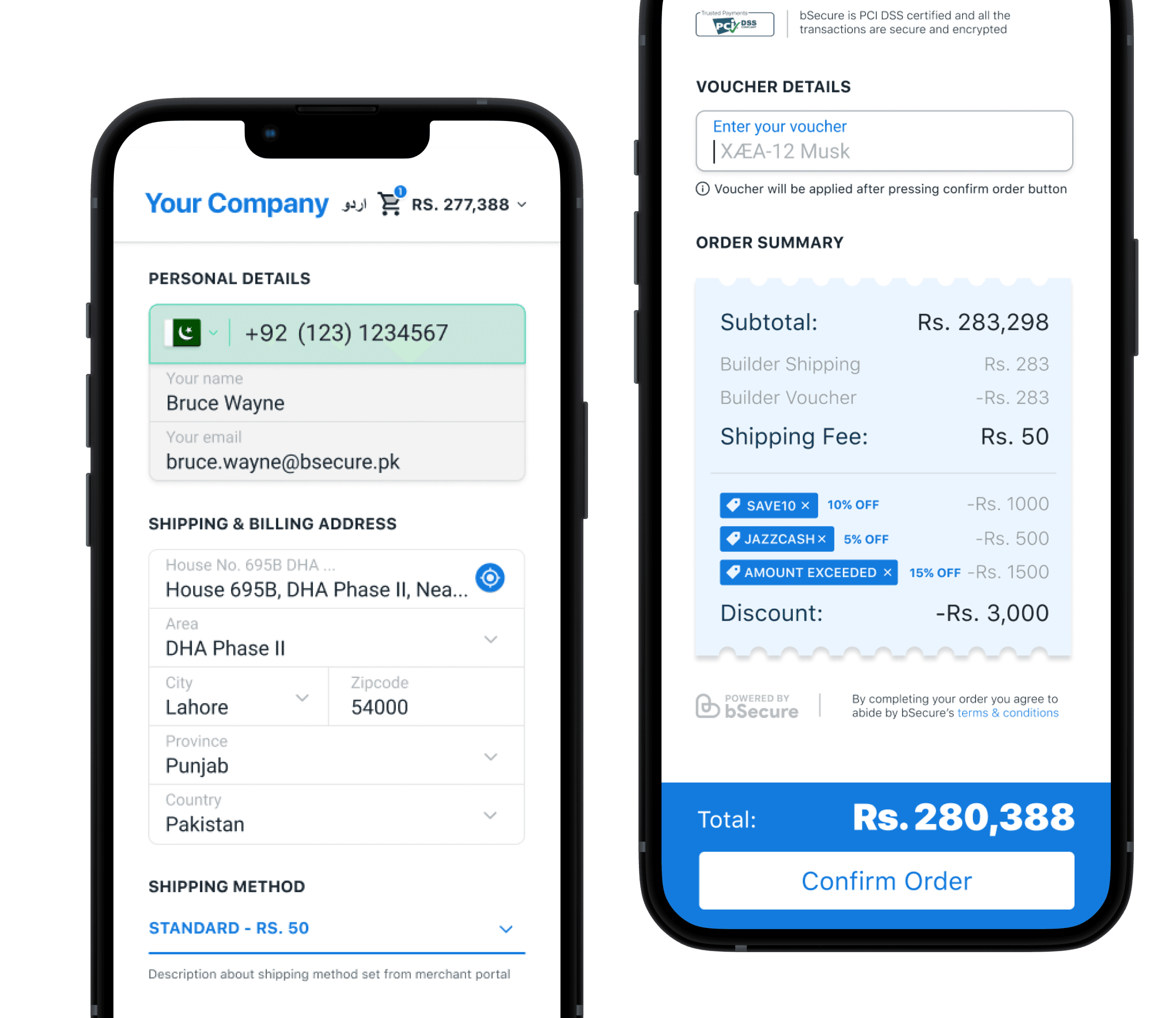
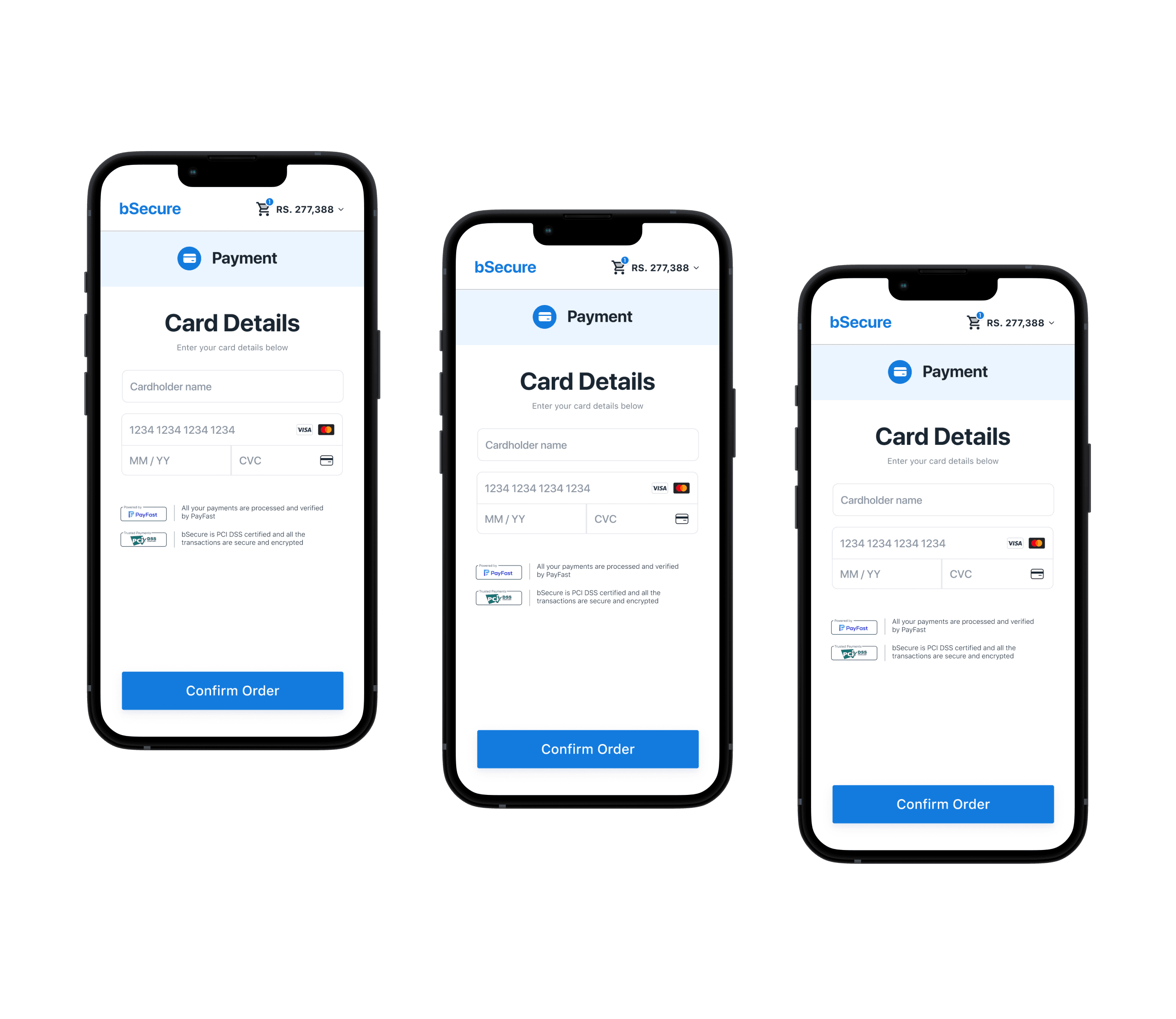
You can check the new journey by trying the demo on our official site.
User Testing
After the development was done, we tested the journeys on staging and later at live environment. But the crucial test was once the new flows was used to our customers and how were they perceiving the changes. For the initial couple of weeks, we were keeping a close eye on the checkout journey of users via HubSpot and internal 3rd party logs for any indication of issues. Except couple of issues regarding information changes shown live, everything went perfectly and as it was intended.
One of the issue which couple of users conveyed through feedback at the end of order was that since their are no page redirections (as the name sound, ONE PAGE CHECKOUT), if they change anything in their personal saved information, the information doesn't get updated quickly. The issue basically was due to our API sending update information call after delay since we didn't have any other way of telling whether the user has finished updating information or not. So we needed a trigger without adding another button on the screen as we already had main CTA button for confirm order. For this issue, we solved by adding triggers on the input fields, sending API calls whenever there was any change in the state of fields.
The Outcomes
We successfully launched Pakistan’s first One Page Checkout in Sep, 2022. Some of its impact on the product and business side are,
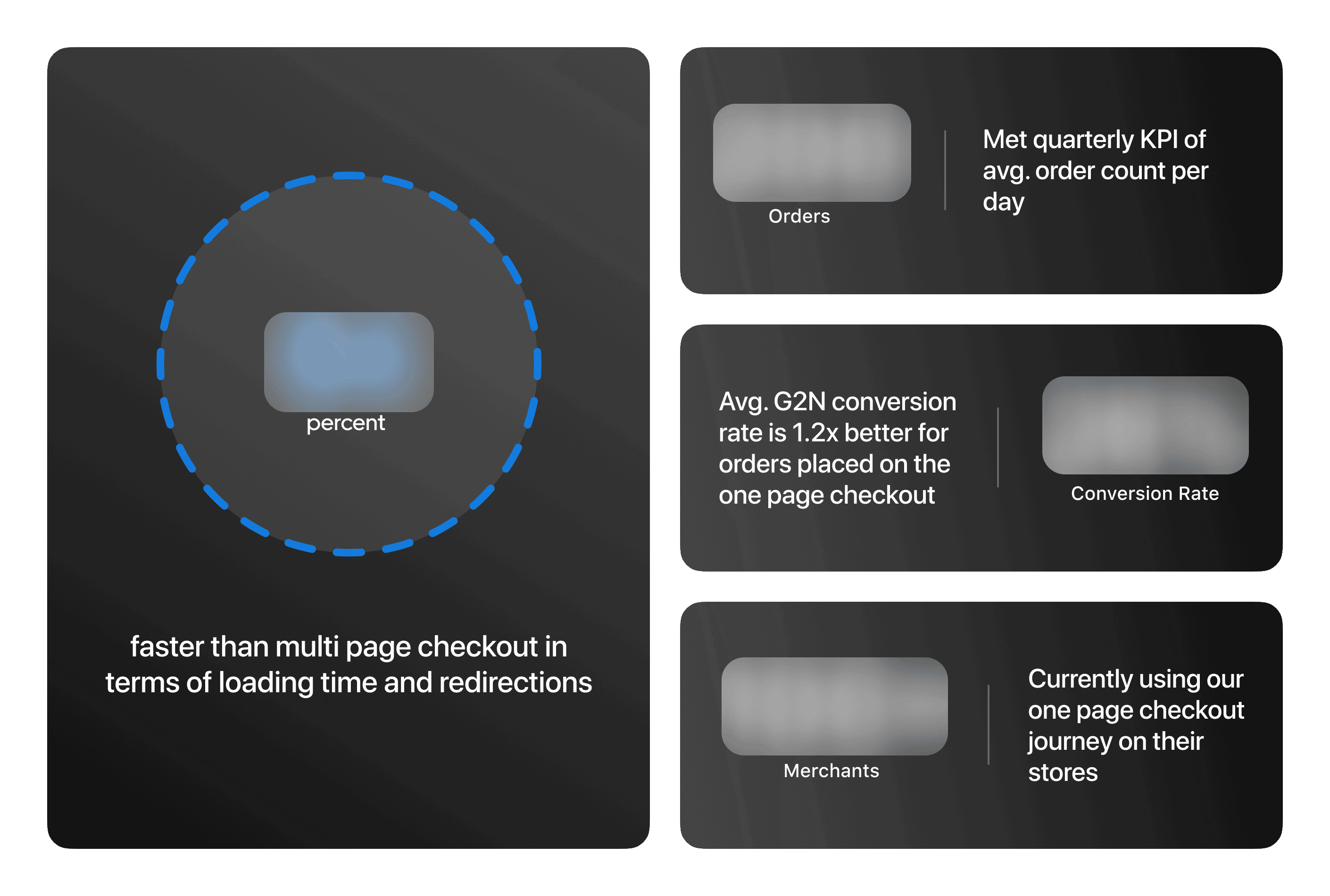
We successfully launched Card Gateway Journey in Nov, 2022. A superfast and very light journey which is a game changer for not only users looking to quickly do online payments but also to merchants who doesn’t want user to get lost between too much information. Some of its impact on the product and business side are,
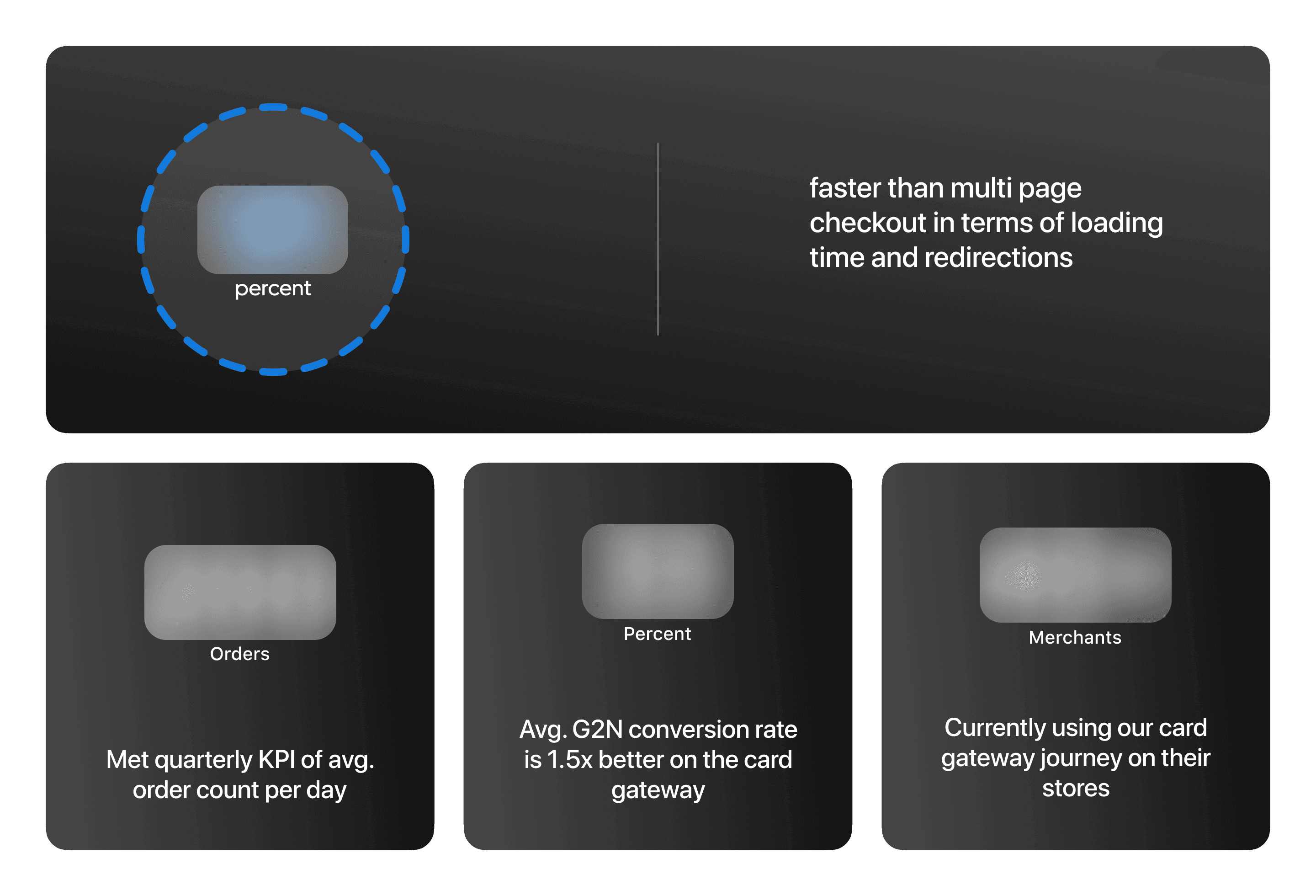
Stats clearly showcase the how major the impact it had on the product and business, making bSecure checkout a standout option compared to its local competitors. This was such a huge victory for our team for the amount of effort we all put in.
Thanks for watching. If you have any query regarding it, kindly drop me a message!
bSecure is a one-click checkout solution for selling your products all across the globe instantly. We bring everything together that’s required to manage and streamline your product checkout for an instant buying experience. A security-centric approach with every transaction encrypted and never compromising on transparency of user needs and expectations.
Along with a e-commerce plugins and bSecure dashboards for our merchants, we also have a complete checkout solution for our customers including state of the art features and security protection, guarantee of making your online shopping experience easy and quick.
My Role
Most of the time, my day to day includes researching about how to further improve the checkout journey and identifying any usability issues faced by the customers while placing orders online. Furthermore, I’m also responsible for managing the research and feature flows of our products and how each and every feature is build correctly and ultimately how everything will work together on customer, merchant and on bSecure side. Also, I'm managing the merchant and business portals being used by our team internally and by the 150+ merchants currently live with bSecure.
Over this course of more than a year, I have worked on some amazing projects including Recurring Payments, Fraud Detection, Multi Currency Support and Pricing Plan, where some of them are still in development pipeline and some are already being used by our merchants. For this case study, I’ll be focusing on one of our biggest challenges in the last year, which was Refining the Checkout Journey.
General Brand Design
Before diving straight into the case study, I wanna share some random brand designs and the identity so you can get the sense of how the brand look and feel. Firstly inside the bSecure universe, we have a merchant portal which is used to manage everything related to an online store by the merchant. Some of the features we offer are order management, analytics, inventory management, gateway settings and checkout customizations. On the other hand, we have a separate portal entirely being used by our team to manage everything related to the business, like merchants, pricing, orders, customers etc. Here are some quick updated snapshots of brand designs which I have worked on,


The Challenge
In our first quarterly reviews, the internal analysis of our checkout journey revealed some interesting figures related to the efficiency of our checkout journey. The idea was to basically do the in depth analysis of our performance and later compare it with local and international competitors to understand our highs and lows. The whole process required analyzing users on each and every step of the process and identify the shortcomings and nature of those shortcomings.
The results shed light on some important factors like total time spent by user on each screen, steps involved in a successful order, processing time between every loading and redirection, etc. These basically confirmed that we needed some sort of strategy to improve our customer journey in order to improve our overall conversion rate and ultimately make the customer journey smooth and quick. Here, the goal was pretty vague and needed a lot of research and required some hard data to further consolidate our business decisions and our problem.
Quick Review
Incase you have a short amount of time and need a quick overview of what I accomplished in this case study, here is a 50 sec video highlighting the major aspects of this project,
Problem Overview
The original checkout journey needed the user to go through about 5-6 screens to ultimately arrive on the review page. The average amount of time took was a significant factor which couldn’t be overlooked and needed immediate improvement. Furthermore, every user doesn’t need to go through each and every step every time. I as a designer worked alongside our Product Lead and Project Manager to tackle this issue.
Problematic Stats

All the critical figures are blurred out for NDA reasons, if you need clarity regarding the figures for hiring purposes, kindly send me a message.
Goals
Refine our current user multi-page journey.
Separate journey where user doesn’t have to through each screen.
Reduce loading and redirection time.
Research & Ideation
To accomplish such a task, a lot of research was required on every end of the product, especially around our users and merchants to better understand the issues and to de in-depth analysis before reaching to any concrete solution. For watching the existing user journeys and behavior of the users on those screens, we used HubSpot to watch checkout recordings for orders getting placed, abandoned and initiated orders. From the merchant side, it was necessary to do impact analysis of the whichever direction we planned on moving from all this. It was long process of analyzing hundreds of videos and after that, we basically concluded that,

Proposed Solution
After research phase was over, our team sat down and did a complete summary of what we researched about, what is the impact on our existing product and importantly what is the proposed solution moving ahead. So, our list of action steps which we decided on were,

Design Principles
After the problem was identified and the solutions were decided, I came up with design principles that informed the solution and the following outcomes. This was done to ensure that the design rationale overall remains consistent as per the requirements and while recognizing the strategy to execute the proposed solution.

User Journeys
This was crucial step since crating a user journey where we feel like this is what we intended to do and so many factors were a stake considering the number of parties involved. Simultaneously, we needed to understand how the new journey will impact our existing product, how current features will work on the new journeys, can any impact be on external parties like Gateways, Partnered banks and finally understand how the existing APIs will handle information from a single screen considering previous information triggers were set on the screen navigation.
After couple of months of focused and committed work from the team and all parties involved, we reached a certain point where we identified the impact the new journeys will have and for that, we had to create separate APIs for handling live information with triggers set on the state of the components instead of screen redirection and how the changes in provided information needed to be shown on the same page and at the same time of the change so user doesn't get confused.
After that, we landed on how the user will use the new journeys and ultimately which information is crucial for user on that single page that needs to be shown and which is not that important that we can nest inside dropdowns and tabs. This was done so that the user understand the clear hierarchy of the page and doesn't have to put in the effort since the whole goal is the reduce the checkout time. Here is the simpler version of the information architecture explaining how all the journeys are different to each other in terms of information flow,


User Interface
After the we were happy with everything regarding the research, architecture and the flows, the next thing was the design phase for finally executing all this. Just like our multi-page checkout, the One Page Checkout will consist of 2 sub-journeys, separate for new and returning customers. However, the Card Journey will behave the same way in both scenarios considering nothing changes between the user flows for debit/credit card pre-payments. Presenting you the final user interface for our both new journeys,


You can check the new journey by trying the demo on our official site.
User Testing
After the development was done, we tested the journeys on staging and later at live environment. But the crucial test was once the new flows was used to our customers and how were they perceiving the changes. For the initial couple of weeks, we were keeping a close eye on the checkout journey of users via HubSpot and internal 3rd party logs for any indication of issues. Except couple of issues regarding information changes shown live, everything went perfectly and as it was intended.
One of the issue which couple of users conveyed through feedback at the end of order was that since their are no page redirections (as the name sound, ONE PAGE CHECKOUT), if they change anything in their personal saved information, the information doesn't get updated quickly. The issue basically was due to our API sending update information call after delay since we didn't have any other way of telling whether the user has finished updating information or not. So we needed a trigger without adding another button on the screen as we already had main CTA button for confirm order. For this issue, we solved by adding triggers on the input fields, sending API calls whenever there was any change in the state of fields.
The Outcomes
We successfully launched Pakistan’s first One Page Checkout in Sep, 2022. Some of its impact on the product and business side are,

We successfully launched Card Gateway Journey in Nov, 2022. A superfast and very light journey which is a game changer for not only users looking to quickly do online payments but also to merchants who doesn’t want user to get lost between too much information. Some of its impact on the product and business side are,

Stats clearly showcase the how major the impact it had on the product and business, making bSecure checkout a standout option compared to its local competitors. This was such a huge victory for our team for the amount of effort we all put in.
Thanks for watching. If you have any query regarding it, kindly drop me a message!
